I must admit, I considered dispensing with the “Shambling Towards
Affordability” title for these valuation updates, but in the end I
decided that tradition must be maintained. Anyway, other than
the fact that the housing market is neither “shambling” nor moving
“towards affordability,” it’s a perfect fit.
One thing I did change was to combine my two previous valuation
indicators, home-prices-to-incomes and home-prices-to-rents, into a
single metric. I thought this would make it simpler to get a
single big-picture view on home valuations, and it makes the chart
maintenance a little easier on me as well. The indicator is
constructed simply by dividing the Case-Shiller San Diego home price
index by an equally weighted average of San Diego rents and per
capita incomes, and normalizing the whole deal so that January 2000
equals a value of 100 (just like the CS index).
OK, enough background… let’s have a look:
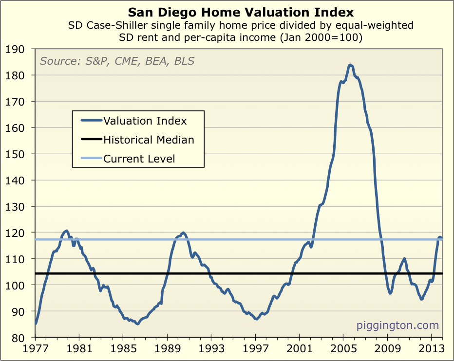
Despite the recent runup, San Diego housing valuations are still
dramatically lower they were during the bubble. However, homes
are far from cheap — at 12% above the historical median valuation
(down from a recent high of 13%), housing has become nearly as
expensive as it got during the 1979 and 1990 peaks.
This isn’t a very big sample set, but for what it’s worth, here’s
what happened each of the last three times housing valuations rose
to this level:
- Late 1970s –Valuations rose just a bit further, then fell
into a multi-year decline. Nominal prices actually rose
slightly during this period, but valuations dropped as high
inflation drove up incomes and rents. - Late 1980s — Once again, valuations rose a bit further then
declined for the better part of a decade. This time, there
was an actual decline in nominal home prices of 17% per the CS
index. Meanwhile, rents and incomes rose, further reducing
valuations. - Early 2000s — Valuations exploded upward during what became a
monumental bubble, eventually (many years later) crashing back
down below the historical median.
So here we are at this level once again. What will happen
next? Here are a few reasons why I don’t think that’s
knowable.
- Again, small data set. I only have data on three prior
cycles, not enough to draw general conclusions from. - The first two times during the data set that we reached this
level, we saw big valuation declines. But that doesn’t
mean that valuations magically decline once you hit this
level. The 1990s bust was exacerbated by a pretty bad
local recession, and the early-80s valuation decline coincided
with both a serious recession and extremely high mortgage
rates. In other words, the outcome from here is partly
dependent on what happens in the real world. (That said,
housing’s high valuation puts it in a vulnerable situation, as a
positive economic outcome already appears to be “priced in”). - And then we have that pesky little incidence in which
valuations reached these levels, just started to falter, and
then flung up to previously undreamt-of heights. The
primary fuel for the housing bubble was an overly accommodative
central bank that was providing excess liquidity in an attempt
to mop up after that prior bubble… sound familiar? - I’ve used the historical median as a baseline for comparison,
but it’s entirely possible that the sustainable level of “fair
value” pricing could creep up over time. That can only
really be known in retrospect. - And then, of course, we have interest rates. This chart
shows how monthly payments stack up against rents and incomes:
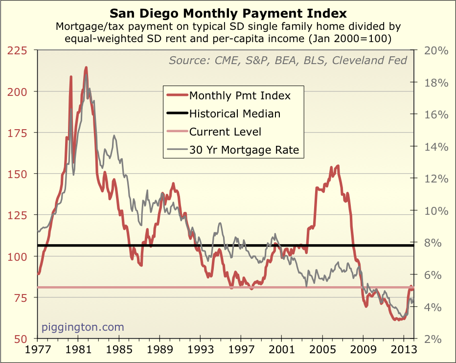
Despite last year’s move up — a result of both rising prices and a
jump in mortgage rates — this chart shows that monthly payments are
still very much on the low side of history. For as long as
that continues to be the case, it could allow valuations to “float”
up above normal levels. When it changes, though, that will
remove a major tailwind for housing valuations. (And, that
really does seem to be a “when,” not an “if,” because rates are only
as low as they are due to central bank intervention that must end at
some point… as to when, that’s anybody’s guess.).
Interesting side note: last year’s move up in the monthly payment
index appears pretty minor on the scale of this chart, but it was gigantic
in relative terms, increasing by 34% in just fourteen months!
That is a major (relative) hit to affordability, but it’s not
readily apparent on the chart because we started at such low levels.
Anyway, you can see why I think there are many reasons that it’s
tough to know with any certainty what will happen with home prices
and valuations. But we do know this: homes are more expensive
than their typical historical level, and valuations are at levels
that, when previously reached during our admittedly limited data
set, always eventually returned to (and through) the median
valuation.
Shorter version: San Diego homes appear to be overpriced.
Proceed with caution.
Bonus Nerd-Out: Is Housing In a Bubble?
This is a question or proposition I’ve heard a lot… in fact, there
is an active forum
thread addressing this topic right now.
For what it’s worth, I don’t actually think it’s all that meaningful
to contemplate. The important thing to understand is whether
something is overpriced, and by how much. The question of
whether it is a “bubble” is mostly a matter of semantics, and is
based on one’s own definition of a “bubble,” which can obviously
vary from person to person.
But just for fun, let’s try to figure it out.
I’ll start with the definition. To me, the defining feature of
a bubble is extreme overvaluation. Investor enthusiasm and
rapid price changes can certainly figure into it, but if something’s
not really overpriced compared to the fundamentals, it’s not a
bubble.
So how overpriced is overpriced enough? For this, I will defer
to the really smart folks at GMO, an investment management firm that
has done a ton of research on historical investment bubbles.
They have a purely quantitative definition of a bubble: when an
asset’s valuation reaches 2 standard deviations above its historical
fair value trend. Such an occurrence should be, and has been,
a very rare event. And very interestingly, almost all of the
major bubbles they’ve studied (36, if memory serves) have eventually
“popped,” aka, come back down to their fair value. (The only
ones that haven’t popped are still ongoing, so the jury is still out
on those. But the conclusion is still that bubble almost
always — or, maybe, always — burst).
The red line in the graph below shows what the threshold would be
for a bubble in San Diego housing:
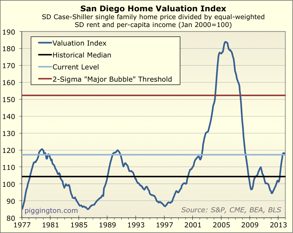
While we reached, and handily surpassed, bubble status in the
mid-2000s, clearly we are nowhere close just now.
Some might argue that the bubble itself distorted this definition:
if we hadn’t had the mid-2000s bubble, the standard deviation of the
valuation series would be a lot lower, and the bubble threshold
would accordingly be lower as well. Now, this is certainly an
interesting point, but I don’t feel that it’s a good idea to start
cherry-picking which data you use, as this kind of defeats the
purpose of using a quantitative, unbiased definition.
Nonetheless — just for curiosity’s sake — here’s what the bubble
threshold would look like if we only based it on pre-2003 data (2003
having been picked somewhat arbitrarily as the year when SD housing
really started to go nuts):
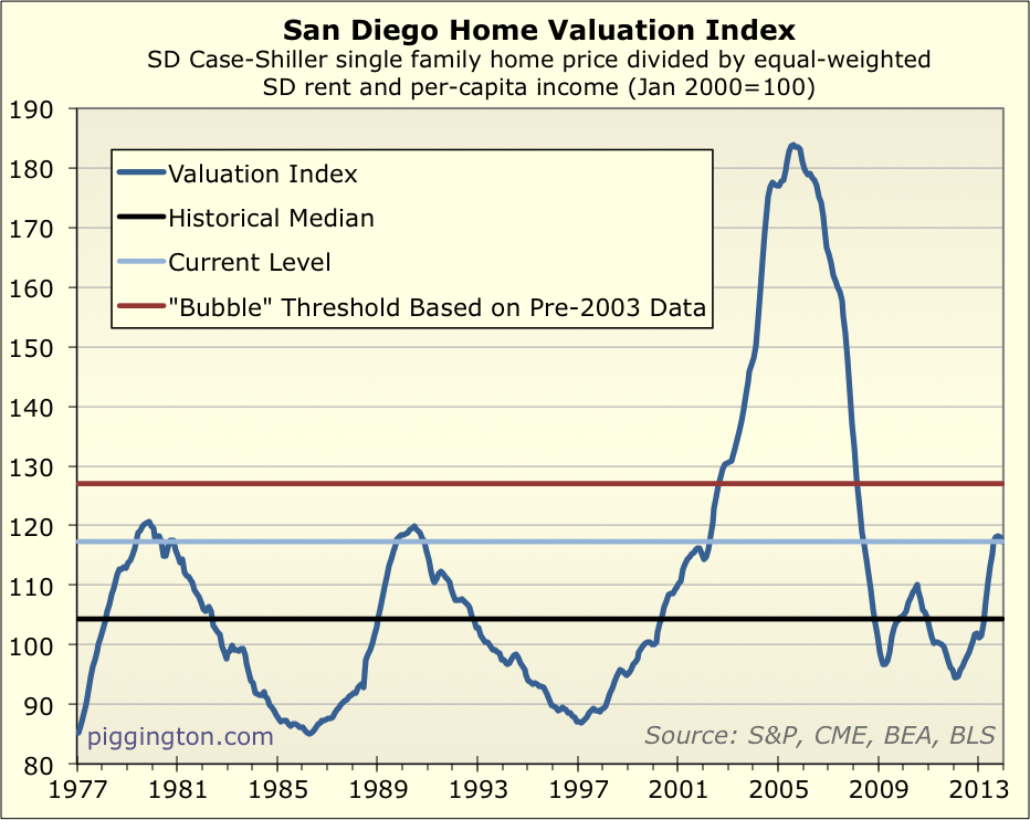
Even by this much less stringent definition (and again, one that I
don’t think is valid, for reasons described in the last paragraph),
we do not meet the bubble criteria.
So, using GMO’s quantitative 2-sigma definition — which is as good
a definition of any I am aware of — this is not a
housing bubble. For what that’s worth. (But homes are
still overpriced).
Well, here’s hoping for a
Well, here’s hoping for a three-PEAT of the late 70s and late 80s. (Thinking of growing a pornstache to prepare.)
Rich, I like the last graph
Rich, I like the last graph you show. Including extreme outlier bubbles like 2005ish time points only distorts the definition of a ‘bubble’ to something larger than the last one. At least, it does in the relatively short time spam you have posted. 2003-2008 ‘bubble’ is 14% of the total time span 1977-2013 graphed.
The last graph to me makes a lot of sense. Prices are at traditional ‘overpriced’ levels that correlate with low inventory; and corrections as price revert to normal. But not at bubble territory that endangers crashing the local economy. It just doest scream ‘crazy’ after the drama of 2004-2008.
Call me crazy, but I remember
Call me crazy, but I remember the 1989 bubble, and it was a bubble. The 2000-2008 bubble was massive credit bubble with housing as the most obvious beneficiary of the excess credit.
Also, in the 70s and 80s, we had demographic shifts that we don’t have today: Baby Boomers entering their peak buying years, and women entering the workforce en masse. Add to that the credit expansion which began in the early-mid 80s, and it’s easy to see why prices got so high during those earlier two peaks.
IMO, the main reasons we’re seeing asset prices climb like they have over the past few years are the incredibly low interest rates and massive investment by foreign entities and speculators (foreign and domestic) who are desperately searching for yield in this ZIRP-ish world. With the wealth gap the way it is, there is a lot of “excess” money at the top looking for a place to earn yet more money. Not sure how this will end up, but I just don’t think it’s indicative of a healthy economy.
Agreed, I would love to see
Agreed, I would love to see Rich somehow able to factor in government intervention into these charts. Since QE3 just started it’s taper and markets (especially emerging) started going into turmoil, will taking away the punchbowl start to bring on the hangover from the cheap credit orgy we’ve been on? I guess there really is no historical precedent for something like QE3, so how could we begin to know the impact it has had or what taking it away will do?
They say don’t fight the fed, and the fed is fighting to keep house prices high, but saying they will stop fighting slowly… They could always say one thing and do another, but doesn’t this tend to look like there will be a downtrend in prices as the fed withdraws asset support policies?
doesn’t this tend to look
doesn’t this tend to look like there will be a downtrend in prices as the fed withdraws asset support policies?
Not downtrend necessarily, but definitely downward pressure. And if I were to bet, I would bet on a downtrend too.
As the Fed buys less mortgage backed securities, mortgage rates will go up which will take some heat off the market. My question here is – without the Fed depressing rates, what is the new mortgage rate equilibrium?
I’m sorry Rich but this graph
I’m sorry Rich but this graph makes no sense to me, why would you divide by equally weighted rent and incomes. Rent is money going out , income is money coming in, so they should not be grouped together in my opinion, but that is just that, my opinion. I guess from a landlord perspective they would be in the the same grouping. I was thinking as a home buyer however. From previous graphs I recall the bottom being in spring of 2009, this graph shows it being in 2012. I’m currently drinking wine so let me know if I missed something.
moneymaker wrote:I’m sorry
[quote=moneymaker]I’m sorry Rich but this graph makes no sense to me, why would you divide by equally weighted rent and incomes. Rent is money going out , income is money coming in, so they should not be grouped together in my opinion, but that is just that, my opinion. I guess from a landlord perspective they would be in the the same grouping. I was thinking as a home buyer however. From previous graphs I recall the bottom being in spring of 2009, this graph shows it being in 2012. I’m currently drinking wine so let me know if I missed something.[/quote]
Rents and incomes are the two fundamentals for housing:
– Incomes show how much potential homebuyers are earning
– Rents show how much it costs to put a roof over your head in San Diego, without including the “investment” aspect of home ownership
Both are good fundamental factors for home prices, and both ratios (home prices to rents, home prices to incomes) have been very mean reverting over time. Combining them together is just a way of looking at the two main fundamental factors in one swoop.
The fact that one is money going out and one is money coming in (from a renter/homebuyer perspective) is not relevant…. I’m not trying to look at it from anyone’s “perspective,” I’m simply looking at prices in relation to their fundamental underpinnings, which I have always argued are best represented by local incomes and rents.
2009 was the bottom in nominal prices, early 2012 was the bottom in inflation adjusted terms and in terms of all the ratios (price to rent, price to income, price to avg of both).
when calculating bubble
when calculating bubble threshold we should definitely ignore the mid 2000 bubble.
since the graph is based on income and rent based. but mid 2000 bubble is happened b/c of stated income and zero down loans. these situations should never happen in the near future at-least for a decade, so we can definitely ignore that from future calculations.
^^^
No, those situations
^^^
No, those situations happened because of 120% LTV loans. I’ve seen quite a few units where the amount owed was at least 20% OVER peak value.
When doing a geneaology
When doing a geneaology search I found out my grandfather made $900/year as a laborer and paid $9 a month in rent back in 1940. Now that is what I would call affordable. Granted it was not here in CA but in upstate NY. I suppose that it might still be possible to pay 1% of yearly salary in rent today, but not in CA, unless making some good wages.
Still possible today — there
Still possible today — there are small towns in upstate NY or Michigan where you can rent a 1-bedroom apartment for $300-400 per month. If you’re making $30 grand a year, the numbers work out similarly.
Even in some bigger cities, the numbers can work out. You can still rent an efficiency or small 1 br apartment in Philly for $400-600 per month.
I have no idea of the size of
I have no idea of the size of the rental, but do know there were 4 little ones, ages 1,2,3,and 4.
Getting close — here’s a
Getting close — here’s a 3-bedroom apartment in rural Michigan for $600…
http://grandrapids.craigslist.org/apa/4312575556.html
And an entire house in Grand Rapids /w garage for the same price…
http://grandrapids.craigslist.org/apa/4324520380.html
Farm house for $700/mo…
http://grandrapids.craigslist.org/apa/4307343070.html
But can they earn the same
But can they earn the same income as laborers, relative to rent, that moneymaker’s g-g-father did? That’s the main issue.
Sure, there are lots of places where rent is cheap, but there’s a (not so good) reason for that: no jobs! 🙁
Not really — it has more to
Not really — it has more to do with land availability. You have metros which have a lot of empty land and can still build out, which keeps rent cheap, even if there are jobs.
moneymaker wrote:When doing a
[quote=moneymaker]When doing a geneaology search I found out my grandfather made $900/year as a laborer and paid $9 a month in rent back in 1940. Now that is what I would call affordable. Granted it was not here in CA but in upstate NY. I suppose that it might still be possible to pay 1% of yearly salary in rent today, but not in CA, unless making some good wages.[/quote]
In much of Europe, farm laborers paid a pepper-corn rent and were living in tied dwellings, which came with the job. Not sure if this happened in the US, but it might explain very low rents in rural areas.