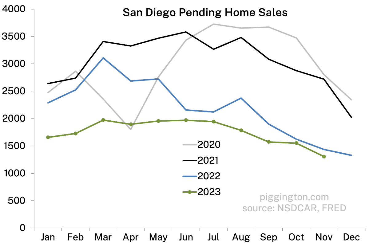
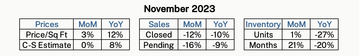
Sales have been creeping down, which is normal for this time of year:
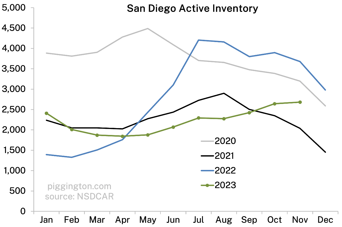
But inventory has been creeping up, which is not:
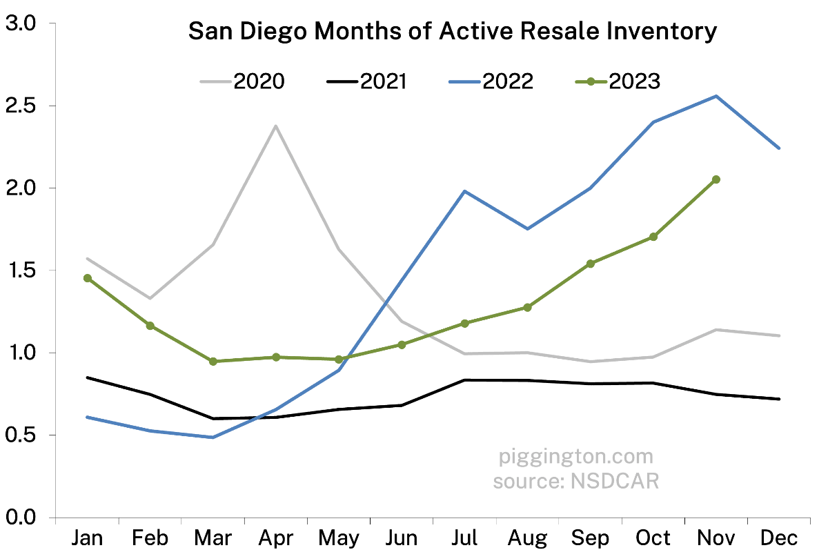
The result has been a significant rise in the all-important months of inventory ratio.
Here’s a zoomed-out look at months of inventory:
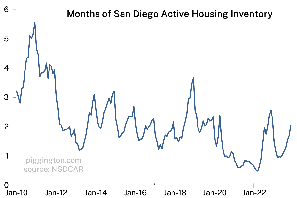
This next chart shows why I called this indicator “all important.” That was unserious, by the way… I actually think many people overestimate its importance by making long-term predictions based on current inventory levels. Inventory is an ephemeral thing, subject to significant changes (as the chart above shows), and the level of inventory at any given moment tells you next to nothing about the long-term sustainability of housing valuations.
However, it tells you a lot about near-term price pressures. And this chart of (inverted) inventory and monthly price changes shows that we’re approaching a level at which home prices have typically stalled or declined.
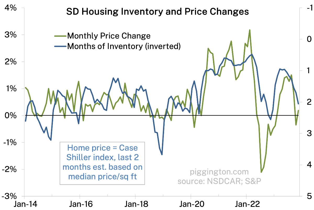
Despite that, prices were resilient last month:
However, given the high and rising supply-to-demand ratio, my guess is that prices will struggle to gain further ground in the very near term.
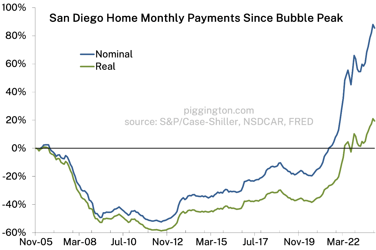
On the upside, mortgage rates have backed off quite a bit, so monthly payments will likely improve a bit in next months’ version of the below graph. However, they remain firmly in nosebleed territory, and as I discussed here, rate moves seem to cause offsetting reactions in supply and demand. So it remains to be seen how much this helps.
More graphs below…


Is it wrong to see these low pendings as creating pent-up demand?
Or is it after effect of accelerated demand the low rate period pulled forward
No, I don’t think it’s wrong at all. I do agree that demand was pulled forward, and so part of the lull in activity is probably offsetting that. But beyond that, I think it makes sense to assume that any time the market really slows down for whatever reason, that it’s creating pent up demand.
But the same can be said for pent up supply. Using the same thought process: for every person who’d like to buy but doesn’t, pent up demand is created. But for each of those people, there is a person who’d like to sell, but doesn’t. That leads me to believe that this frozen up market is creating pent up demand and pent up supply in more or less equal numbers.
There are two kinds of pent-up demand. Those who are entering the home buying age and buying their first home and the move up buyers. the move up buyer demand cancel out with their supply. However, for the new first time home buyers, they must be cancelled out with new homes and people dying. First time home buyers can come from immigration as well as people getting older. All the stats I’ve been reading are that we’re not building fast enough to offset new demand. So, these low pending IMHO are creating pent-up demands. People will only get older. They don’t get younger, which means that demand won’t go away.
“However, for the new first time home buyers, they must be cancelled out with new homes and people dying.”
Or people moving out of SD or switching from owning to renting.
PS where are the stats you noted? I would like to find stats on SD housing supply vs. population over time… have you seen such a thing?
I don’t remember exact sources but did see clip on the news about how we’re short by millions of houses. I see it periodically when they report on housing starts. I have never seen anyone say, we’ve finally built enough housing.
Also, your statement about “people moving out of SD” should also account for people’s income as well. If more people moving in can afford houses vs people moving out who can afford houses. Then, that’s a positive move for demand.
As for people switching from owning to renting, then we would see an increase in pending, not declining.
Another tea leaf I read is the increase in rent. That tells me the people who are moving here (who’s renting first until they find a place to buy or wait till the rate drops) are more affluent than the people who are moving out who were also renting. Which is why rent is going up and not down.
Per zillow rent on new SD leases is up 3.2% yoy — exactly the same as inflation. So, no change implied in the wealth of renters.
“As for people switching from owning to renting, then we would see an increase in pending, not declining.” True but irrelevant to my point, which was that you left out a category of scenarios that could increase supply.
“Also, your statement about “people moving out of SD” should also account for people’s income as well. If more people moving in can afford houses vs people moving out who can afford houses.” True, it should be net owner moves: sellers moving out of SD minus buyers moving into SD. Relative income is again irrelevant — I’m just naming other scenarios that could cause an increase in supply.
We have people moving out now, San Diego net migration is outward, yet, where’s the supply?
I can’t disprove the statement about people switch from owning to renting, so I’ll give you that one. However, I can’t imagine there’s are that many to be considered additive to pent up supply.
While IMHO, the biggest factor is demographic and birthrate. Kids will get older, form families and want to buy a home. The outward migration have to surpassed amount to negate the pent up demand.
I’m really confused here because you just keep arguing against things I never said.
In your first post, you implied there were only two things that could increase supply: “ for the new first time home buyers, they must be cancelled out with new homes and people dying.”
I replied to say that there are other things that could potentially increase supply too. I named a couple of them that I thought of.
That’s it! That was all I said. Every single thing you’ve brought up (ex the correction about net people moving out vs. in) has had nothing do with my point.
So I’m going to extricate myself now. Hopefully it’s now clear what arguments I did and did not actually make.
I guess that’s where you got confused. I never said those are the only two ways. Key word is only.
I meant to say, “There are two major kinds of pent-up demand.”
Home Buyers Are Ready to Buy. But Sellers Aren’t Selling. (msn.com)
Just read an article that showed the home price to income ratio is higher now than in 2006. Stopped by to see if you had any local income charts. Looks like not this month. Wondering if you could include some ratios of price and payment levels to local income figures next time around.
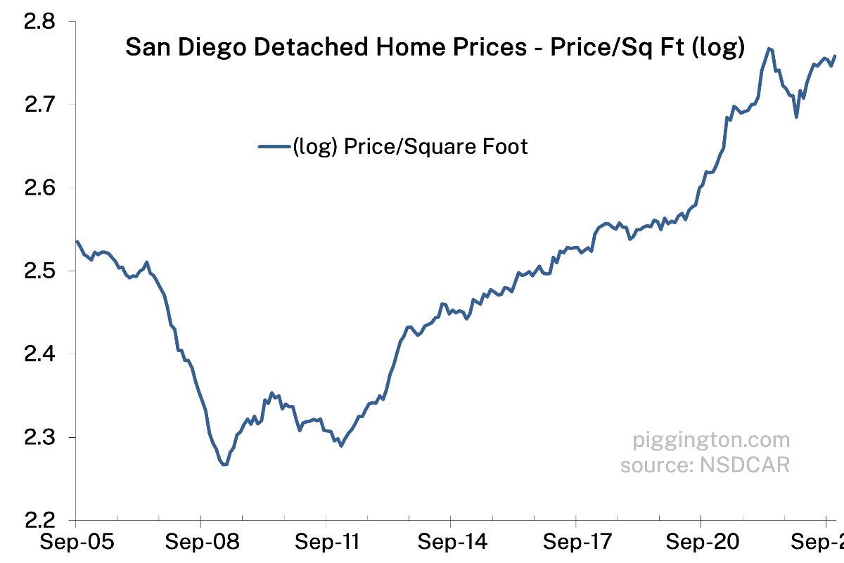
Here’s some from August: https://piggington.com/shambling-away-from-affordability-again-july-2023/
Oh. And rent to income as well might be interesante.
These markets always crash after a freeze up like this in the winter. Divorces and forced sells will gap the market down in a heart beat.
I hope you’re right.
Currently, there’s only 2 houses for sale in my area of 22k+ households (75k+ people), any idea on when we’ll gap down? Now that the Super Bowl is over and that’s usually the start of the selling season.