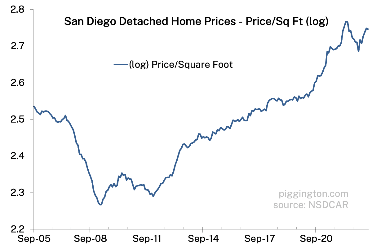
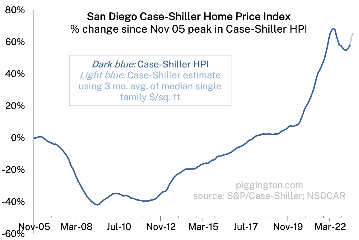
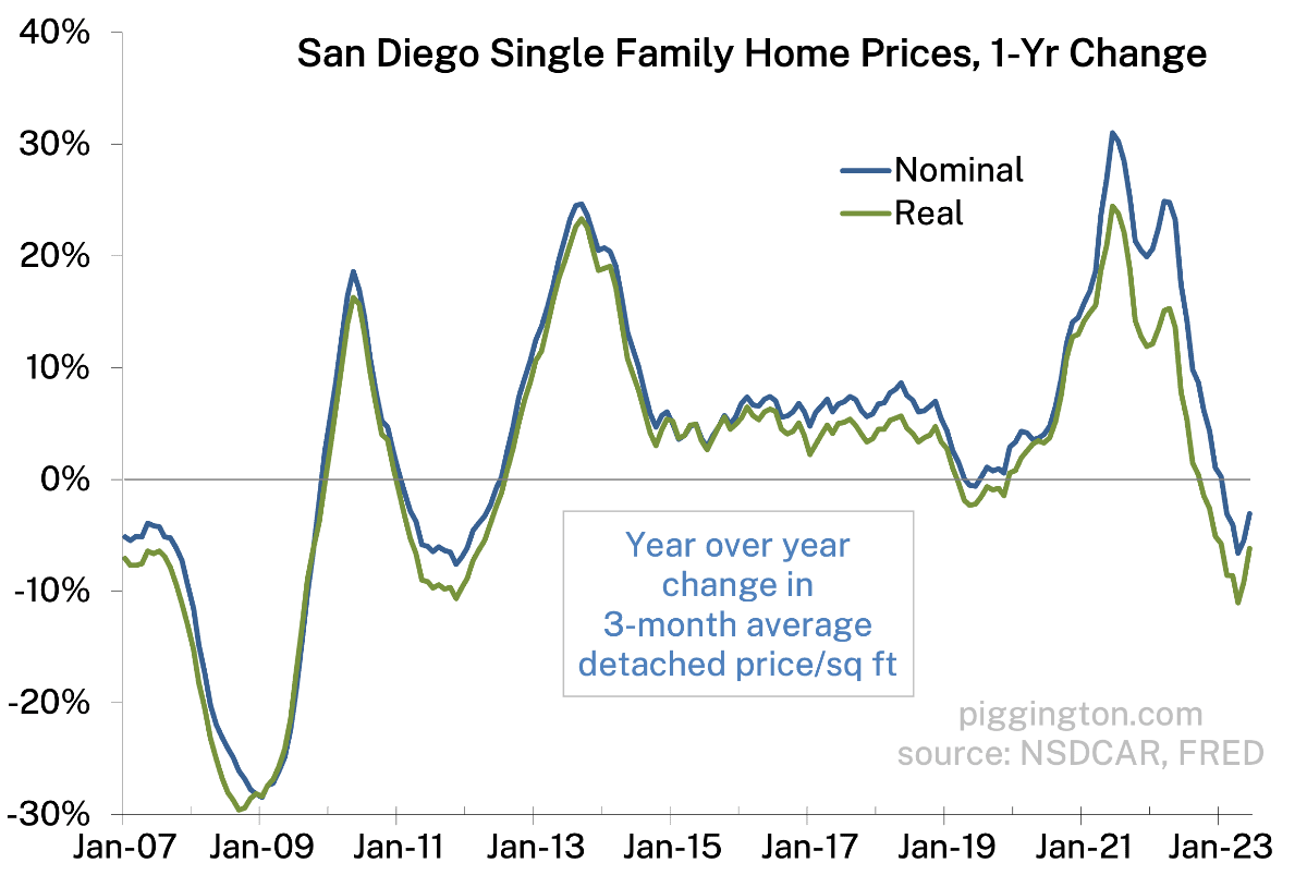
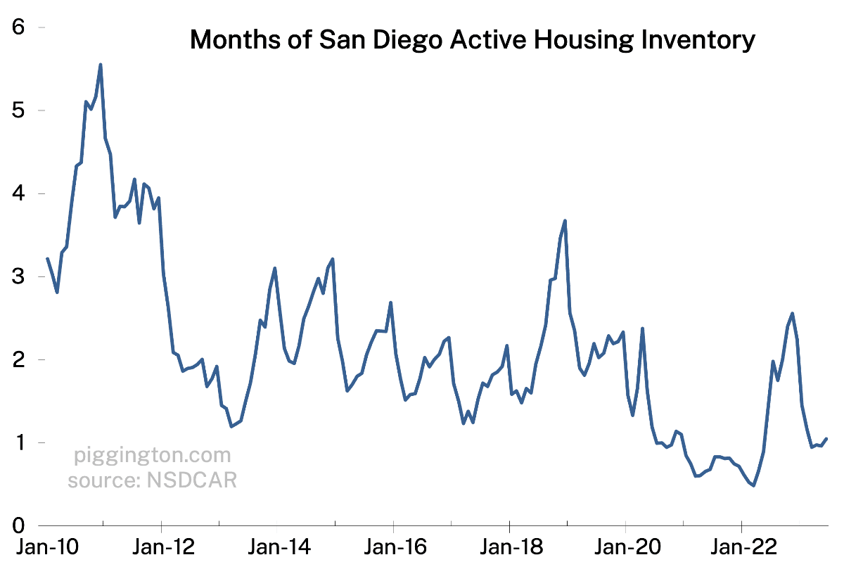
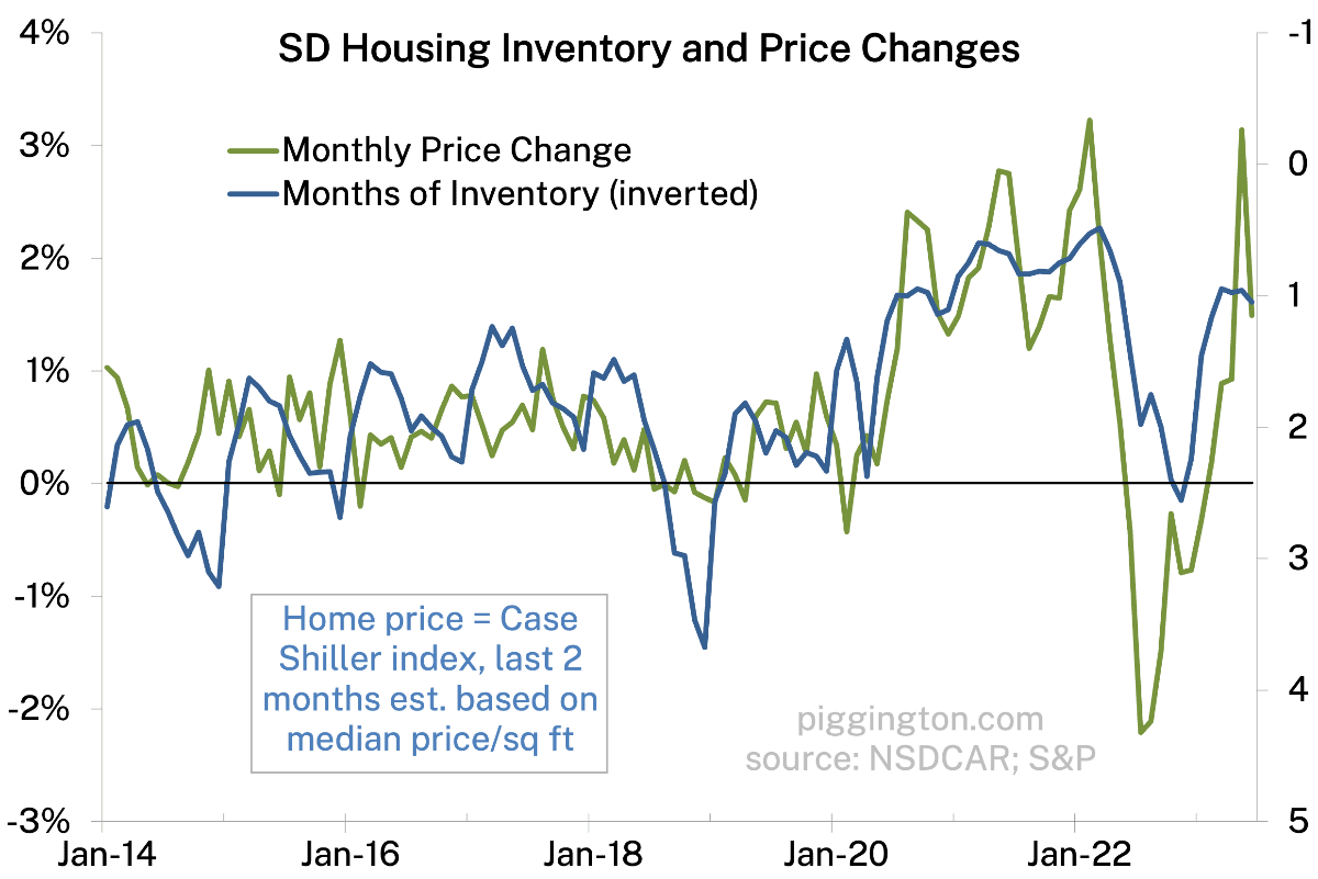
Well if you squint really hard, prices backed off a wee bit last month, and months of inventory crept upward. But in spite of this small move in favor of the buyers, we are still very much in standoff mode.
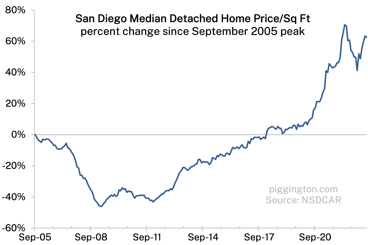
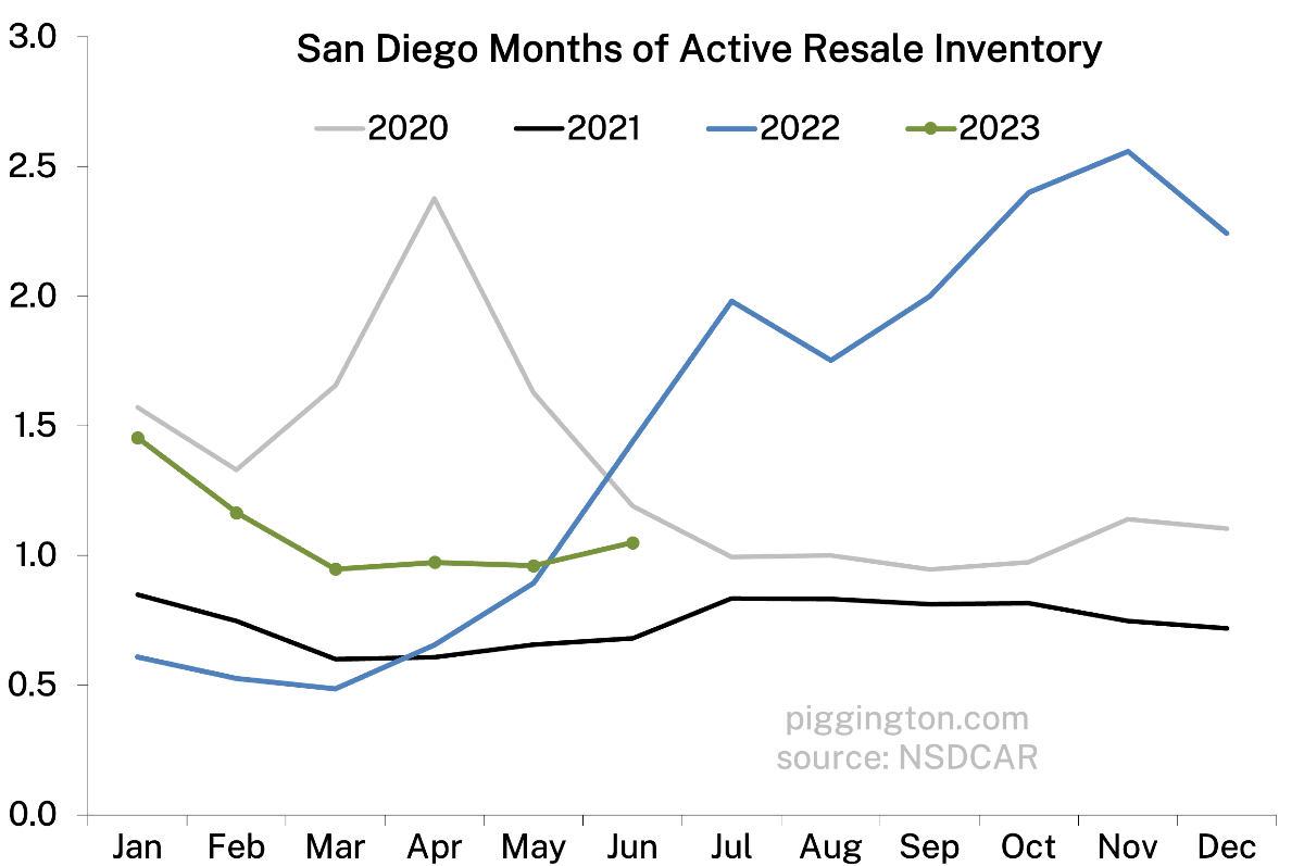
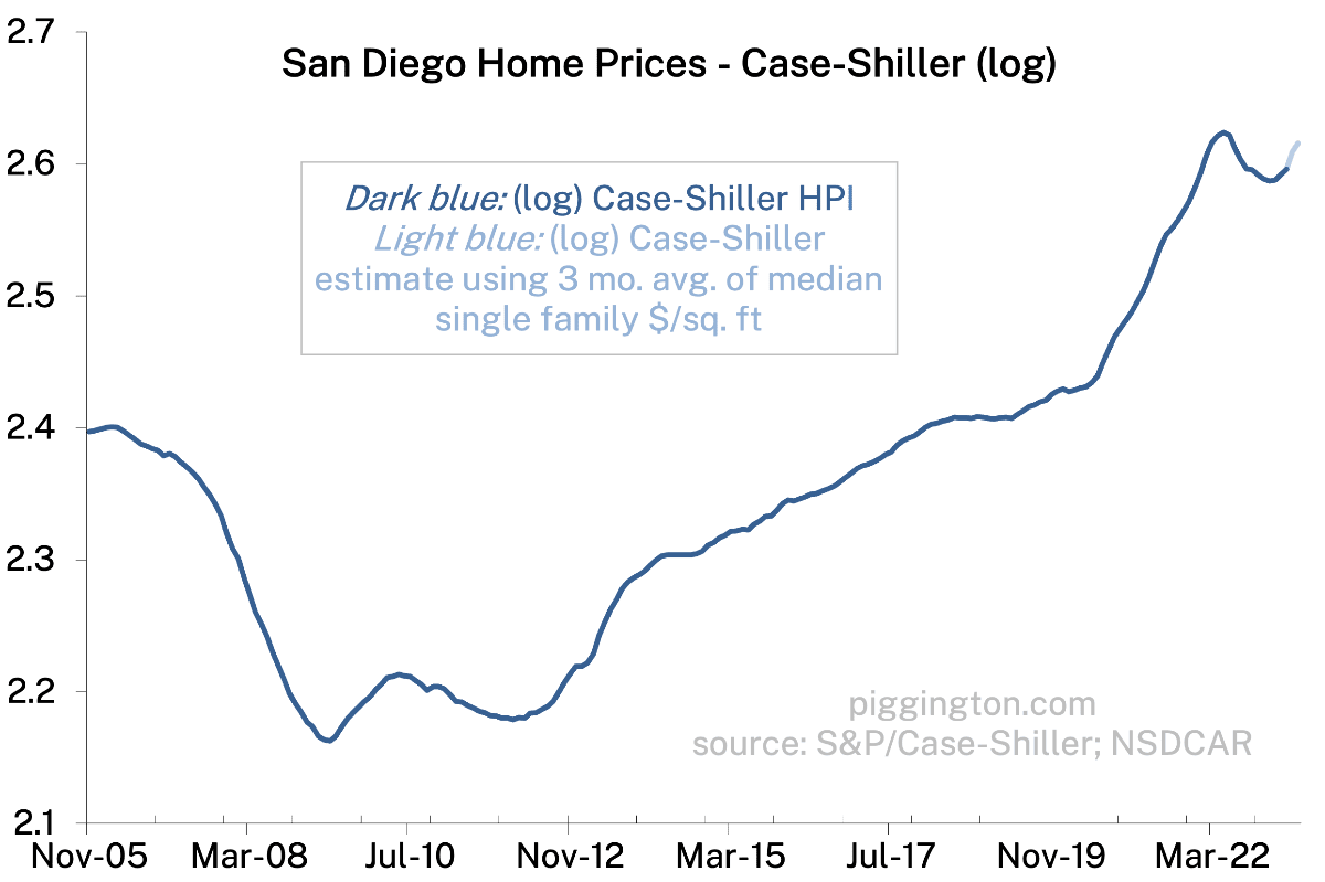
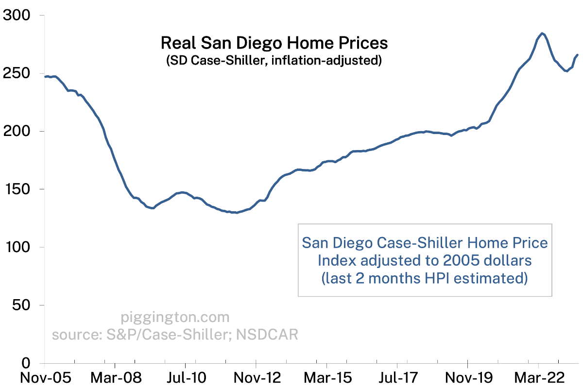
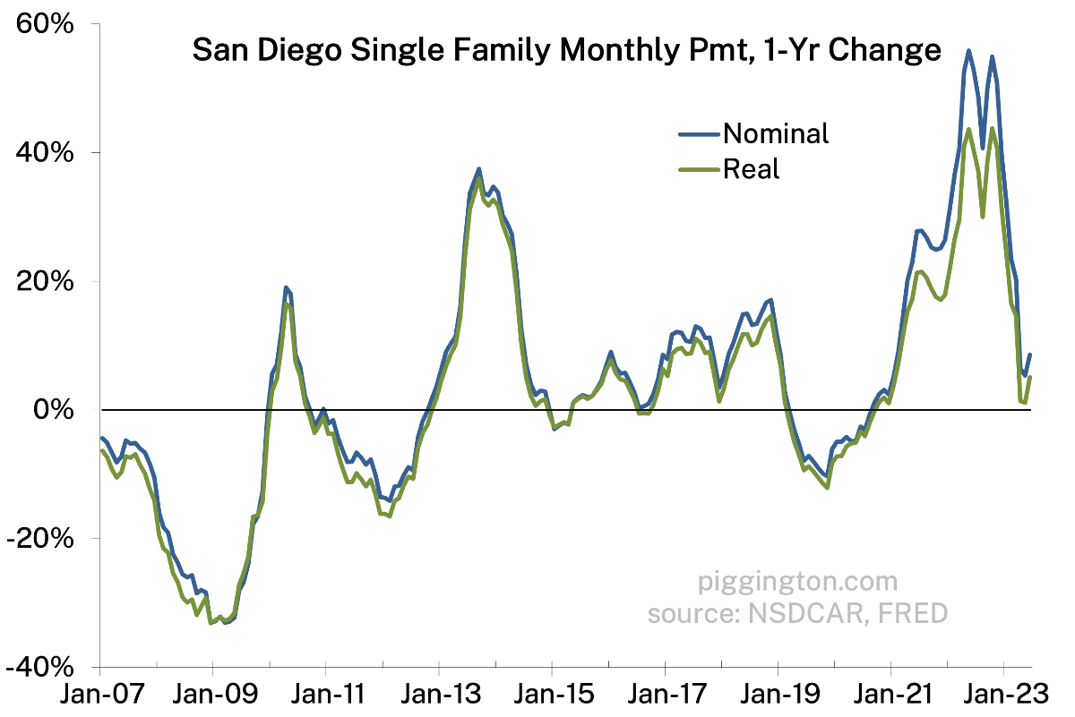
Between the price recovery and last month’s pop in interest rates, we are now at new multi-decade highs for monthly payments — even in real terms:
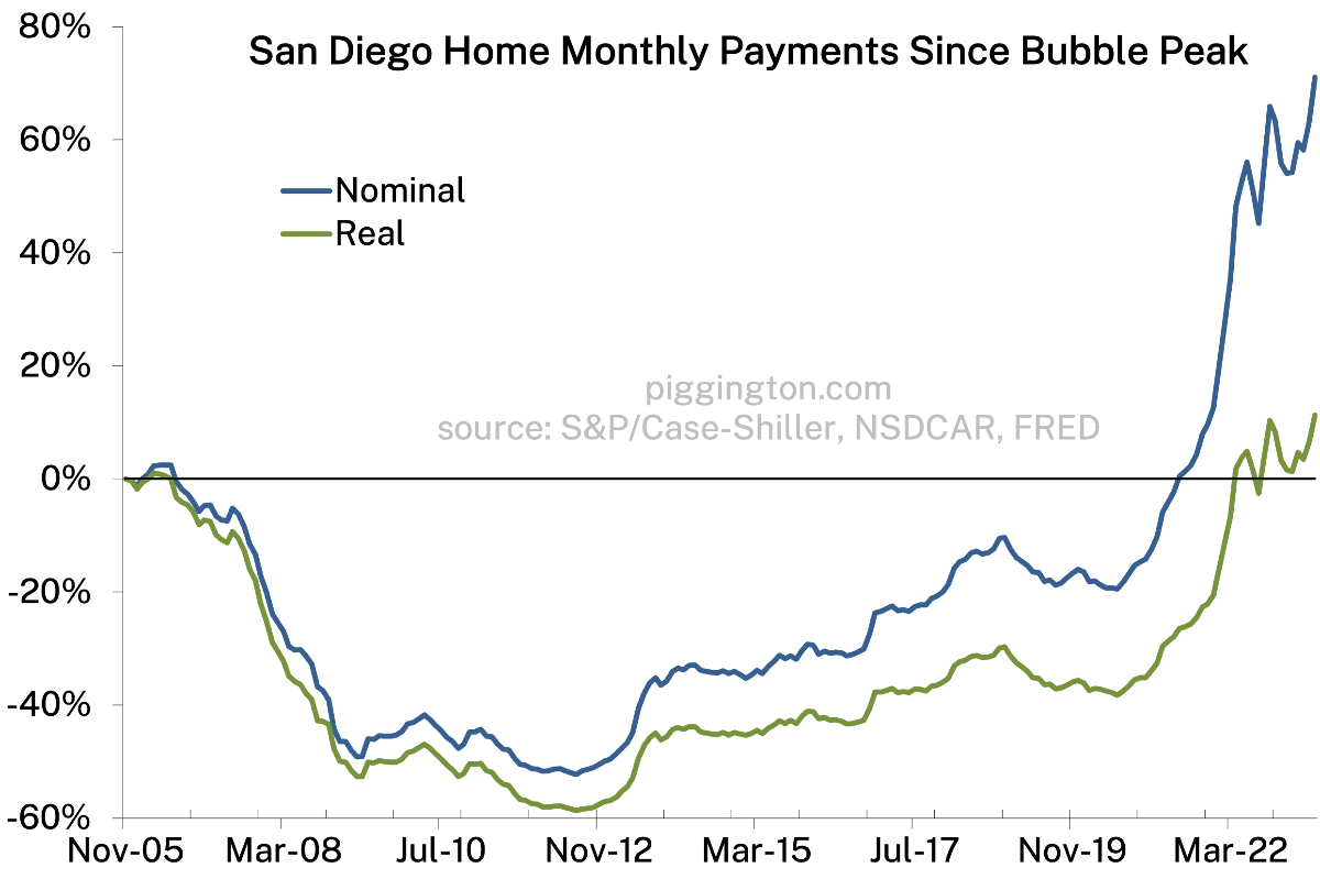
That’s it for this month; more graphs below and I’ll try to update the valuation charts soon.


Hate to create work for you but would be great to see 2019 added to inventory graph(s) to show where we were prepandemic
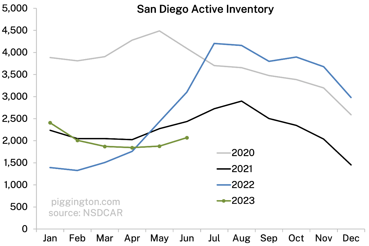
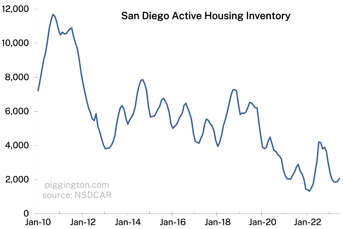
Lazy answer – if you look at the fourth graph from the bottom, we were at 6k+ for the first half of 2019… ie ~3x current levels!
Even better and shows how much things have changed. 6K is pretty much the long term average. We are at 1/3rd of that
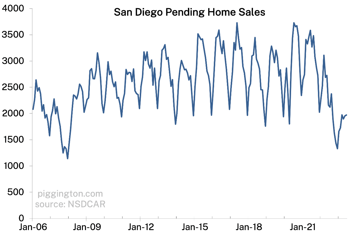
Yeah way below long term typical levels. I like the below to illustrate that… it shows that we are well below the low end of the post-bubble/pre-Covid range. (Though this is partially balanced by the next one, showing how low sales activity is).
inventory:
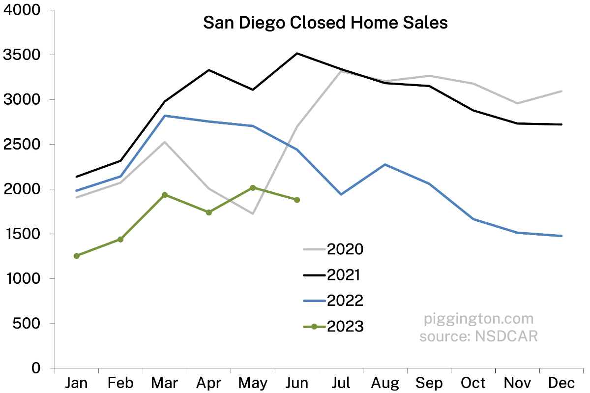
sales:
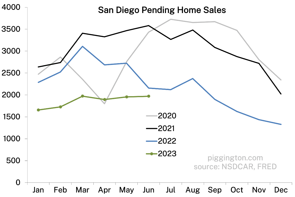
Looking at the above I’d put long term pending average around 2500. We are only about 20-30ish% below that so demand is holding up much better than supply. I think its a case of the data showing SD as a market has fundamentally changed. It’s just not the same place it was 10-20 years ago in terms of desirability
Interest rates need to be elevated for a long time for inventory to “recover”
Glen Kelman was on CNBC today and was asked what was happening in the market. He must have said 3 times that demand is way down but inventory is down even more. Ive been saying that exact thing here for at least 6 months:)
Was out Ubering the other day. Had a discussion with a passenger works for Swinerton, which is a large commercial developer. Most of our conversation was about lab space/biotech and if too much has been built or is in the pipeline, hard to call but fair chance of too much lab space in near term.
Conversation turned to Apple and their complex in RB, this will take a few years to build out and the plan is for 5-6K employees as HP vacates.
Final note was most surprising, Meta asked for 5K employees to consider relocation to San Diego (don’t know where campus might be), assume UTC/Sorrento Valley area.
Apparently, 31,000 Meta employees asked to be considered for the move from their current location (Bay Area) etc to San Diego. Don’t know timing or if this will actually happen but more tech companies are coming in. Factor discussed was the “friend effect”, as more have friends here, more friends are incentivized to follow.
Expect 4S to benefit from Apple but it will be a step by step incremental process.
At the very least, if these kind of relocations occur, it may well place a floor under prices even at current rates. Also not expecting any softening of rents for near term (1-5 years).
I’m curious what the valuation index graphs would look like now, and where the threshold would be for a “bubble” (2 standard deviation).
Is this the latest version? https://pcasd.com/san-diego-housing-measuring-valuations-the-role-of-rates-and-whether-to-buy-now/
This is the most recent version (soon to be updated when I get some time): Shambling towards affordability, January 2023
Thanks! I just saw the quick link at the top: Articles>Valuation Updates. Can you include the “bubble” threshold line in the next update? Also, any thoughts about how to define a bubble threshold in the high volatility of the last 20y?
I just don’t think that’s a particularly meaningful stat in this case. It comes from attempts to look across multiple different asset classes over very long histories, to try to get a sense of patterns. I don’t think it’s as useful for a single asset class with a shorter history, especially when it is such an idiosyncratic market (notably: heavily dependent on financing cost, and subject to supply constraints that don’t exist in most asset classes). So short answer, no, I don’t really want to include it as I don’t think it’s very useful in this application and I think it could be easily misinterpreted.
Understood. I also found some of your previous replies where you pulled out the ’05 bubble, which is essentially what I was interested in. A lot of the discussion on this site revolves around assets trending to historical norms in the long term and rejecting the “this time is different” mentality. While it is quite possible that this time is actually different, I’m struggling to find the data to confidently back that up.
I’m not even in the market anymore, but I credit this site and the data for helping us buy our first house at the end of ’08 (when it was suggested I change my name to PowayKnifeCatcher). My friends will often come to me for advice on the market. At this point all I can say is that prices are historically high, but short term supply/demand will likely keep it that way, long-term is hard to predict.
Glad the site was helpful way back when, and nice job, that was a great time to buy.
“While it is quite possible that this time is actually different, I’m struggling to find the data to confidently back that up.”
I don’t think you can ever confidently prove that “this time is different.” But that doesn’t mean it never is!
I’m a big reversion-to-the-mean guy, but I like to think of mean reversion as a strong tendency, not an iron law. Sometimes there CAN be structural changes that cause new permanent shifts in valuations, market relationships, etc. And as you traverse down the stack, from say RE as a whole, to residential, to a specific locality, the chance of such a shift increases.
So I try to stay open to the possibility of structural shifts, while staying skeptical of the extrapolative narratives that always accompany any major market move. FWIW, in case that helps put these charts in perspective.
PS – I updated the valuation charts here.
PPS – I think WFH was likely a genuine permanent shift upwards in sustainable housing valuations (at the expense of commercial RE valuations).