So much for that price pullback. The median price per square foot
for single family homes rose in January, just hitting a new
post-crash high:
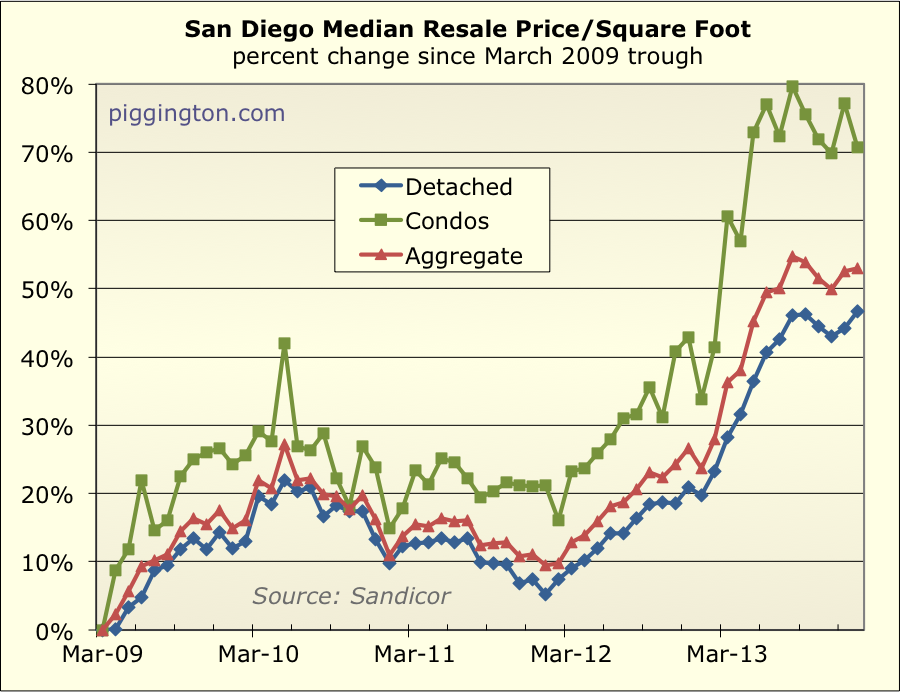
The always wild condo median price per square foot was actually down
for the month, but prices rose in aggregate.
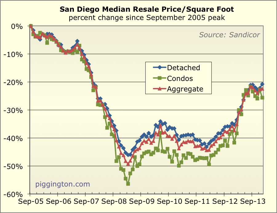
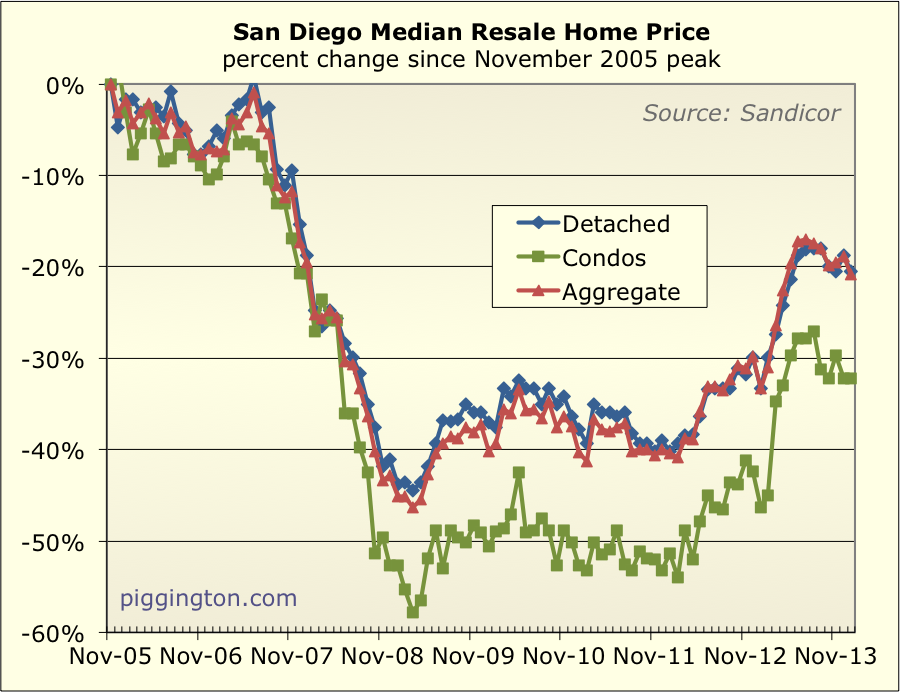
Here’s a look from the peak:
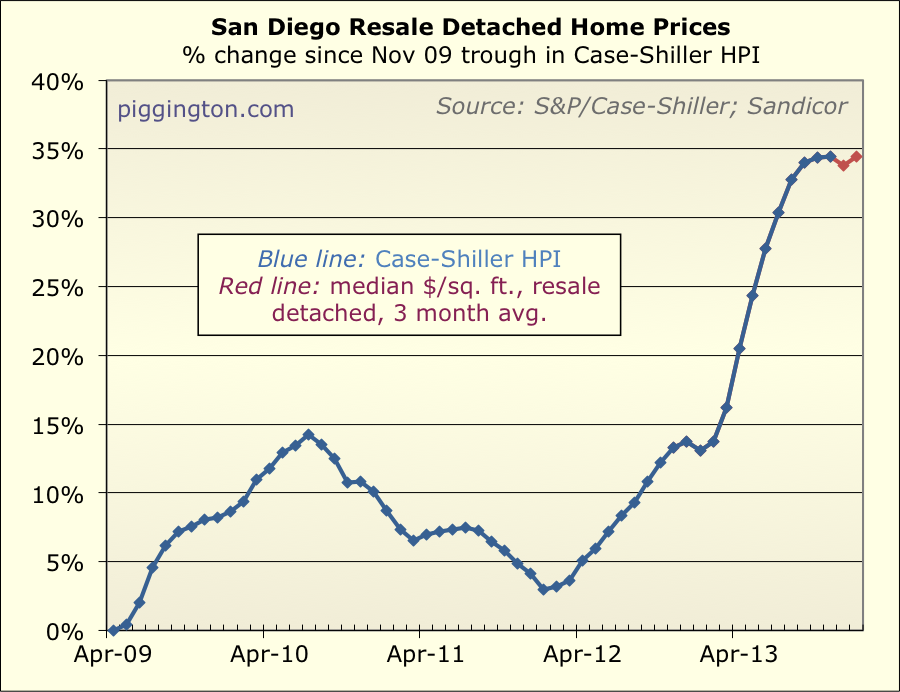
Here’s the CS Index with the past two months estimated based on the
price/square foot:
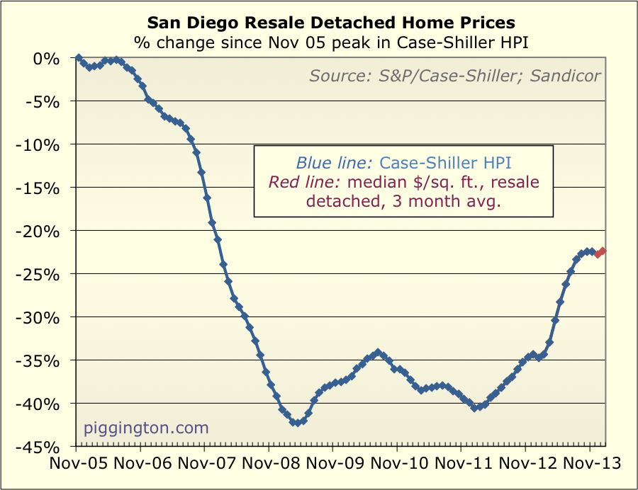
Same thing from the peak:
The median sale price (not per square foot) has actually been
declining for both property types for several months:
This is actually interesting. It looks like the median price
pretty much topped out before rates went up, and has been in a
downtrend since. However, the median price per square foot has
been flat to up, meaning that people sacrificing quality and getting
smaller homes.
For the supply and demand stuff, I like to compare to the same month
in prior years, as there is a big seasonal impact. This is
especially important in December and January, as things usually get
thrown off due to the holidays. So on the charts below, note
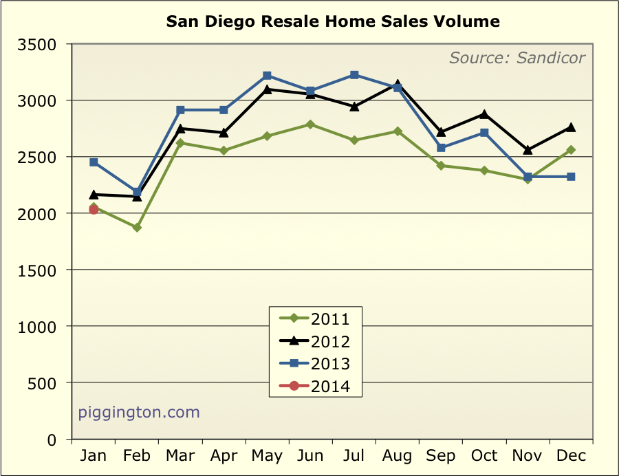
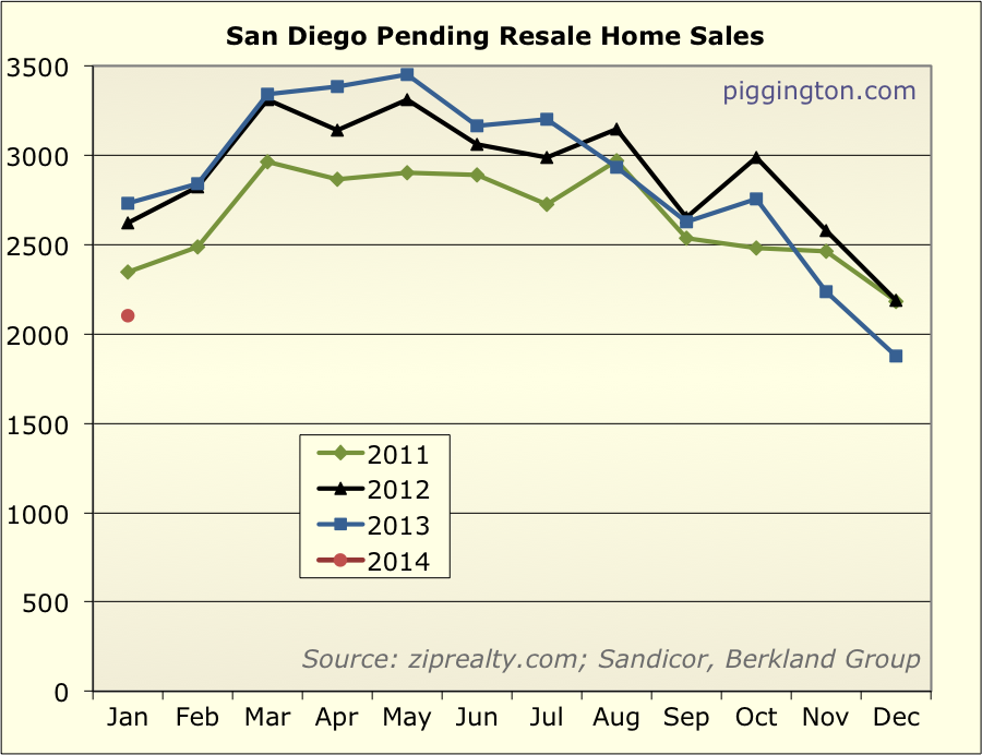
January’s red dot, and compare to Januarys over the past 3 years.
Starting with sales — they were down 17% from last year, and back
to about their 2011 levels. This is a pretty significant
decline from this month last year. And unlike the recent spate
of disappointing US economic reports, this can’t be blamed on the
weather!
Pending were even weaker… worse than any January of the past 3
years, and 23% below last January’s level:
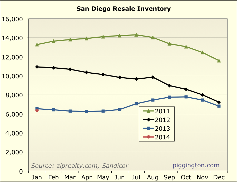
Inventory remains low:
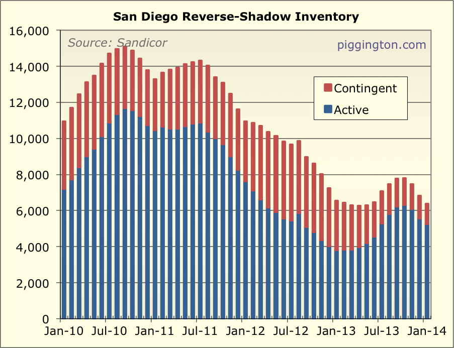
However, the decline in inventory is entirely in the “contingent”
category. Contingent properties are usually bank-owned homes
that have an offer pending approval from the lender that owns the
property. Thus, they aren’t inventory in the typical sense, as
they are already “spoken for.” They were a pretty huge part of
inventory for a while, as the below graph shows, but as the short
sales and foreclosures have subsided, they’ve been shrinking fast:
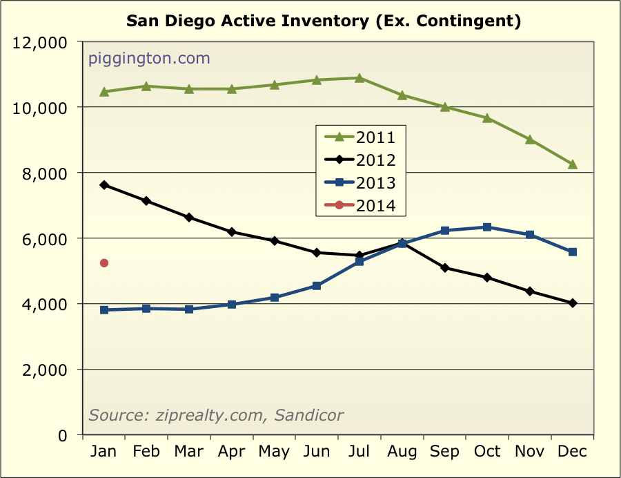
Here is just the active inventory, with contingent properties
removed. There is actually 38% more active inventory than
there was a year ago — coming off a low base, to be sure, but a
significant jump:
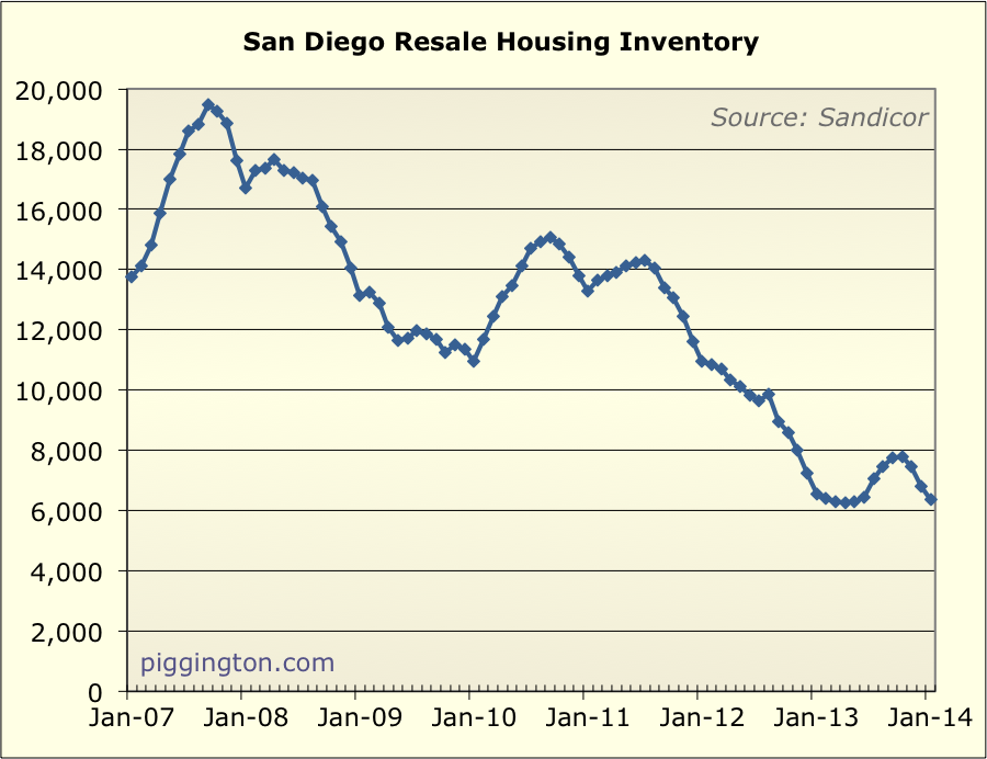
Here’s a linear look at inventory (active and contingent) going back
to 2007. Unfortunately I don’t have an active series going
back that far.
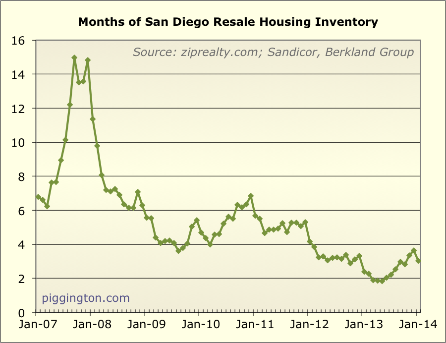
The all-important months of inventory measure was 27% higher than
last year:
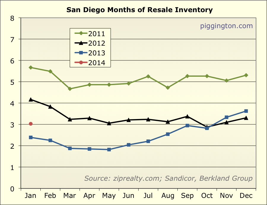
But that was coming off an extremely low base, and months of
inventory still shows a scarcity of homes for sale compared to
demand:
Here’s the chart comparing months of inventory and price
changes.
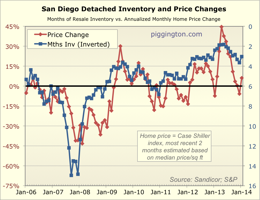
Notwithstanding the recent (and thus far very short-lived) price
dip, the tight level of inventory suggests support for home prices
in the months ahead. However, sales are weaker than this time
last year, and active inventory is higher, so I wouldn’t expect
anything like 2013’s price surge.
