The size-adjusted median resale price was absolutely crushed in December:
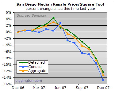
By this metric, single family home prices were down 4.6%, condos were down 5.8%, and a volume-weighted aggregate of the two was down 5.0%.
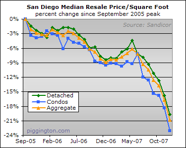
Here’s a longer term view, from the peak of this series in September 2005. Since that time, the size-adjusted median price has dropped 19.7 percent for single family homes, 23.1 percent for condos, and 20.9 percent in aggregate.
I don’t think that this represents a "catch-up" from the first half of 2007 when, due to the compositional shift caused by the subprime tightening, the median-based indicators started heading up even though same-home prices were declining. The reason is that the credit crunch hit higher-end borrowers (thus getting the sale composition somewhat back in line) all the way back in August, and as I understand it, it’s not really the case that borrowing has gotten a whole lot harder for them since. I.E., the catch-up has already happened and what’s going on at this point represents something else.
It makes more sense to think that lenders started pricing REOs more aggressively (possibly encouraged by the arrival of year end), and that in so doing they caused both an actual price decline and a further shift towards the type of lower-end properties that are more often in foreclosure. As sdrealtor said in the prior post, "I believe what you just observed is the switch to a foreclosure driven market. For the last two years, only the perfect homes were selling and prices were holding up pretty well. Now the screaming deals (given current market conditions) are dominating the market."
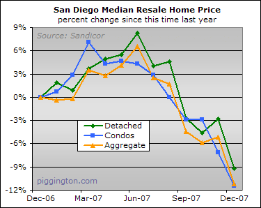
Issues of composition aside, prices are under pretty unbelievable pressure. A one-month move like this (and like we saw in the plain vanilla median, below) is pretty amazing in the normally languid housing market.
Month-to-month, the vanilla median was hit even harder: down 6.6% for single family homes, 4.6% for condos, and 6.4% in aggregate (yes, that’s in a month!). Can’t wait to see the U-T headline on that one.
Here’s a view since the aggregate peak of that series:
I tried something new this month. Now that the subprime-induced distortion is removed from the median based indicators, the size-adjusted median is presumably giving a more accurate read on price movements. Not as good as the Case-Shiller HPI, of course, but also not lagging by 2 months like the HPI. So what I’ve done is to project the potential HPI using the 3 month average of the single-family median price per square foot (using the same 3-month smoothing as the HPI itself).
If the size-adjusted median has been giving a remotely accurate read on same-home price movements, as opposed to being the artifact of a compositional shift, then the November and December HPI should look something like this:
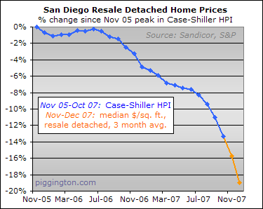
That is some serious acceleration!
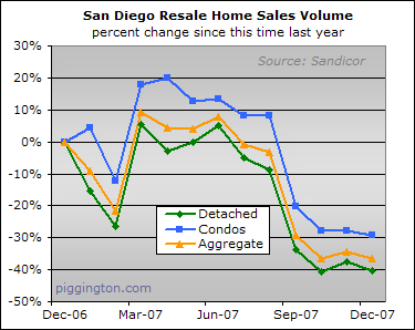
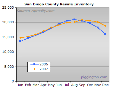
Moving on to supply and demand, things weren’t a whole lot cheerier, as volume was down 36.6% from a year ago.
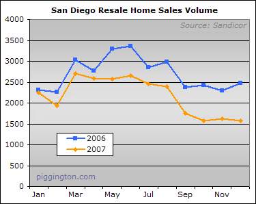
Here’s a look at how 2007 stacked up against 2006:
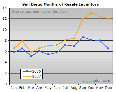
The inventory situation has been taking a turn for the worse as well, and by mid-December (when I did my usual monthly snapshot) it was up 16.9% over the prior year.
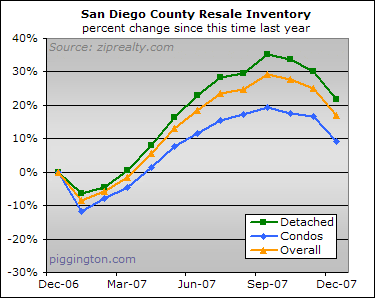
The 2006-vs-2007 graph gives a better idea of what’s going on with inventory. Inventory stayed at 2006 levels throughout the year, but in the end it never declined as it did at the end of 2006. This probably has to do with the fact that so much of it needs to be sold — a bad sign for prices.
Putting the two together, the months of inventory figure was abyssmal. I recently read on Calculated Risk that 6 months of inventory is considered normal and the prices can be expected to decline when you hit 8 months of inventory. So what happens at 12 months? Yikes.
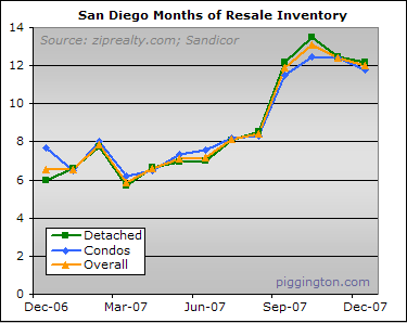
The tail-end of 2007 has looked far worse than 2006, inventory-wise, so it should be no surprise that the price decline has picked up the pace as seen in the charts above.
Yet this relationship seems lost on many people. To my continued amazement, pundits keep coming out of the woodwork to call the bottom. (Yes, people are still saying the bottom is right around the corner, and not just the permabull trolls that occasionally do drivey-bys here on the Econo-Almanac — a recent NC Times article sports the latest instance).
Here, as a public service to my fellow Piggs, is a quick and easy four-point rejoinder to the next permabull who tells you this is the bottom:
- There is an enormous inventory overhang.
- Much of the inventory is of the "must sell" variety.
- Many more foreclosures (aka must-sell inventory) are known to be in the pipeline.
- Prices are still far too high in relation to local rents and incomes.
For busy executive Piggs and coffee achievers here’s a shorter version:
- In a market that is both overpriced and oversupplied, prices will decline.
There’s an even shorter version, but it requires you to carry a taser around everywhere, so I recommend one of the above two approaches.
Rich,
I just want to extend
Rich,
I just want to extend a huge THANK-YOU for building/maintaining this blog and publishing this data and your analysis (and I know I speak for many others). It is bar none the best (and probably the only) place on the web to get a fully consolidated, unbiased look at the San Diego residential real estate market, with incredibly insightful analysis to boot! You tell it like it is. Kudos, you da man!
New_Renter
Nice update Rich.
This
Nice update Rich.
This reminds me … I saw a red stain on the road yesterday.
It was either vandalism via paint-can-dropping or perhaps there really is some blood in the streets.
I notice that many of these
I notice that many of these graphs fall off the cliff starting right around August… when lending suddenly tightened.
>chirp<
Hi Rich,
Thanks for all the
Hi Rich,
Thanks for all the charts and the insightful analysis.
Not to ask for more, but how about the inflation adjusted price decline? I always enjoy this one – I think too many people forget about the true wealth lost.
Thanks!
according to
according to http://data.bls.gov/PDQ/servlet/SurveyOutputServlet?data_tool=dropmap&series_id=CUURA424SA0,CUUSA424SA0 San Diego’s CPI from 2nd half 2005 (the peak) was 222.9
The reading for the first half of 2007, the most recent reading, is 231.9. A simple trend line puts 2nd half 2007 at about 234. This equates to about 5% inflation over the 2 year period, so just add 5% for a rough estimate.
Per Dataquick data, Peak was 518,000, November 2007 was 440,000. This is a 15% fall unadjusted. The adjusted figure is (222.9/234)*$440,000=$419,128, a 19% fall.
So Rich, these numbers are
So Rich, these numbers are real declines and not inflation adjusted? Or are they indeed inflation adjusted?
If these graphs are not inflation adjusted, would, as Robson illustrates in an example above, the declines be steeper or would they be more tame?
I appreciate having a forum full of contibutors who know more about economics than I do.
HiggyBaby
These are not inflation
These are not inflation adjusted… if one were to take inflation into account, the declines would be steeper than what you see above. I will update some inflation-adjusted graphs soon.
Rich
Rich,
I appreciate the
Rich,
I appreciate the quantitative approach you take to real property valuation in the article above. I have a question about the labeling of the charted data. Most charts refer to ‘San Diego’ residential real estate and some refer to ‘San Diego County’ residential real estate. Would you please confirm that the data for all the charts in the article are based on San Diego County real estate prices? I believe that was your intent.
Thanks,
[email protected]
Yes, it’s all San Diego
Yes, it’s all San Diego county.
Rich