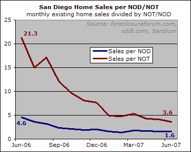
Below is a 1-year chart of the number of resale home sales (condos and single family) in a given month divided by that month’s NOTs and NODs, respectively. (I will provide a longer-term version when the DataQuick data hits the streets).

I noted the exact current and year-ago values so that you could get a more precise idea of just how much awful-er things are looking in the here and now.
Looking at this chart, it’s not going out on too much of a limb to guess that the housing market will fare worse in the latter half of 2007 than it did in the latter half of 2006.

Charts like this truly
Charts like this truly highlight Rich’s skill in not only analyzing the market but in displaying information that allows others to see the market with the same clarity he does.
Really, this is a brilliant, brilliant way to look at the data. Compare yourself to the average person who only gets to hear from “analysts” and UT “experts” who do little more than look at a median price plot, and you should feel privleged to have the opportunity to see this chart.
Give me this 1 chart over 1,000 powayseller posts anyday.
I don’t believe the word “awful-er” is supposed to be hyphenated.
Rich,
First, I love the
Rich,
First, I love the site. I come here daily to look for new updates and when I talk to skeptics of the housing bubble, I always try to send them to this site. I believe you provide fact based, unbiased data and feedback and I thank you for that.
I was hoping you could verify that I understand what this data means? I believe it means for every one Notice of trustee sale (NOT) there are 3.6 regular home sales. This is opposed to the previous year’s numbers of 21.3 homes sold per one NOT.
These numbers do not state whether the number of NOT’s increased (Denominator) or the number of home sales decreased (numerator), so it is hard to tell exactly what the cause is for this change in ratio. Just guessing, but, based on what I’ve read here and elsewhere, it was probably a combination of the two.
Now, to the point. I think the key element behind this data is that the amount of forced to sell inventory is going up which you have stated will be the key driving force for a market decline. Banks have no desire to carry housing inventory and as such will sell to the highest bidder, even if it means a loss.
Is this correct? Did I leave anything out?
Thanks for your time,
David
Thanks everyone for such
Thanks everyone for such kind responses.
David, both your guesses are correct. This is meant as a companion piece to the prior article:
http://piggington.com/june_foreclosures
…which shows how much nods/nots have risen. Some background on the importance of these numbers can be found here:
http://piggington.com/sales_and_must_sell_inventory
Other Dave, I don’t think awfuler (or awful-er) is a word at all… 🙂
I don’t think awfuler (or
I don’t think awfuler (or awful-er) is a word at all…
Maybe not…. yet. But by the end of the year the way things are going, it might be a nominee for inclusion in the Webster Dictionary.
Rich this is a very good
Rich this is a very good interpretation of the market. I dare say however, that if you charted the same information by zip codes, you would see a wide disparity due to the financing vehicles used. I am not saying that higher ends are not affected at all. I am saying however that in my opinion the distressed sales to sales statistic you created will vary in potentially a drastic manner by zip.
SD Realtor
I can’t tell you how upset I
I can’t tell you how upset I am that that you think I think ‘awfuler’ is a word.