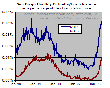
Whether one looks at Notices of Default or Notices of Trustee Sale, San Diego’s foreclosure rate is now as bad as or worse than it was during most of the 1990s housing bust:

Nonetheless, analysts are still out there asserting that defaults are low as a percentage of overall housing supply*. The problem with that statement is that while they may comprise a small fraction of the overall housing supply, they are at (or above) a level that was able to cause big problems in the 90s.
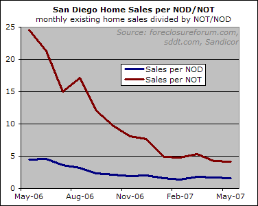
Foreclosures may be a small fraction of overall housing, but they are a much larger fraction of for sale inventory, or (more important in my mind) the number of sales.
If you believe that comparing sales volume to foreclosure activity provides a decent read on market health, then things are looking far, far worse than they did one year ago.

* – Some data detail: in the first chart, I used labor force instead of population or housing supply because the latter are not available in a monthly series, and since labor force is a decent enough approximation I just used that rather than going through the hassle of estimating monthly changes based on an annual series. The May estimate is arrived at by applying April’s year-over-year rate of change to last May’s figure. I’m not concerned about estimating labor force because NODs and NOTs are much more volatile than labor force, and therefore any monthly changes in the NODs/labor force or NOTs/labor force will be almost entirely due to changes in the NODs and NOTs.**
** – Wow, I even bored myself typing that last paragraph.

Nice, looks like almost one
Nice, looks like almost one foreclosure for every four sales.
If you look just at resale homes, those that foreclosures are competing against, it gets much worse, closer to one in three.
The bubble info blog highlighted this a little bit ago. The most interesting piece of data was a snapshot of how quickly four established fairly large agents were moving Repo homes. Their pending count was 100. Roughly about two months of pendings though. That’s a good movement, one every other business day.
It gets scary though when you look at their volume and geuss there are maybe another four or eight like them and it foreclosures are still piling up like mad.
Is it possible to get the
Is it possible to get the last chart to go back a little bit further. I always find it interesting to see in relationship to the last cycle.
I realize that the data might not exist, but it would be good to at least see if back to 2000 if possible.
On the first chart, it is interesting to see the slope of the increase relative to the last downcycle in the early 90s’ I remember living through that (in Los Angeles) right after college, so now it will be interesting to see it again, now that I’m actually aware of ‘housing’.
Nice work, Rich, by
Nice work, Rich, by normalizing the NODs/NOTs via workforce to allow solid comparisons over time.
Yep, it’s not pretty, now, and will be getting ever uglier.
Ouch, I just glanced over at
Ouch, I just glanced over at Innovest’s foreclosure forum, he’s updated his chart showing June foreclosures on track for 838 up from 614 in May.
All the rules have changed in
All the rules have changed in the last couple of months. Lending banks are now being held accountable for the trap they set, borrowing money they didn’t themselves have, while using loose and illegal practices in the process. The massive lawsuit against Wells Fargo / Wachovia, Indymac / OneWest bank, Citibank, Bank of America, JP Morgan Chase, GMAC…………..can actually, not only put a stop to your foreclosure, but also pause your house payments with no loss to you…………
https://sites.google.com/site/sueyourlendernow/