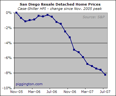
The latest Case-Shiller Home Price Index number for San Diego are out. As we know, the Case-Shiller HPI — let’s just call it the HPI for short — arrives with a considerable delay, so today’s value only represents home sales closed in July (which themselves represent deals made primarily in June). The world was a different place in June and July, lending-wise, and the HPI will continue not to reflect round 2 of the credit crunch until the September number at the earliest.
Nonetheless, just for kicks let’s have a look at what was happening with aggregate resale prices as of July:
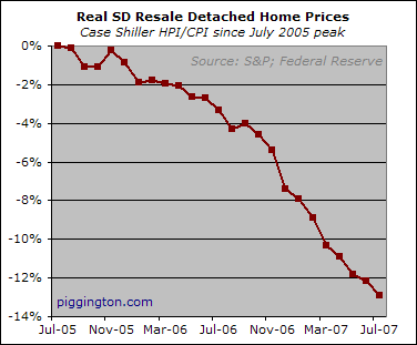
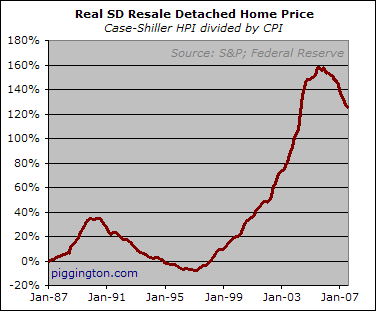
Below is that same series adjusted for inflation as measured by the CPI.
(As an aside, I have huge problems with using the CPI as a measure of "inflation," where inflation is taken to mean the aggregate decline in the purchasing power of a currency. The CPI only measures a small subset of what our currency can buy and it doesn’t even do a particularly good job of that. On the other hand, it at least measures price pressures within that basket of consumer goods, more or less, so it can be used to compare home prices with prices of those goods. As with all these statistics, it can be useful but one must keep its limitations in mind).
OK, with that out of the way, here is the "real" (or close enough to it, per the above) decline in the HPI since the series peaked in July 2005. As you’d expect the CPI-adjusted peak occurred before the nominal peak.
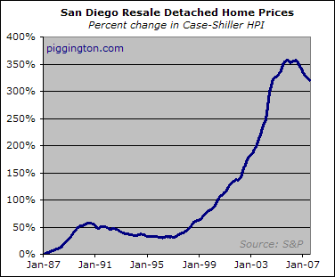
Here is a long-term charts of the San Diego HPI, going as far back as I have data for:
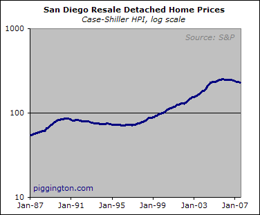
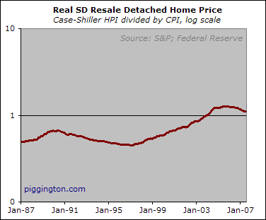
Here is that same series with a logarithmic scale on the chart. Excel’s lame-tastic handling of log charts limits the utility of this one, but here you go:
…and here is the long-term series of the HPI adjusted by CPI, featuring both linear and log scales:
I continue to believe that the HPI’s deterioration will pick up the pace starting with the September numbers, due somewhat to seasonal weakness but moreso to the effects of the second phase of the lending crunch.
Seasonal weakness is just
Seasonal weakness is just around the corner. November – January are bad months. Median price changes for those months in SD (based on 1987 to 2006 case shiller data) are +.22, -.13, +.28. Compare that to the median June to July increase which is +.76. This month it was at -.73!
Though I am one to harp about the the bust being a “long, slow, & boring”, even I think that the winter months could bring 2% a month declines when seasonal weakness and credit crunch, and ARM resets, and huge REO inventory are added together.
PS, for Rich or others…is there a primer on the site for how to turn excel charts into something that the “add image” function will upload? I’d put up a chart of the month by month median change data from the Case-Shiller dataset if someone would give me the info on how to go from excel to piggington-ready image.
Hi Brian – No such tutorial
Hi Brian – No such tutorial on the site. I do the charts in Excel, take a screen grab, and crop in Macromedia Fireworks because that’s the image tool I am used to. There is doubtless a method that doesn’t require Fireworks.
Once you get an image you can upload it via the “add image” link on the comment editing page.
BTW the Case Shiller does not measure the median price; it is an index calculated from the aggregrate movement of home prices based on those same homes’ prior sales.
Rich
Hi Rich, thanks for the note
Hi Rich, thanks for the note back.
I probably could have described my analyses more clearly. What I did was to take the case-shiller data set and calculate the monthly changes from the start of 87 to Jan 07. For each month there are thus 20 price changes, one for each year. I (rather, excel) then determined the median price change for each month. For July, the median change was +.76, May was +.90, etc. Provides a nice picture of the “typical” price change month by month and a crude benchmark for a “seasonal adjustment” to put month by month price changes into perspective.
Ahh… got it. Thanks for
Ahh… got it. Thanks for clarifying.
Rich
Uploading Charts from
Uploading Charts from Excel
Brian,
There are probably a lot of different ways to do this but the easiest way I can think of is as follows:
1. Open the MS Paint utility.
2. Draw the chart in Excel so the chart is embedded in the worksheet
3. Click on the chart so that the entire chart is selected
4. Do an Edit/Copy (Ctrl + C)
5. Paste the image into MS Paint
6. Save the image as a .jpg to keep the file size small
7. Upload the .jpg image.
Hope that helps.
Asterix
Brian,
You said, “For each
Brian,
You said, “For each month there are thus 20 price changes”.
Are you referring to twenty metropolitan areas?
There is an astonishing diversity across the metro areas, by the way. Anyone know why the Pacific Northwest is still rising?
Hi Fearful, no, the analysis
Hi Fearful, no, the analysis is different than that.
As a number of people have noted, prices are generally stronger in the spring months than in winter. Rich did a nice post where he looked at whether there were any strings of “up” months during the long 90’s downturn. Turns out there were, but these were swamped by later declines in the weak months of the year.
What my analyses do is just identify, over the last 20 years, what the typical change is in a given market (for example, san diego) for a given month.
Let’s take July as an example. This year, the change from June to July was -.73%. This is clearly bad, but the further question is, “how bad, relative to the typical July”. We can get a sense of the typical July by calculating the June to July change in price (using the case shiller monthly data for san diego) for every year from 1987. From that, you get 20 price changes (the one from July 1987, July 1988, etc.) From this string of 20 price changes, you can then take the middle (median) price change to give a sense of the typical monthly price change.
Below are the typical price increase/decrease for each month for san diego market based on the available data from Jan. 1987 to Jan. 2007. The seasonal variation is nicely evident. This is a very crude way of doing a “seasonal adjustment” when we get the new monthly case shiller data.
JANUARY: 0.28%
FEBRUARY: 0.42%
MARCH: 0.53%
APRIL: 0.93%
MAY: 0.90%
JUNE: 0.94%
JULY: 0.76%
AUGUST: 0.71%
SEPTEMBER: 0.51%
OCTOBER: 0.40%
NOVEMBER: 0.22%
DECEMBER: -0.13%
I’m sort of swamped with a project right now, but if you are handy with Excel you can download the data from the S&P website (they update it every month) and look for yourself at the month by month data for all the markets as well as the composites.
Thanks Asterix!
Thanks Asterix!
Hi Rich –
As usual, you have
Hi Rich –
As usual, you have delivered great data, presented clearly and simply. Upcoming months should prove even more interesting.
As for your concerns about normalizing Case-Shiller HPI by CPI, wouldn’t this have been more relevant when earnings tended to better track increasing living costs. This was perhaps was more true before the escalating global wage arbitrage of the past decade or so, so maybe now some suitable measure of spending power should be used for normalizing the data?
Great point SDnonSerfer —
Great point SDnonSerfer — wages would be a better deflator for reasons of both accuracy and relevance. However, I am not aware of a monthly source for local wage data. (I use nationwide cpi data but since there is probably much mor elocal variance in wages than in consumer goods, I would prefer to use wage data that is local).
If anyone knows a source of such data I’d love to hear it.
thanks,
rich