Well, hello there! Can I interest you in some housing data? Some
charts and graphs, perhaps, and possibly even a table?
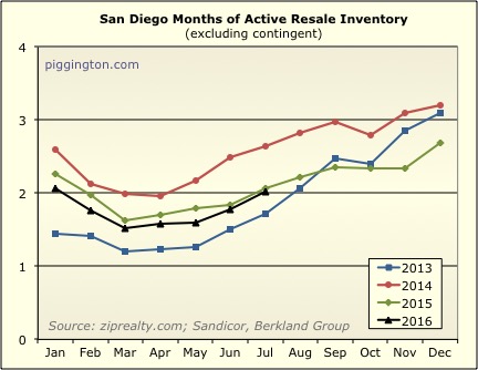
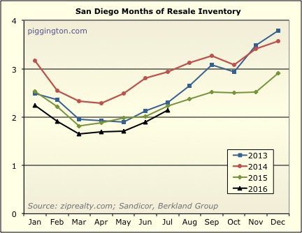
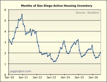
I’ll start with what I think is the key graph in this (currently
undersupplied) market: months of inventory, which combines supply
and demand into a single handy stat. We can see here that
while supply increased compared to demand, that is typical for the
season, and we remain slightly below last year’s levels.
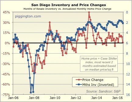
Per the following graph, that argues for more price increases to
come, unless either supply or demand changes pretty significantly.
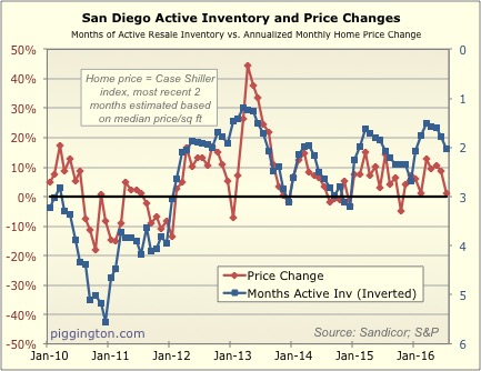
With that said, last month’s price increase was pretty modest —
more than would have been predicted by the above chart.
Here’s a table summarizing last month’s stats:
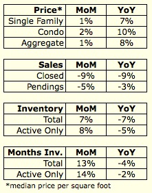
So, not a whole lot different than lately. Inventory tight,
prices creeping upward, but both those factors entering a seasonal
period of decline.
Fun note: the median condo price per square foot is within striking
distance of the peak. Single family is not too far
behind. Only 11 years later!
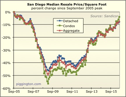
A selection of graphs for your viewing pleasure is included below.
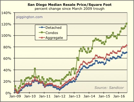
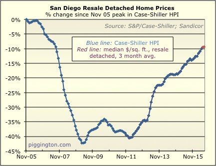
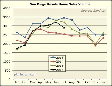
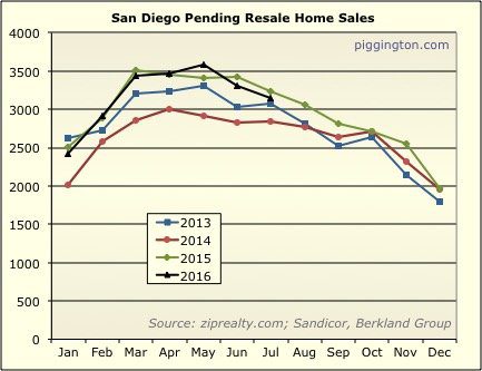

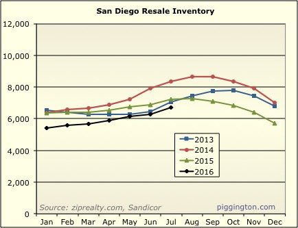
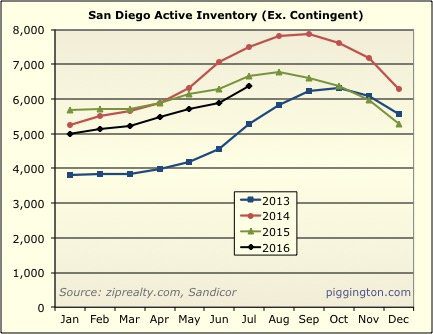
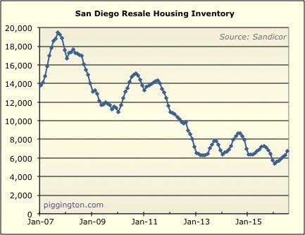
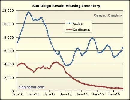
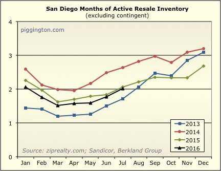
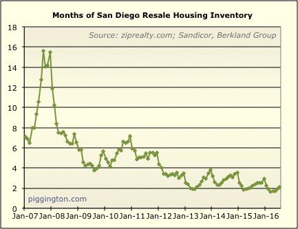
The average supply in
The average supply in December seems to be around 3 months where as the average for January is closer to 2 months for all years, does the available supply change that much in 1 month every year from December to January? Based on the first graph.
Yes — people list after the
Yes — people list after the holidays are over.
If people list after the
If people list after the holidays wouldn’t that increase the supply in January.
Sorry, I replied in a rush
Sorry, I replied in a rush and answered it very poorly. Take two!
You are looking at months of inventory, so let’s break it down into its components to get a clearer view.
Months of inventory = (# homes for sale) / (# of sales)
# homes for sale: This drops between Nov and Dec (as the holidays get going), and then drops again between Dec and Jan. I heard once that a lot of listings lapse after the first of the year; haven’t confirmed that but it would explain the abrupt drop each Jan.
# of sales: I use pending sales as that gives a slightly more timely view than closed sales. And, pending sales usually collapse in Dec. This is a holiday thing as well: if people haven’t gone into contract on a home by the time the holidays hit, they tend to stop looking, then start again in January. So pendings drop hard in Dec, then increase in Jan.
So Dec has higher supply in terms of listed homes, but lower demand as measured by pending sales — so each January, the numerator drops and denominator increases, hence the large drop in the overall months of inventory figure.
What was in January 11? Why
What was in January 11? Why the chart goes up?
Think this had some
Think this had some impact:
2010: A couple of new additions were made to the first-time homebuyer tax credit program under the Worker, Homeownership, and Business Assistance Act, which was signed at the end of 2009. Anyone who planned to buy a new principal residence, not just first-time homebuyers, could qualify for a credit up to $6,500. This credit could be applied to the 2009 or 2010 tax bill and, again, did not have to be paid back as long as the homeowner kept and lived in the home for three years. And in 2010, the income limits were raised.
Yes when some of these
Yes when some of these incentives expired in 2011 is when prices mostly hit their true bottom.
Thanks for putting together
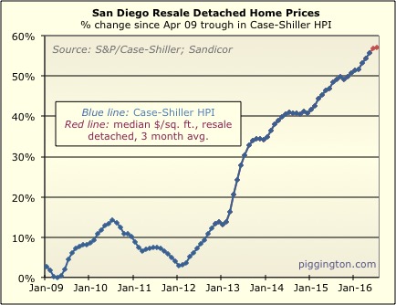
Thanks for putting together great info Rich. The “SD Resale Detached Home Prices” chart shows a pretty dramatic picture – so prices are now only 10% below the old ’05 peak. Of course today’s market conditions are very different than that crazy time. Do you have a version of this chart that shows inflation-adjusted prices? I wonder how far off we are in today’s dollars.
As a wannabe homeowner, I feel hesitant to purchase at this time given the price levels. But given the consistent perennially low inventory, soaring rents (especially compared to ’05), and fairly strong economic outlook, I feel like there is still a fair amount of room for prices to move upward – sadly for me.
A year old and needs to be
A year old and needs to be updated, but it actually hasn’t changed a lot (in terms of the ratio of prices to rents/incomes):
http://piggington.com/shambling_towards_affordability_midyear_2015