I think we can agree that the typical Econo-Almanac reader is both
unusually attractive, and a busy go-getter with places to be and
things to do. Things besides reading a real estate blog.
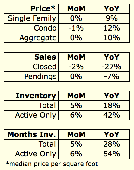
It is for you Coffee Achievers1 that I present this convenient new2
table summarizing the month’s statistics:
1 Youths, please see this important educational video.
2 It is unclear to me why I didn’t start doing this like 8 years
ago or something.
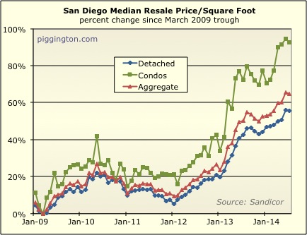
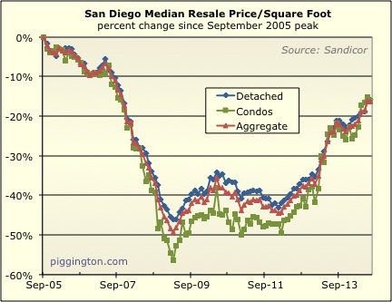
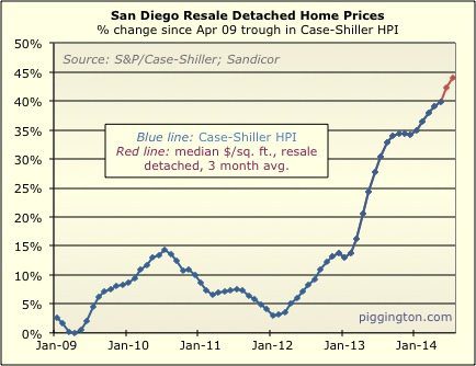
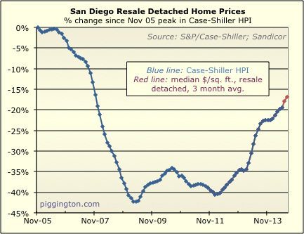
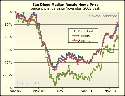
Moving on to the charts… the single family median price/sqft
backed off slightly, but this was expected after last month’s
surge. In fact, I expected it to back off a bit more than it
did. Due to the uptrend in months of inventory (discussed
below), I’ve been expecting price appreciation to slow — but even
after last month’s decline, the price/sqft is still up 3.5% from
May. As always, there can be noise and volatility in this
data, and the median price per square foot is definitely an
imperfect approximation of actual price changes (though it’s a
pretty decent one). But with that said, prices appear to have
risen a good amount over the past couple of months.
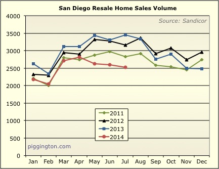
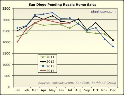
Closed sales were slightly down for the month, while pendings were
about flat:
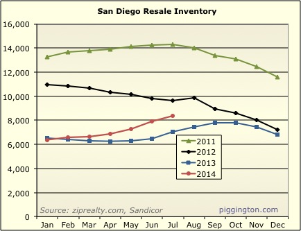
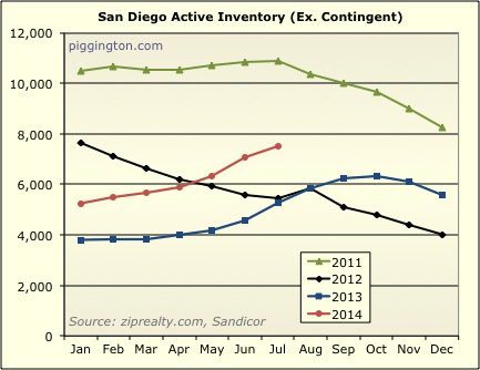
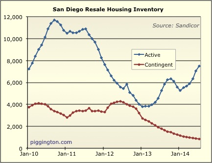
Inventory continued its pattern of recent months: total inventory
rose, but underneath the surface, active inventory was rising more
strongly as contingent inventory declined:
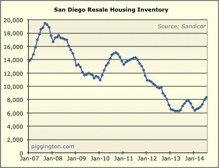
We haven’t seen this much active inventory since January 2012:
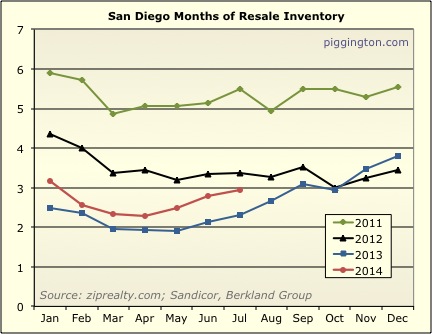
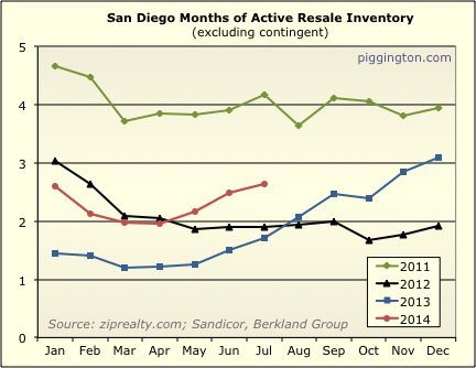
As a result, months of inventory rose, and months of active
inventory rose more than that. The latter is well above
mid-year levels of either 2012 or 2013:
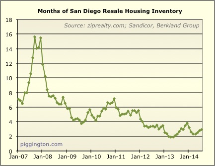
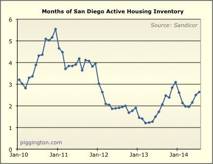
However, both measures of inventory are on the historically low side
(especially months of overall inventory):
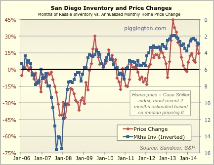
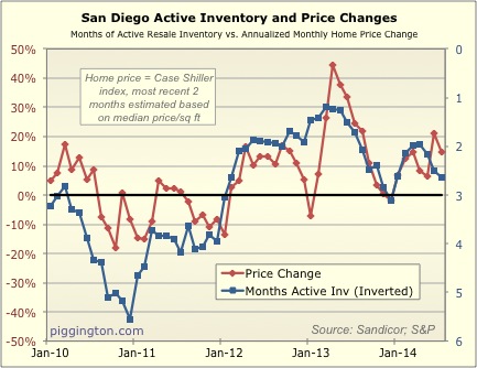
The trend of rising months of inventory — should it continue —
suggests a slowing of price appreciation in the near future.
Then again, this was already the case, and prices have been pretty
strong recently. Perhaps the decline in mortgage rates gave
prices a boost. But if that’s to be an enduring factor, then
it should bring more demand to the market at current prices and
bring down the months of inventory figure.
This is why I like this measurement; it encapsulates everything that
affects supply and demand (including price, the economy, rates,
etc.) into one figure. As the above graphs show, this figure
does have a pretty good correlation with price changes, though that
relationship is far from perfect. The situation right now can
be summed up thusly:
- The market is somewhat undersupplied compared to demand, which
implies further price increases in the immediate future. - But, supply (vs demand) has been increasing fairly rapidly,
which implies that these price increases should be modest. - And, if that trend of increasing supply continues at this
pace, prices could soon flatten or begin to decline.
We will see what future months bring…

Love your writing style,
Love your writing style, Rich. 🙂
Thank you for these graphs. Looks like we’re heading in the right direction, at least it’s getting to be slightly more normal with respect to inventory and price changes.
I predict 5 months of
I predict 5 months of inventory by years end! Then we’ll see what represents a normal price in the market. Sales seems to be leading inventory inversely. Meaning even if inventory were stagnant, if sales drops by half it doubles the months of inventory.
Here’s to 7 by next summer…
Here’s to 7 by next summer… *clink*