April saw a continuation of what we saw in March: fairly strong
demand, ridiculously constrained supply, and rising prices.
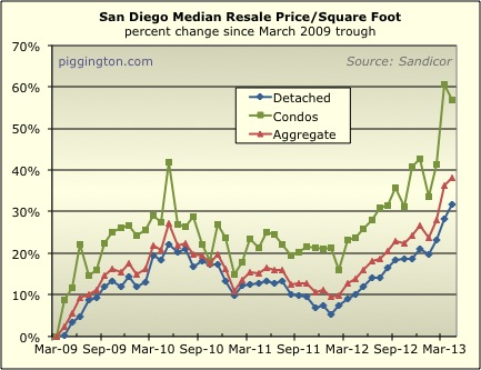
Starting with the latter, the median price per square foot for
single family homes rose 2.6% last month. That makes for a
year-over-year increase of 19.5%! The condo price/sqft was
actually down for the month, but that doesn’t mean much considering
last month’s moonshot. I tend to ignore the condo series due
to its volatility, but for what it’s worth, the median condo
price/sqft is up 26.9% since last year, and the detached/condo
aggregate figure is up 21.3%.
Now, I strongly suspect that a portion of the recent price rise
represents a shift in quality, as opposed to actual price
increases. In other words, people are buying nicer stuff than
they were — that would be the quality shift part. The
“actual” price increase part is that they are also willing to pay
more for a home of a given quality than they were before. I
don’t really have any idea what the mix is, but I suspect that
quality shift plays a role because:
- That would just be a really dramatic change in actual prices
- My old pal the excellent blogger and realtor Jim Klinge
reports an increasein higher-end sales
(beyond what could be accounted for
just by price changes, it seems)
We will only know the real situation with the release of the
Case-Shiller index, which largely addresses the quality issue by
measuring each home’s price against the prior sale of the same
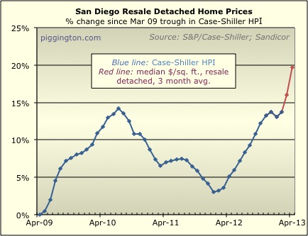
home. In the meantime, here is my “estimate” of the
forthcoming CS numbers, calculated very simply by taking a 3-month
average of the detached home price/sqft. (CS uses 3 months of
data, and only looks at detached homes). This technique has
actually worked quite well up until now, but for reasons noted
above, I suspect this estimate is overstating the price increase
over the last couple months.
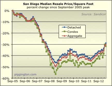
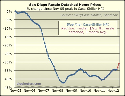
Here are the same two graphs as above, starting from the housing
bubble peak:
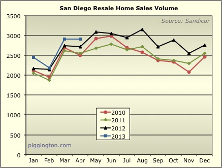
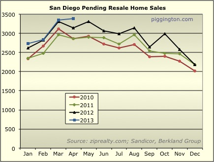
Moving on to supply and demand, sales were pretty solid — the best
April in many years, but not by a dramatic degree:
As has been the case for a while, the real “drama” has been in the
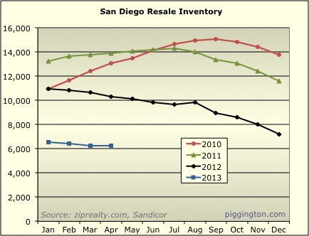
lack of inventory. Inventory was pretty flat for the month,
but sits at what is a very low level comparative to previous years:
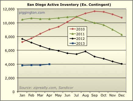
If we take out the contingent inventory (mostly short sales with
offers waiting for bank approval), inventory did nudge up a tiny
bit, but is still exceedingly low:
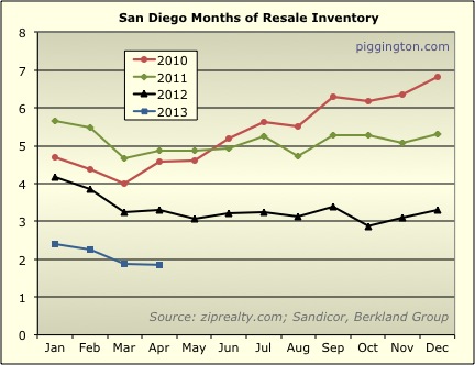
Months of inventory declined slightly to hit a new post-bubble low:
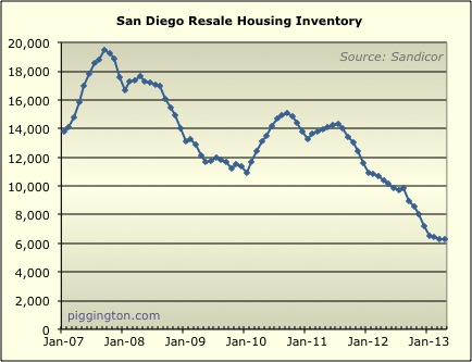
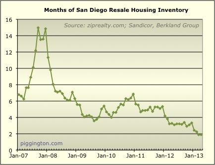
This longer-term graph of months of inventory (unfortunately this is
as far back as the data I have goes) shows just how extreme the
decline has been:
As I’ve often discussed, months of inventory is highly correlated
with short-term price movements. Over the course of data I
have, 6 months of inventory has tended to mark the line between
upward and downward pressure on prices. This can be seen in
the chart below, which marks the 6-month level with a thick black
line (the months of inventory figure is inverted in order to make
the correlation more clear). Also clear from the chart is the
strong relationship between prices and months of supply in
general. The recent price increase was well predicted by the
relentless decline in months of inventory:
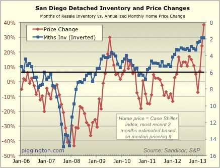
(BTW, I’ve noted this before, but I want to mention again that the
idea for this graph came from the extremely informative Calculated
Risk blog).
As compared to the historically neutral level of 6 months of
inventory, we currently stand at just 1.9 months. If the above
relationship remains intact, that is obviously an auspicious sign
for home prices in the near term (and a depressing one for potential
buyers).
As for the long term, that will be dictated by things like the
economy, rates, and of course valuations. On that last point,
I intend to finally update my valuation ratio graphs soon (I
really mean it this time). Stay tuned.

I strongly disagree about the
I strongly disagree about the CS overstating the price increase.
Perhaps I have misunderstood your assertions but it appears that you think that the detached “quality increase” closings skew the ppsf north because people are buying nicer stuff.
Historically and broadly, these short term gain trends are far more pronounced in the cheaper and attached set.
Recently and locally, this trend is even more pronounced in high-density areas. Thats not a huge surprise because people like to buy condos and small houses in cities. They don’t like having a 1200sf house in Murrieta (though that would be popular in Hillcrest). The peak to trough for metro sd (old neighborhoods minus downtown) was like 50% (of peak price). The trough to peak will probably be more like 70% (of original peak). Its absolutely nuts. The mean rate of change in lower-end stuff is increasing like the CO2 count (also a liberal conspiracy).
That volatility is consistent with the last 10 years as an observable macro trend in these sub-markets.
Short version:
The very best investment for your dollar was buying as many 1-bedroom North Park condos as you could afford in 2008. And selling it. Right now. Before the government starts backing away from the GSE’s again.
My 2 bits…
2008? “Very best” would have
2008? “Very best” would have been buying as many shares of F at $0.99 as you could 🙂
Unlike North Park condos, it has increased 14x or so in value since ’08.
urbanrealtor wrote:I strongly
[quote=urbanrealtor]I strongly disagree about the CS overstating the price increase.
Perhaps I have misunderstood your assertions but it appears that you think that the detached “quality increase” closings skew the ppsf north because people are buying nicer stuff.
Historically and broadly, these short term gain trends are far more pronounced in the cheaper and attached set.
[/quote]
I don’t think the fact that the price moves are stronger in the cheaper stuff is incompatible with the idea that people are buying nicer stuff across all sectors. Those two things could be happening at the same time.
But, it’s just a guess in any case… it could certainly turn out that the price/sqft numbers are fully reflecting real price changes after all (ie that there is no quality shift).
Looking at a bigger picture
Looking at a bigger picture here (includes pre-bubble era, whole country), it seems like we are basically back to the normal pre-bubble levels. San Diego market seems to more or less follow all trends:
Did people forgot what “the normal” used to be?