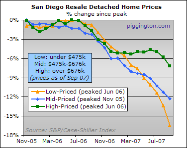
The high-priced tier dropped in September, as expected, but the low tier was positively abused:

For those curious about month-to-month drops, they are:
- -1.5% for the high tier
- -1.2% for the middle tier
- -3.6% for the low tier
Recall from the prior article that the September HPI figures include sales from July and August as well as September. Considering the 3-month smoothing, drops like these (especially the low-tier drop) are pretty substantial.
From their respective peaks, the drops are:
- -7.2% for the high tier
- -12.3% for the middle tier
- -16.4% for the low tier
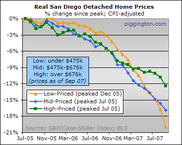
Here are the same indexes adjusted for inflation as measured by the CPI:

The CPI-adjusted losses from their peaks (which are earlier, of course, than the nominal peaks) are:
- -12.4% for the high tier
- -16.9% for the middle tier
- -19.9% for the low tier
Because the September data includes 3 months’ worth of sales, only the very early effects of the credit crunch (round two) are represented. For that reason, I continue to maintain that the green line is going to do some catching up with its little friends in the months ahead.

This seems to defy the
This seems to defy the notion that all prices drops are of an equal dollar amount despite the value tier… at least so far.
Given average prices in SD (more mid tier, right?) is it reasonable to expect that mid tier to get hit harder as the correction persists? Or at even match in terms of %?
Quite to the contrary this
Quite to the contrary this shows that price drops are of relatively equal dollar amount drops.
The low tier is the leading
The low tier is the leading indicator; the other tiers entered into the decline later and are lagging. I’m anticipating they will catch up and eventually surpass the low tier in terms of percentages lost.
This is what happened during the last bust – I call it price compression. Excluding the (true) luxury homes, the difference between the bottom end and the top end compressed. At that point if someone was willing to pay a little more on their purchase price they were rewarded with a much nicer home. The difference between a $300k home and a $350k home was substantial.
The luxo homes lost significant value but they didn’t compress much beyond the median percentages. It was the move-up market that really got nailed because that’s where the worst excesses were. Of course, that was last time, when the ratio of luxury homes was much smaller. This time we built a ton of luxury homes with no obvious buyers, many of which are still in various stages of development. I have a feeling the $1,500,000+ market is really going to show us something this time.
Price compression makes a certain amount of sense, too, if you think about it. How many average quality $900k tract homes did this region ever really need? Based on wages I’d say the answer to that is — none.
sdr- I stand corrected.
sdr- I stand corrected. We’ll see what the next few months bring. So does that mean generally homes increased by roughly the same $ amount? Or is it time senstive like Bugs said?
Isn’t San Diego almost entirely in the upper 2 tiers, maybe even mostly the top tier anyway?
So does that mean generally
So does that mean generally homes increased by roughly the same $ amount? Or is it time senstive like Bugs said?
Isn’t San Diego almost entirely in the upper 2 tiers, maybe even mostly the top tier anyway?
The thirds are, by definition, for San Diego.
Specific areas may be predominantly in one third or another.
S&P / C-S reached the conclusion that it is broadly true that the bottom third increases more, in percentage terms, than the top third.
Regarding the dollar increases, I suppose it all depends on how you define “roughly the same”.
I completely agree with
I completely agree with Bugs. The low end is leading the charge. Only time will tell if we’ll have price compression this time like last time. All the logic in my head say it will, but no one really knows until it’s all said and done. We’ve been saying that the low end of the market is leading the charge for awhile now, so nothing is really surprising here.
The low tier looks like
The low tier looks like jumping off a cliff, the mid tier looks like going down a water slide, and the high tier almost looks like walking down stairs (anything else would be uncouth). The down trend June to Sept in the high tier is worth noting (credit crunch), I wonder if we will see that flatten out this Spring again. Remember that at the end of 06 into the beginning of 07 the NAR did a pretty good job of painting a picture that all is safe. Now we have to deal with this pesky thing called REALITY.
I wonder if we will see
I wonder if we will see that flatten out this Spring again.
I would fully expect to see a decline into December or January and a flattening or maybe even a rally in Spring ’08…
followed by another round of bottom-calling.
Would we see the tier 3
Would we see the tier 3 homes that are in the million +/- will eventually fall especially in Fallbrook area. Fallbrook have a lot of homes for sales in and around 1 mil but kept the prices solid. When will these homes owner realize that it is time to drop the price in order to sell.
Any suggestion!
I recently read a book “Boom
I recently read a book “Boom and Bust” by an author that wrote another book about 20 years ago which predicted 1992 recession. In his new book, he is predicting that we will have another recession in 2010. What’s his reason? He explained about the average 18-year cycle that exists in the last 300 years of historical data, and the cause of the cycle mostly relates to land speculation activities from money greed, this would never change even in today’s hi-tech world. I agree with his argument in the book, in another word, people should be careful in buying houses nowdays, unless you can absolutely afford it, it would like digging a hole for yourself and stay there for another 10 years or more if you need to stretch out to do that. I believe there are people staying in the same place for more than 10 years, it might not be such an issue to those people, but are you able and willing to do that to be one of them?
Crossing tier
Crossing tier boundaries.
I’m curious how these charts handle a home that crosses a tier boundary. For example a home that sells for $500k at one point would place it in the middle tier ($475-$676). But if the home later sells for $450k, is that home still counted as a home in the middle tier that has lost 10%, or is it now counted in the lower tier (under $475)? Something tells me that how this is handled might affect the resulting graph. Probably not by much though, so it’s really just my curiosity.
The financial component of
The financial component of price is being erased now: because it is the lower tier that enjoyed the greatest increase in availability of financing, it is suffering the most.