I have been following your posts for a few years and also the Eric and Deva Edelman San Diego Real Estate youtube channel that goes through MLS data weekly: https://youtu.be/xppiUaVzN2k?si=0gHak2LQ-i3PkfkE . Their active inventory numbers show a ~25% increase over the last few months and relatively stagnant sales, so I’ve been surprised to your charts showing a very mild increase in active inventory and decrease in months of inventory . Is it just a difference in data sources?
It looks like the main thing is their data is more recent; they have data through 4/15, and I always just do a mid-month snapshot so they are a full month more current than the March data above. You can see on the inventory graph that it always jumps a lot in April, so they’ve captured that and I haven’t (yet).
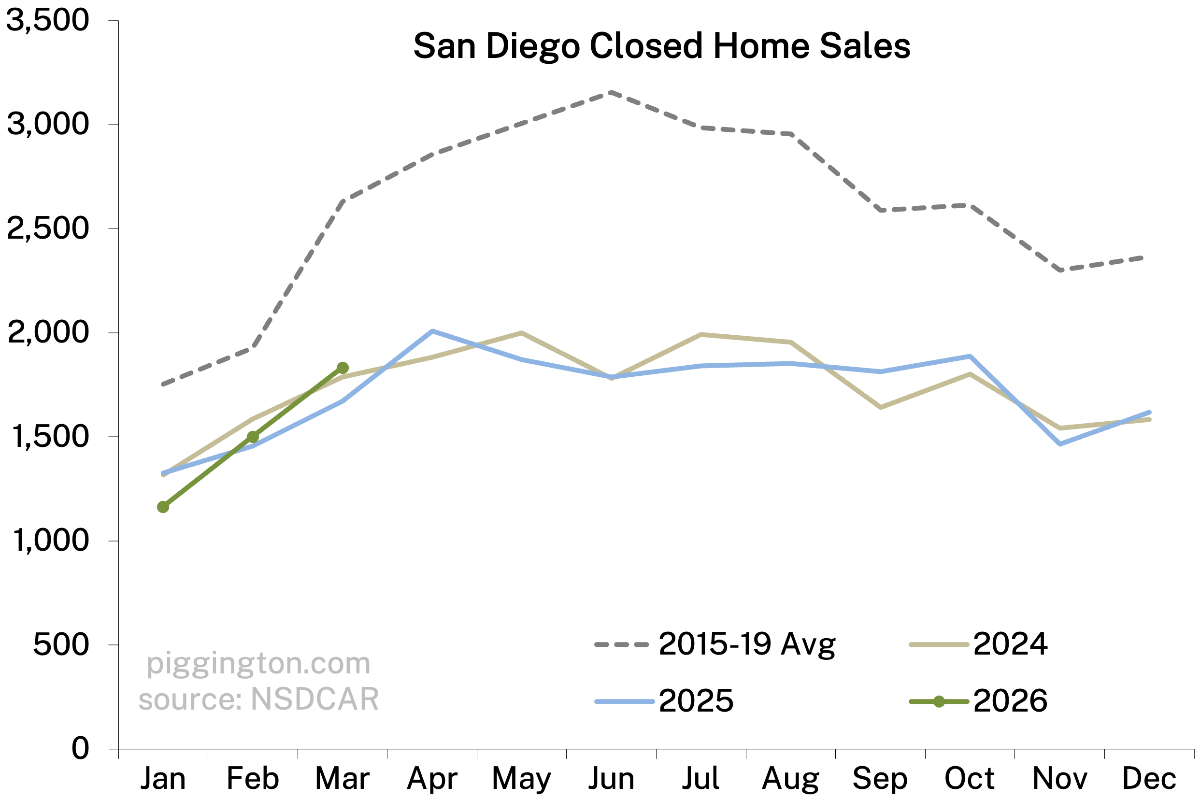
If I exclude April, their active inventory chart for Jan – March goes from 4300 to 5100 (18% increase) in that period compared to your charts showing ~3700-> 4000 (8% increase). Looks like proportionally the same closed sale changes even if the absolute numbers are wildly different
Looking at that video the asterisk says data includes townhomes and condos…
PBDude
5 months ago
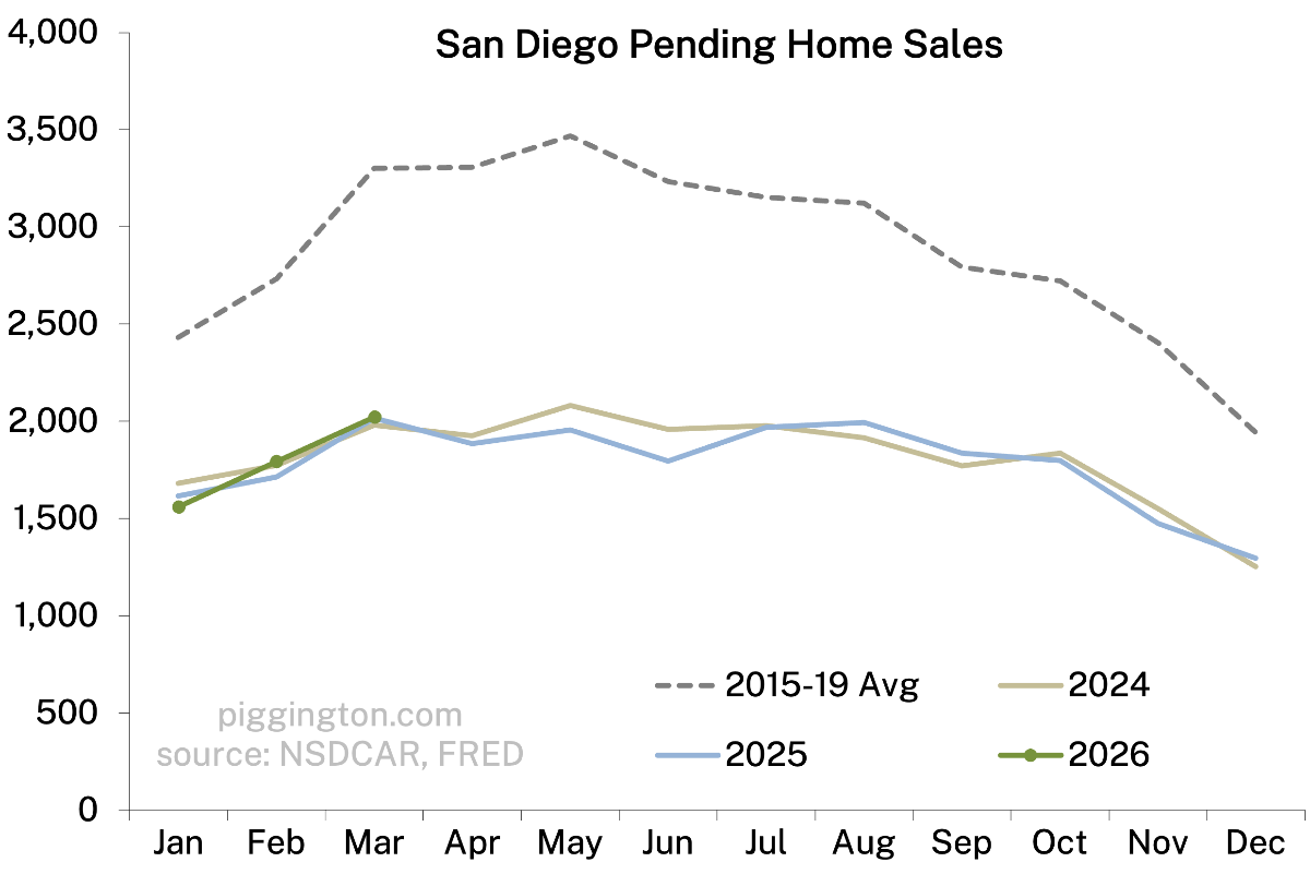
Feels like the county-level charts are running out of signal right now because everyone is staring at the same aggregate data. The more interesting question is probably what happens when you break it down by ZIP and by property type. My guess is the real signal right now is less in headline price and more in local inventories, pendings, relistings, DOM, and price cuts.


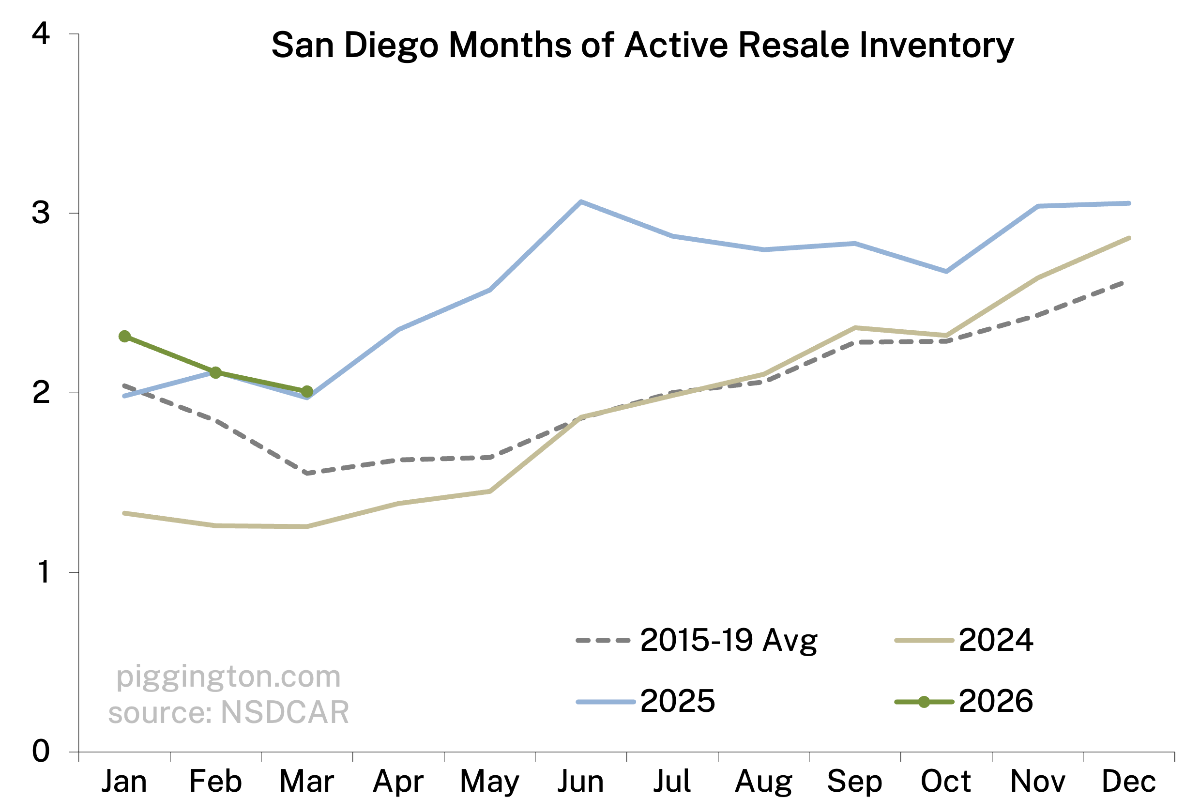





I have been following your posts for a few years and also the Eric and Deva Edelman San Diego Real Estate youtube channel that goes through MLS data weekly: https://youtu.be/xppiUaVzN2k?si=0gHak2LQ-i3PkfkE . Their active inventory numbers show a ~25% increase over the last few months and relatively stagnant sales, so I’ve been surprised to your charts showing a very mild increase in active inventory and decrease in months of inventory . Is it just a difference in data sources?
It looks like the main thing is their data is more recent; they have data through 4/15, and I always just do a mid-month snapshot so they are a full month more current than the March data above. You can see on the inventory graph that it always jumps a lot in April, so they’ve captured that and I haven’t (yet).
If I exclude April, their active inventory chart for Jan – March goes from 4300 to 5100 (18% increase) in that period compared to your charts showing ~3700-> 4000 (8% increase). Looks like proportionally the same closed sale changes even if the absolute numbers are wildly different
Yeah they must be pulling from a wider geographic range I guess…
Looking at that video the asterisk says data includes townhomes and condos…
Feels like the county-level charts are running out of signal right now because everyone is staring at the same aggregate data. The more interesting question is probably what happens when you break it down by ZIP and by property type. My guess is the real signal right now is less in headline price and more in local inventories, pendings, relistings, DOM, and price cuts.