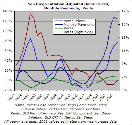
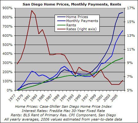
OK, here is the whole series: home prices, monthly payments, rents, and rates, for as far back as the complete set of data goes.
The first chart displays the percent change in inflation-adjusted San Diego prices, payments, and rents since 1977. The second chart displays the same information in nominal terms. Mortgage rates are indicated on the right axis in both charts.
At this point I am clinging to a shred of hope at least a few minutes will elapse before someone asks for a followup chart.
I kid, I kid. OK, onto the good stuff:


As I’ve discussed before, I tend to de-emphasize monthly payments as a good measure of home valuation or, more to the point, as a predictor of whether current prices can hold up. Without rehashing the whole topic, suffice it to say that the following two scenarios have very different implications, valuation-wise:
- Lifetime high monthly payments concurrent with lifetime high mortgage rates (as happened in the early 80s)
- Near-lifetime high monthly payments concurrent with near-lifetime low mortgage rates (as is happening right now)
Nonetheless, even using real monthly payments as a proxy for valuation, home prices have clearly overshot their fundamentals. Consider the various changes since the housing market bottomed in 1997:
|
Change since 1997
|
|
| Real Rents |
20%
|
| Real Home Prices |
138%
|
| Real Monthly Payments |
112%
|
As one commenter correctly pointed out, some of that home price rise can be attributed to "catch-up" after homes became undervalued in the mid-90s. However, look at what’s happened since rates bottomed out in 2003 — a year in which homes were already quite richly valued:
|
Change since 2003
|
|
| Real Rents |
1%
|
| Real Home Prices |
32%
|
| Real Monthly Payments |
41%
|
That, my friends, is pure speculative mania.

Hey Rich, could you…
Just
Hey Rich, could you…
Just kidding. This is great and methinks I better hold off on buying just a wee bit longer.
I also agree that the real key is what has happened since 2003. At that point a reasonable correction seemed possible. That no longer seems to be the case.
Thank you, Rich. I really
Thank you, Rich. I really appreciate you taking the time to do that. It looks like my guesses weren’t that far off.
Your point regarding comparisons between historical periods of low and high rates is very relevant. Actually, I would prefer to say periods of low and high inflation instead (inflation and long-term rates move in tandem, anyways). High inflation (1970s) meant fast-decreasing real house payments, so it made sense to stretch one’s budget for the first couple of years. Low inflation (present times) means that those large payments won’t erode as fast.
One could, of course, dare to ask for a variation of the first chart, using real mortgage rates in the calculation (Freddie rate minus inflation). Since I don’t dare make another request, I’m hoping someone else will 🙂
Very Nice. Completely agree
Very Nice. Completely agree about the low rates versus high rates (versus home price) business.
And, yesss, real mortgage rates WOULD be interesting!
So, based on what happened
So, based on what happened in the last crash, where rates dropped from 10% to 7% or 30% drop, price dropped about 30%. From the crash before that, where rates dropped from 17% to 10% or 41% drop, price dropped about 25%. Rates would have to drop 30-40%, which would bring it down to 3.5-4%, to have similar declined of 30-40% inflation adjusted. If rates stay the same, logically, it would drop more. If rates rises, then logically, it would drop even more than that. How much more is anyone’s guess. But in the last 2 crashes, rates dropped between 30-40% to keep the inflation adjusted price to fall much more than 30-40%.
Here’s the Mortgage Rates,
Here's the Mortgage Rates, paid points, inflation and 'real' (rate-inflation) (Anybody care to calculate actual APRs from the points and rate?)
[img_assist|nid=2168|title=Real Mortgage|desc=|link=node|align=left|width=466|height=319]
I had to shrink the above
I had to shrink the above image to keep the rest of the post readable. This is supposed to automatically happen but I guess it doesn’t work on .bmp files so I converted it to a gif.
To see the original size click the image then choose “original.”
Very nice work, Rich (and
Very nice work, Rich (and nice follow-up, nsr).
Amazing, how monthly payments roughly followed the tractectory, up and down, of interest rates, until ’00, when payments headed north big time.
It’s going to be ugly when interest rates revert (i.e., move up) to historical norms.
Look at this charmer found
Look at this charmer found on Craigslist…
It’s AMAZING what people think they can get away with…my God the greed.
Craigslist Listing
Montrose is a pretty upscale
Montrose is a pretty upscale community near Glendale CA, and I’d be willing to bet that is typical in the area, though I agree it is ridiculous.
I live near there and we are starting to see more for rent signs, reduced prices, and homes coming off the market slowly, but there still are some sales.
Based on what I’ve heard people say on this site, (and not the daily load that comes from Housing/Realty/Mortgage companies) I think this next summer and/or the following will be a sobering knock upside the head of those who have paraded their wealth in equity over the last few years, and don’t think their house can do anything but appreciate. Particularly when they have to sell the brand new B-mer to make that rising payment.
I live in Glendale…few
I live in Glendale…few miles from Montrose. I used to want to live there but now I hate the place. It’s filled with old, crusty stuck up people who think their fecal matter doesn’t stink.
What’s more, alot of Montrose RE is in pretty dilapitated condition…old 30’s, 40’s 50’s buildings that have not been touched inside or out.
I’ve not seen anything as expensive as this. It’s ludicrous. The poster was emailed by me and I stated the price was ludicrous….she basically stated that I should go an live in Compton and that apparently I can’t appreciate the “finer” things in life. LOL.
People are just aholes these days.
Montrose is a pretty upscale
Montrose is a pretty upscale community near Glendale CA, and I’d be willing to bet that is typical in the area, though I agree it is ridiculous.
I live near there and we are starting to see more for rent signs, reduced prices, and homes coming off the market slowly, but there still are some sales.
Based on what I’ve heard people say on this site, (and not the daily load that comes from Housing/Realty/Mortgage companies) I think this next summer and/or the following will be a sobering knock upside the head of those who have paraded their wealth in equity over the last few years, and don’t think their house can do anything but appreciate. Particularly when they have to sell the brand new B-mer to make that rising payment.
Hey Rich great info. and
Hey Rich great info. and charts. Have you every seen a comparison done with how multi-family unit values fluctuate in past boom and bust RE cycles? Basically trying to figure out if it is a bad time to invest in a multi-family apartment building with the obvious downturn in the SFR. Thanks for any and all comments.