The housing market was pretty firm again in February. The
median price per square foot nudged upward for the month:
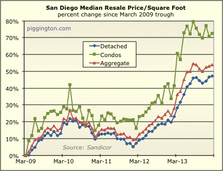
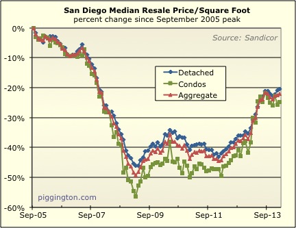
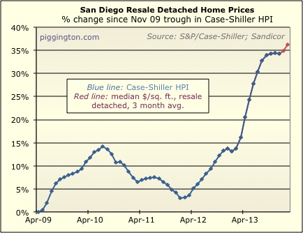
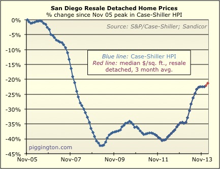
And the Case-Shiller “proxy” (3 month average of single family
median price/square foot) rose after several flat months:
Closing took a typical seasonal drop…
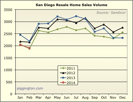
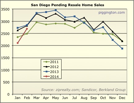
…but pendings rose very strongly for the month (which portends
higher closings in the next month or two):
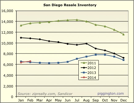
Inventory rose a bit but was still in line with this month last
year:
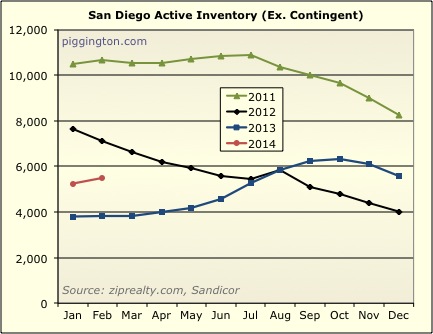
However, active (excluding contingent) inventory is actually a lot
higher than last year (more on this divergence below):
Overall inventory remains quite low:
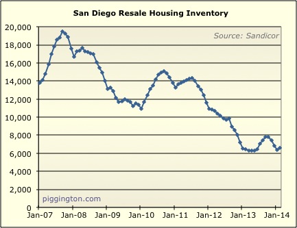
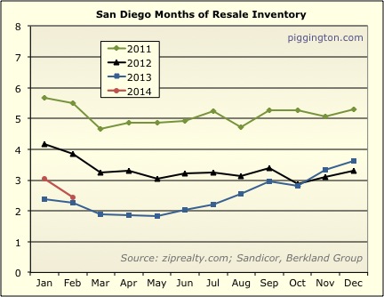
The spike in pendings brought down months of inventory nearly to
last year’s level:
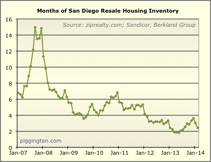
And the directional reversal of months of inventory has corresponded
to a renewed increase in prices:
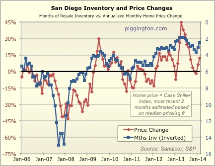
The above graph uses total inventory, simply because my data on
active-only inventory doesn’t go back as far (and total inventory
seems to have worked well enough in any case). However,
because active and contingent have diverged recently (active is up
47% year over year, while contingent is down 59%!), I thought I’d
make a version with only active inventory:
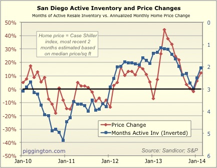
Note that the scaling is different on the two graphs… as I
originally did with the older graph, I’ve set the scaling at what
appears to be a decent fit based on eyeballing it. Anyway, we
can see that months of active inventory is not as low (high on the
inverted blue line) as it was at this time last year, but it’s still
pretty low in the scheme of things. It will be interesting to
see where this number goes from here, but for the time being, both
the months-of-inventory figures appear supportive for prices
immediately ahead.
