The Case-Shiller home price index is not as timely as the monthly median
price data, but has a couple advantages over the latter.
First, because the CS index is calculated by comparing repeat sales
of the same homes, it gives a more accurate read on actual home
price changes (more than you ever wanted to know on this topic can
be found here).
Second, the Case-Shiller data additionally breaks down price changes
for low-, mid-, and high-priced homes, which allows us to observe
what prices are doing in each of those segments of the housing
market.
So, we know that 2013’s price surge was most beneficial to
lower-priced homes, which were up 22 percent for the year.
Mid-priced homes were up 19 percent and the most expensive tier was
up “only” 16 percent. The overall index was up 18 percent for the
year. (Note: the price tiers are calculated simply by separating the
home sales into thirds: the high-priced tier is comprised of the
most expensive one-third of homes sold during the measurement
period, and so on.)
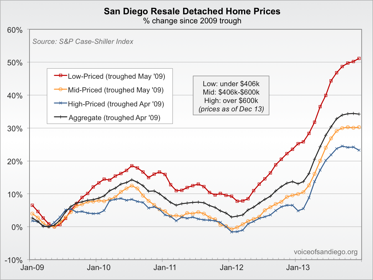
This is the same pattern we’ve seen since the 2009 home price
trough: from their respective lows through the end of 2013, the
cheapest one-third of homes were up 51 percent, versus 30 percent
for the middle tier, 23 percent for the expensive one, and 34
percent for the overall index. (Some historical context for those
changes is found below). Most of that price increase — and in the
case of the middle and high tiers, all of it — has taken place
since 2012.
This graph of the different tiers since the 2009 price low shows
that the relative strength of the cheaper homes continued right
through to the end of the year:


Well it is San Diego after
Well it is San Diego after all. Most of the cities in the 20 city composite declined in price in both November and December of last year. I believe the same was true for the 25th percentile in Los Angeles. The frothier cities are probably surviving off the sheer momentum of ballooning prices in 2013.
I really like the graphs at
I really like the graphs at voice of san diego. They seem to show that we are bubblicious right now. Seems like the higher price homes take the hit first and the lower price ones recover first, overall though the higher price homes seem to retain value.