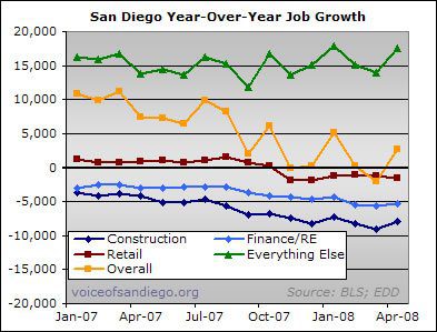
Assuming the EDD didn’t go too nuts with the birth-death model last month, San Diego’s non-housing economy was strong enough to resist the pull of the housing boom beneficiary sectors.

There’s a more detailed discussion of the above graph over at voiceofsandiego.org. Below are a couple of pigg-only bonus graphs.
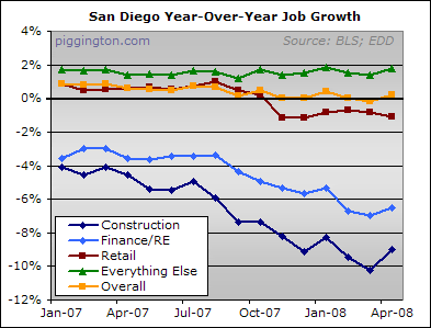
I am indebted to forum user perkowski for suggesting the new approach to graphing job numbers. Instead of graphing the change from a fixed point (e.g. last April), he proposed that I show each month’s year-over-year change in order to see the long-term trend but not suffer any seasonal distortions. I agree that this is a much better way to do it and it shows some pretty clear trends: the housing sectors and the overall local economy are trending down, but the non-housing portion of the economy has been quite steady.
The above graph displays the number of jobs gained or lost; the below shows the same sectors but in terms of percent change:

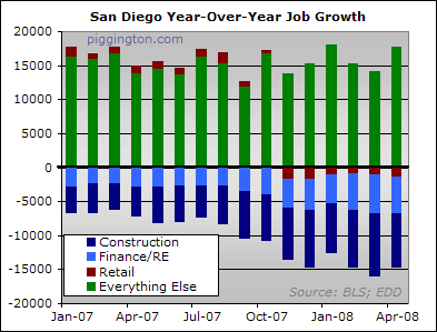
And this next graph shows the housing boom sectors (dark blue, light blue, red) vs. the non-housing boom sectors (all lumped together in green) in their ongoing tug-of-war:

The non-housing economy won the last round, at least according to these preliminary estimates. Even so, a .2 percent employment growth rate is not exactly impressive. It will take a lot more than that to lend much support to the faltering yet still-overvalued housing market.

I can’t speak to the San
I can’t speak to the San Diego employment figures, but at the national level the BLS reported 20,000 jobs lost in April. The birth/death model CONTRIBUTED 267,000 jobs in April, helping us net down to “just” 20,000 jobs lost. Among the many statistical gymnastics performed, the birth/death model reported that 40,000 construction jobs were created by new construction firms in April. Read that again and try to keep a straight face. The “real” number of jobs lost at the national level in April was probably in the neighborhood of 250,000+ because the birth/death model numbers should probably be flat to negative at this point.
And the energy component of the CPI was negative for April. Read that again. Oil prices? Up. Gas prices? Up. Natural gas prices? Up. So how in the HELL do they come up with a price decline in energy for April? I guess solar and wind energy costs stayed the same. Maybe they’ve got a higher weighting in that component of the CPI now.
I swear I think the government is just making these numbers up at this point they’re so divorced from reality. It would be laughable if it weren’t so important.
I swear I think the
I swear I think the government is just making these numbers up at this point they’re so divorced from reality. It would be laughable if it weren’t so important.
Maybe its in Euros, not dollars. Fuel prices have been fairly constant when calculated in Euros.
http://www.x-rates.com/d/USD/EUR/graph120.html
or maybe Chinese Yuan..
http://www.x-rates.com/d/USD/CNY/graph120.html
Man.. I feel my wallet getting lighter already, and I have not even pulled it out!
http://www.x-rates.com/d/USD/ISK/graph120.html
Oh man!!
Dave,
FYI: the energy CPI
Dave,
FYI: the energy CPI component is seasonally adjusted, because gasoline prices have a very strong seasonal component. Same as home sales, by the way.
You’re right about the BLS birth-death model, but, in all fairness, their numbers get revised several times, and they probably get them right in the end (long after the fact, as in years). The problem with all these real time statistics is that they’re notoriously prone to revisions. This is no conspiracy, it’s a simple fact. For example, GDP numbers are released at the end of a quarter, then they get heavily revised for a couple of quarters afterwards, then they get smaller revisions for another couple of years, and there are sometimes revisions even 10 years later. I’m not kidding.
It’s pretty amazing that
It’s pretty amazing that every single time we change the models the unemployment rate and inflation rate goes down.
Had some liberal econ prof state basically below, never believe damn liberals. But in this case it is fact. Whenever numbers appear anti-populist, we get to change the game and nobody will believe those stupid libs! HA.
From the Big Picture:
“Lastly, as to the conspiracy theories, I have my own take on it: The government doesn’t respect you enough to lie. They actually put out all of the official statistics reach month for anyone with the time and interest to plow through them. All of these data runs, adjustments, changes to CPI, historical data — its all online, waiting for you to review it, and be mollified or outraged.
Most people don’t bother . . .”
Here’s example of inflation stats
http://www.signonsandiego.com/news/business/20080417-9999-1n17inflate.html
Here’s non-seasonally adjusted data
http://bigpicture.typepad.com/comments/2008/05/nonseasonally-a.html#comments
For those who hate MSM, I
For those who hate MSM, I will post from our greatest economist, Larry Kudlow commenting on Barry Ritholtz, author of the excellent Big Picture blog.
May 15, 2008
“Incidentally, this morning’s drop in industrial production supports his recession case (even while many other indicators run counter to it). But one thing is certain: Barry’s warnings about rising headline inflation have proven most prescient. In fact, a populist election revolt against high food and gasoline prices is occurring right now.”
Even Larry recognizes that all these stats cant cover up for $3.80 gas prices and 4.50 diesel prices. ($4.8 diesel in CA)
Semi: Filling up their 18-wheel, 80,000-pound leviathans can cost more than $1,300 these days.
LostCat
Does anyone know
LostCat
Does anyone know what percent of the USA’s economy comes from each sector group?