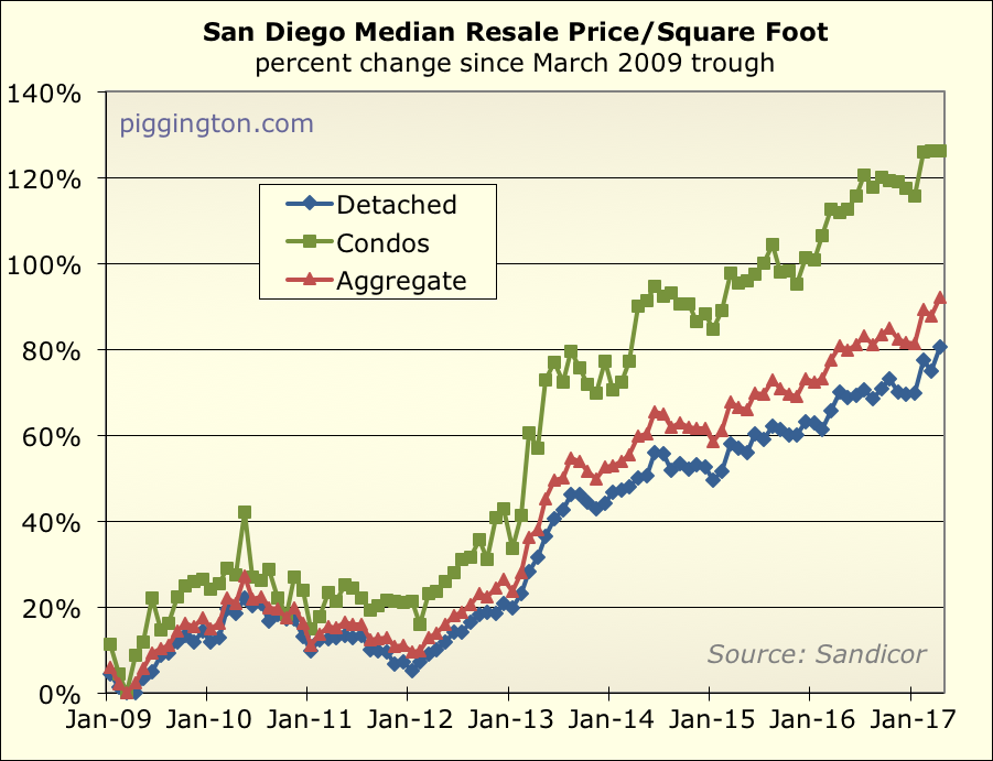
After a pullback in March, prices surged again last month. The
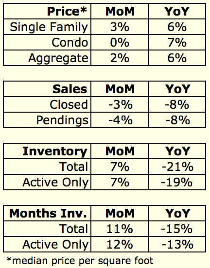
price per square foot for single family homes increased by 3.2% in
April, bringing the year-to-date increase in that metric to 6.5%.
Here’s how those prices look on a chart (note: I mostly ignore condos
as they are much more volatile):
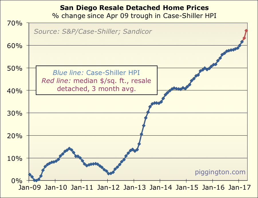
The next chart uses the 3-month average of the single family ppsf, to
approximate where the Case-Shiller index will go:
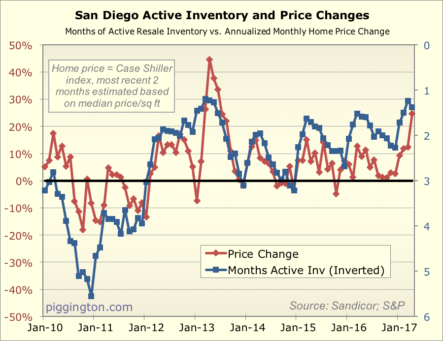
We are finally seeing price changes catch up to what the
months-of-inventory level has been suggesting:
Here’s a summary chart for the month:
Now, let’s look a bit more closely at supply and demand. As requested I
added 2013 back into the year-by-year charts, because that’s the recent
year that mostly resembles this one in terms of inventory scarcity.
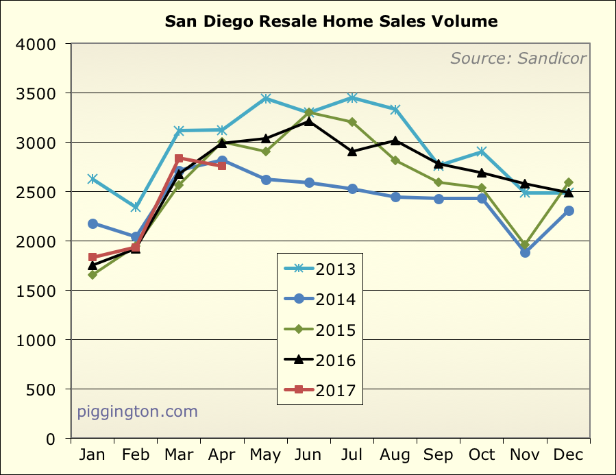
First, sales. Closed sales actually dropped from March, to a level
below both last year and 2013:
Pending sales also dropped, and are now noticably lower than this month
last year. However, they are right on top of the April 2013 pendings:
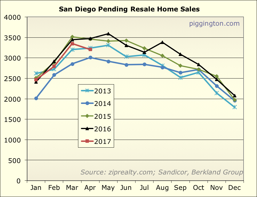
All in all, sales pulled back (presumably as a result of scarce
inventory and/or rising prices), but are still at a pretty healthy pace.
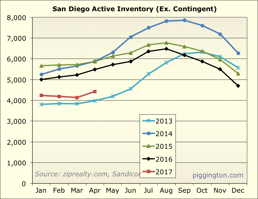
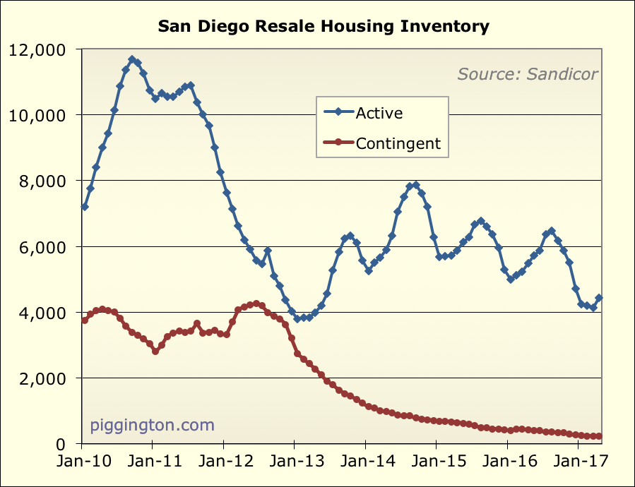
Active inventory actually improved a bit from last month, but it is
still well below 2016 levels. It’s not quite at 2013-level
scarcity but it’s close.
Combining supply and demand into months of inventory (simply, the
amount of inventory last month divided by the number of pending sales
during the month), we see that we did indeed hit those rock-bottom 2013
levels in March… but then we pulled up a bit thanks to both
increasing inventory and a small decline in pendings.
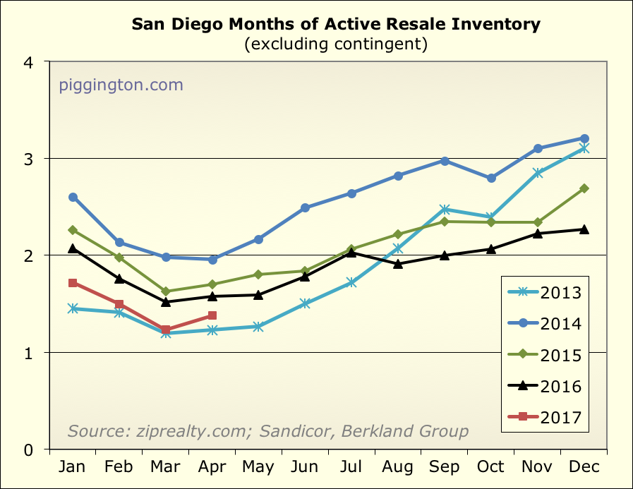
This is still very low, though… lower than any time in recent history
except for those few months in early 2013:
So, the undersupply abated a bit last month, but it’s still very much
at levels that should pressure prices upward in the months immediately
ahead. This is best seen in the graph shown above (and repeated here)
of price changes vs. months of inventory:

Starting midway through 2013, a lot of new supply started to hit the
market — inventory increased by 50% in under 5 months. That eventually
took the pressure off of pricing (which until then had been severe,
with prices rising almost 20% by fall). So, I am watching to see if a
similar pattern plays out this time. Even if it does, though, inventory
is low enough that we should expect the price uptrend to continue for
the next couple months (and beyond, if the inventory situation does not
change).

Thanks Rich. I really
Thanks Rich. I really appreciate you including the 2013 graphs as well!
Really nice data, looks like
Really nice data, looks like a sellers market now, but if higher prices draw out more sellers and inventory improves things could slow down in fall.
Is the ppsf YoY chart at 6%
Is the ppsf YoY chart at 6% right or a typo? Because that seems low if YTD is 6.5%.
gzz wrote:Is the ppsf YoY
[quote=gzz]Is the ppsf YoY chart at 6% right or a typo? Because that seems low if YTD is 6.5%.[/quote]
Tis not a typo… single family ppsf went nowhere, point to point, from Apr-Dec 2016. (In fact it dropped a tiny bit). But there’s a good amount of noise month to month. So even though there was a minor upward trend (visible in the graph with the 3 month smoothing), the single months of Apr and Dec were about the same.
Great charts! Our hood (San
Great charts! Our hood (San Elijo Hills, south 92078) has had very little inventory with homes coming to market going quickly at asking price, for the most part. A number of listings have hit in the last 30-days. We’re watching closely, that’s for sure. How long can this last!?!