It was a month of yet more gains for home prices, per the median
price per square foot, with condos going particularly nuts.
That latter bit is not very analytically important, as the condo
price/sqft can be very volatile. But it does make for an
exciting looking chart:
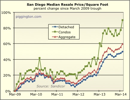
The more staid (and much better indicator of actual price trends)
detached home price per square foot also increased, rising by 1.4%
for the month and 14.0% from the same month last year. (The
condo pr/sqft was up 7.2% for the month and 21.1% for the year…
good times!)
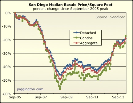
Here’s a look starting from the bubble peak:
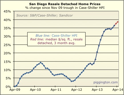
My Case-Shiller proxy/guesstimate thing (3 month average of median
detached home pr/sqft) continued the very smooth ascent that began
in January:
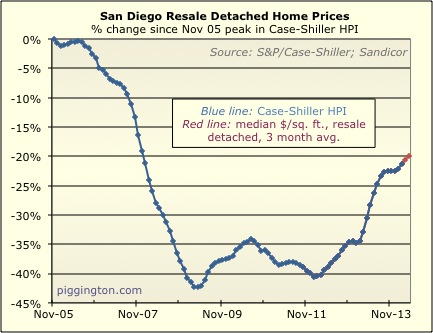
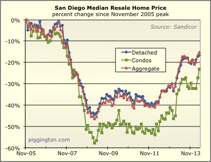
Here is the unadjusted median price, from the peak:
Now let’s look at supply and demand. Closed sales were decent
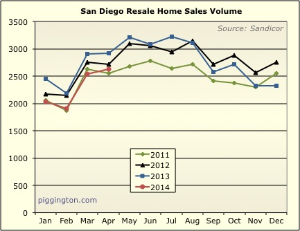
but not great, between 2011 and 2012 levels. Closed sales were
9.7% below last year’s (frenzy-esque) levels.
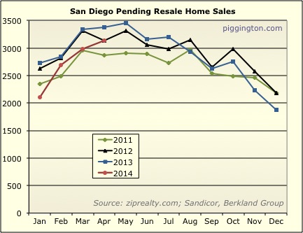
Pending sales looked a little peppier, right at 2012 levels.
They were 7.2% down from last year.
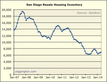
Inventory continues to creep up at a snail’s pace…
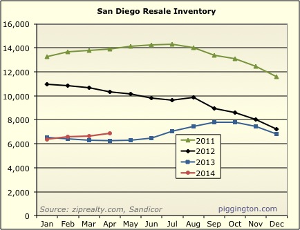
…but remains at very low levels. Inventory was up 9.6% year
over year.
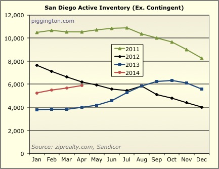
Active (excluding contingent) inventory is rising faster, however,
up a huge 48% year over year!
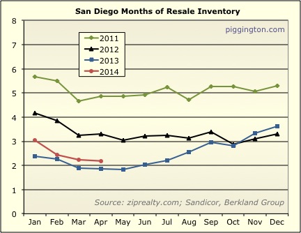
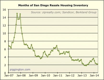
Months of inventory isn’t as crazy as last year, and in fact is up
18% from last year — but that is from an extremely low level and,
thus, remains quite low historically:
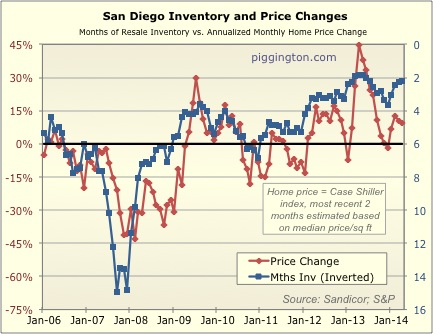
Here’s ye olde chart of months of inventory vs. price changes, which
implies continued upward pressure on home prices:
And here’s a version of the same thing but using only months of
active inventory (which is up 59% from last year’s abyssal
levels). This also implies upward pressure on home prices, but
to a gentler degree than the above.
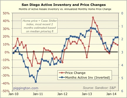
In either case, the market still looks pretty undersupplied, and
unless that changes, it seems likely that prices will continue to
creep up as they have been.
