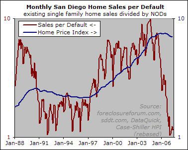
OK, by popular demand (well, by the demand of two people, anyway, but sdduuuuude gets special priveleges because he’s the one who suggested the site’s slogan) here is the prior chart with a logarithmic scale.

Note, first, that Excel’s log scale is lame, and only denotes factors of 10 on the chart. So I rebased the HPI to fall between 1 and 10, so that it would at least kind of fit with the price per sales number.
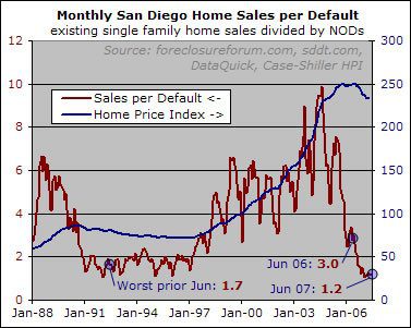
I don’t find this version terribly enlightening. The point of the prior chart (which I also include below so people don’t have to flip back and forth) is that over the time period in question, prices have fallen pretty much any time the sales-per-NOD was below 2, whereas prices have risen pretty much every time the sales-per-NOD was above 2. This suggests to me that prices come under pressure once there is a certain saturation of must-sell supply in relation to the amount of demand. Since we are well past that saturation point, this model predicts further price declines.

In the log chart, shorter term price movements do appear to coincide somewhat with changes in the sales-per-NOD numbers. However, I suspect that this is a correlation caused by the fact that both prices and volume (which would affect the numerator of the sales-per-default series) tend to be weak in the fall and winter.
While we do get a better picture of the relative movements at low values, it’s not clear to me that this conveys any useful information, except to portray just how ugly the current numbers are (which I tried to do via the labels in the original chart). I could be missing something, though. Do the folks who suggested use of the log scale see anything of interest?

The utility of the log graph
The utility of the log graph will become more apparent if the value drops below 1 – i.e when the data spans more than 1 order of magnitude. This graph is just on the verge of needing a log graph.
So, no I don’t see anything yet, but if it really goes to hell, then it’ll be useful. i.e if sales stay flat and NODs double, you will really see it on the log graph but it will barely register on the original one.
Never hurts to be prepared.
Thanks.
This is very interesting.
This is very interesting. Is data available that would enable creation of similar graphs only for houses in a given value? The big question for those of us who have seen and digested the relevant data and are currently waiting on the sidelines is: just how will the bubble burst pan out in different segments of the market?
Of course, creation of a NOD/sales or NOD/inventory graphs for a given segment would require some kind of control for price appreciation over time, but I imagine that this would be solvable.
Is it possible, to start, to get at the volume of NODs by original purchase price or “assessed value” or Volume of Defaults by foreclosure price?
Probably a better, simpler way, but I hope someone can see what I’m driving at..
Woodbury
From the looks of it sales
From the looks of it sales per NOD is not a predictive indicator but rather simply correlated with price changes. That is a little surprising but there is so much noise in the sales per NOD it is hard to tell.
Is there any way to get historical inventory figures? I speculate that inventory is the most correlated to price changes, and NOD’s is the most correlated to the future supply.
Fascinating data in any event.
Is the blue line adjusted
Is the blue line adjusted for inflation? If not, I’d be interested to see how that would change the shape of the 1990s curve.
Rich, if you enable the
Rich, if you enable the minor grid lines on using chart options , then then the log scale becomes better. You can see 2 times 3 times, etc easily.