Apologies for the delay in updating the data… let’s dive right in!
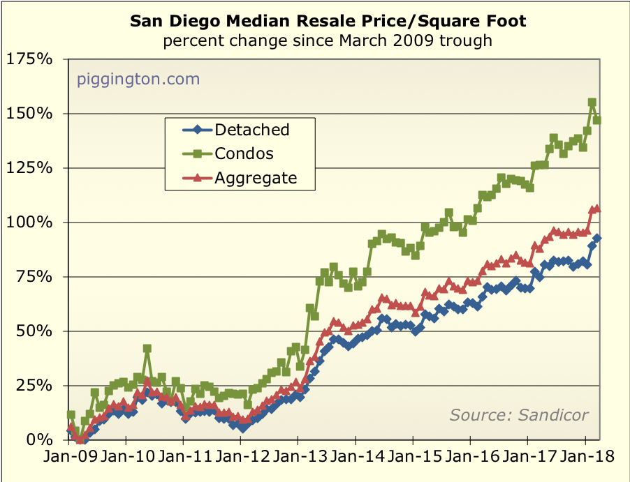
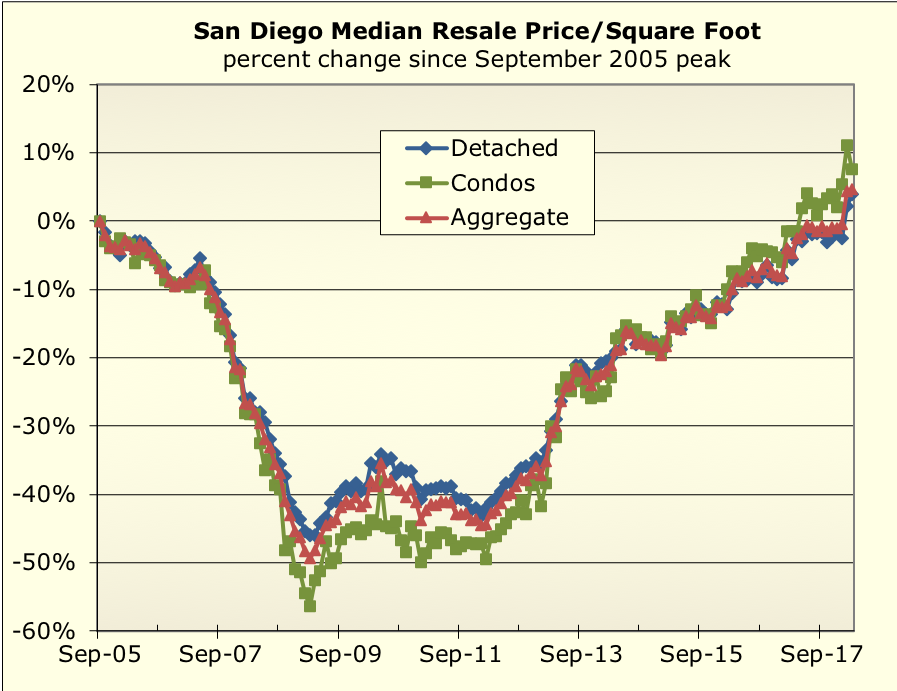
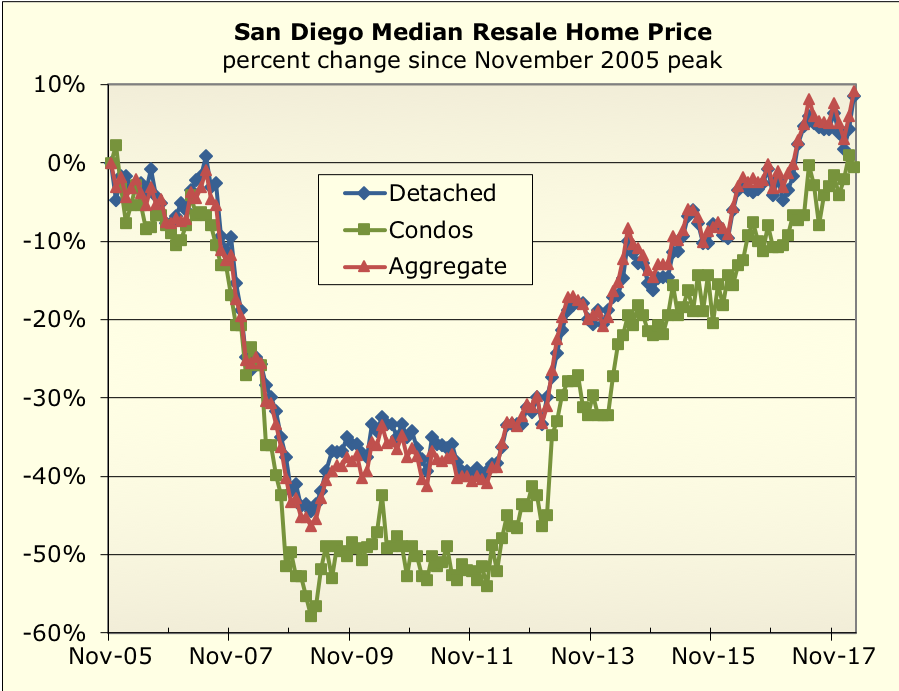
Home prices have been very strong so far this year, with the median
price per square foot showing a big jump in February. Bear in mind that
this is a noisy figure, but the fact that the single family median held
firm in March strengthens the case that the price increase is “for
real”:
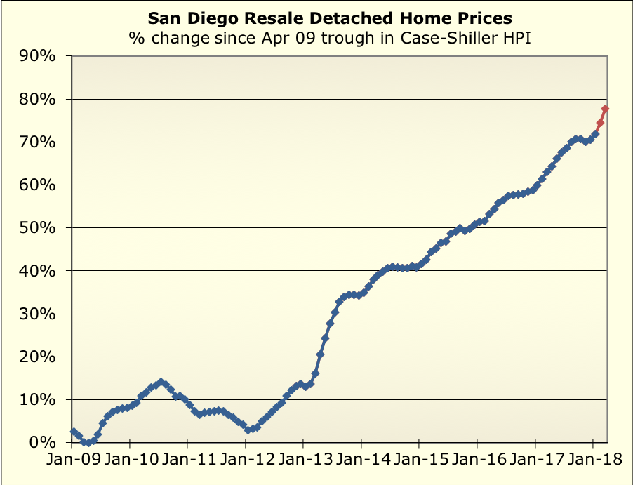
We’ll know for sure when the Case-Shiller index is released. In the
meantime, my proxy which uses the single-family median pr/sqft for the
most recent 2 months is looking… robust:
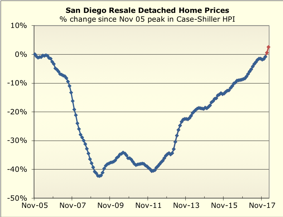
Speaking of C-S, here’s a thing… last month’s figure was just shy of equalling the (nominal)
bubble peak. I imagine the peak will be surpassed at the next release.
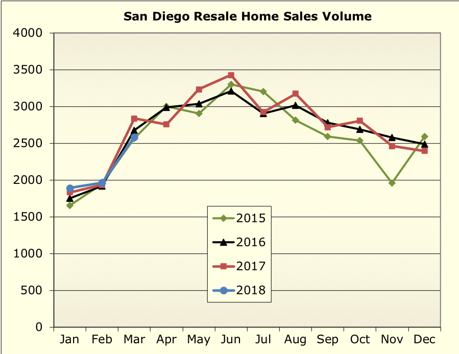
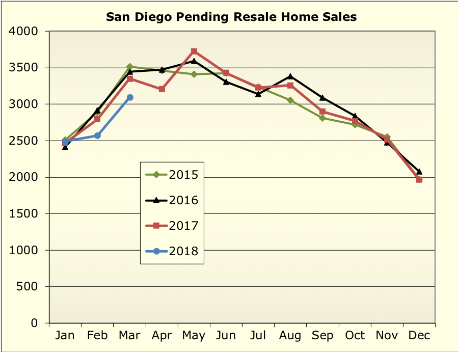
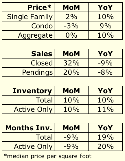
Closed sales were typical but pendings have been slightly weak:
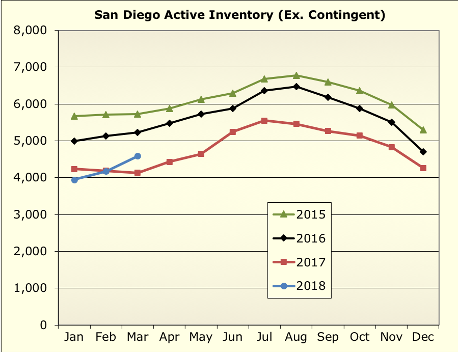
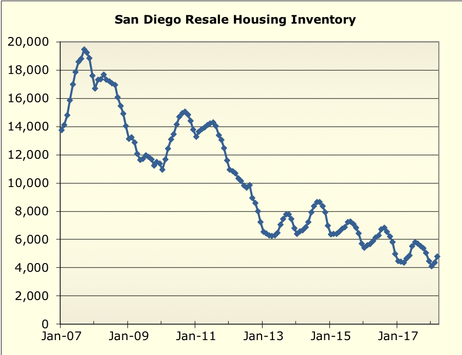
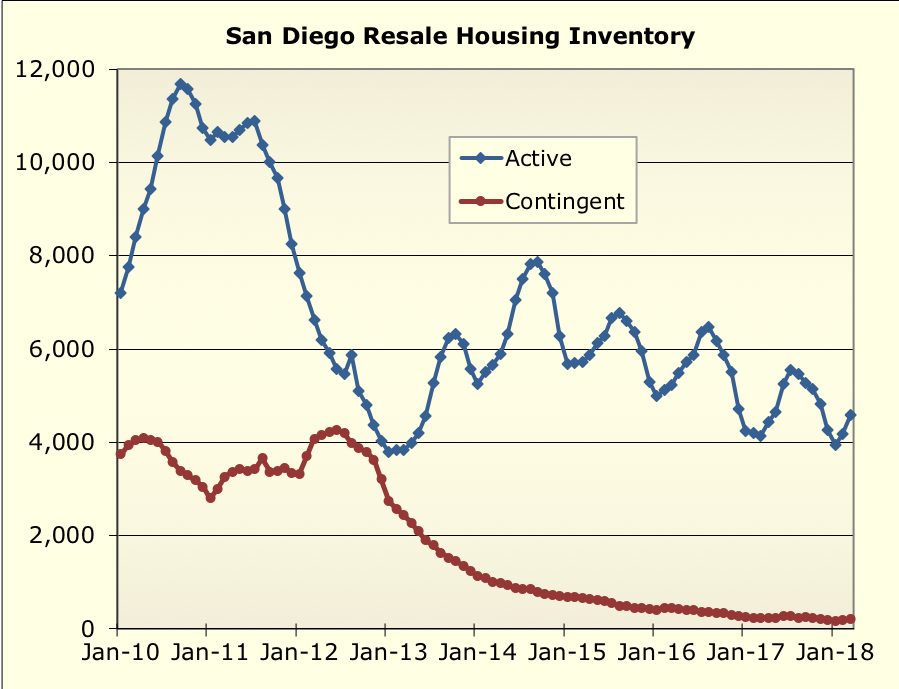
And active inventory is higher than last year:
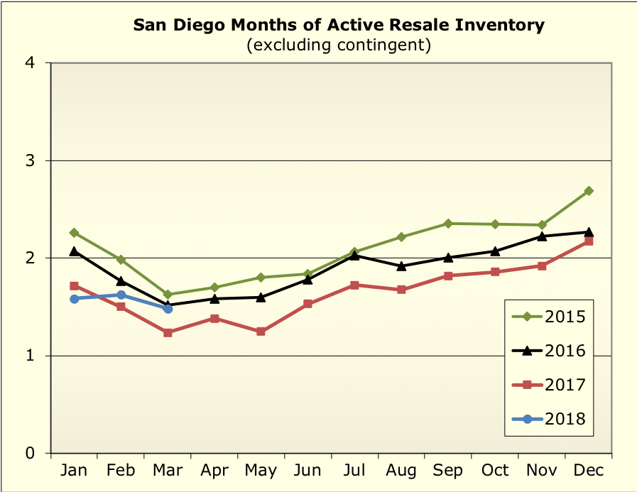
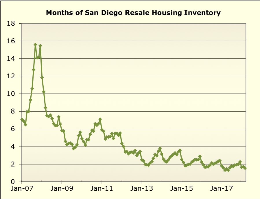
So months of inventory are higher than last year at this time, but
right in line with the prior couple years:
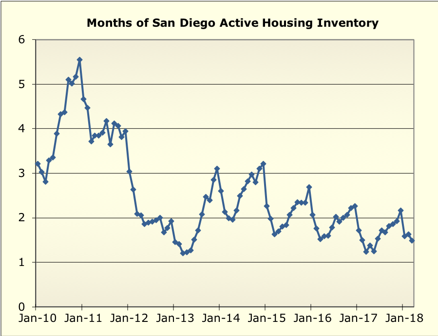
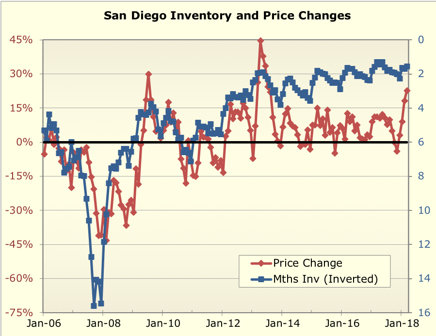
…and quite low in the grand scheme of things:
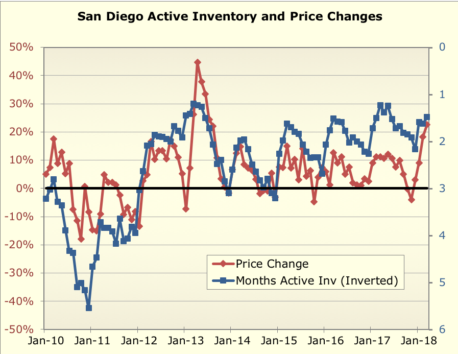
Here’s months of inventory overlaid with price changes… this shows
both how scarce invetory is (the blue inventory line is inverted), and
the fact that price changes track inventory reasonably well. The price
surge in these past few months simply reflects the ongoing scarcity of
supply vs. demand, if you believe this relationship still holds sway.
One thing worth watching will be interest rates. Between January and
March, mortgage rates rose quite rapidly, from about 4% to 4.5%.
The March price stats above are from homes that probably went into
contract a couple months ago at this point. It will be interesting to
see how that impacts things… perhaps it’s responsible for the slight
weakness in pending sales.
But it seems like it would take a pretty big change in supply, demand,
or both to cause the trend to change.
Some more graphs below.

Is So. CA going to have
Is So. CA going to have permanent low inventory?
I am afraid the answer is YES. We will have segment of society who are going to be renters for their whole life. Very sad.
Nothing is permanent — all
Nothing is permanent — all it takes is a bit of instability to get people to start yelling to sell. Few more Fed hikes and the 30-yr rate will be over 5%. Stock markets aren’t doing well either.
This being said, there will always be people who won’t buy even then — no savings = no ability to buy.
Rich,
Are the prices adjusted
Rich,
Are the prices adjusted for inflation? If so, it would seem that we are at/near the bubble peak? If they are not adjusted for inflation, would they look substantially different if they were adjusted for inflation? I would think the inflation since ~2005 is not that great. I’m wondering why you’re not suggesting that we are in a bubble at this point. Perhaps the inflation adjusted graphs would look much different than I think.
Thanks,
Dave
> Are the prices adjusted for
> Are the prices adjusted for inflation?
No
> If they are not adjusted for inflation, would they look substantially different if they were adjusted for inflation?
Yes
> I would think the inflation since ~2005 is not that great. I’m wondering why you’re not suggesting that we are in a bubble at this point. Perhaps the inflation adjusted graphs would look much different than I think.
The more salient things are wage growth and rent growth, which have both been substantial. (Inflation has been substantial too… it’s been 13 yrs! 🙂
They are all good questions — you are getting to the real important stuff — but not covered in the quickie monthly updates. But, everything you are getting at is discussed here: https://piggington.com/valuation_update_bonus_graphs
This is a year old at this point, but there hasn’t been a substantial change since then in valuations, so the overall conclusions still apply. (And yes, I badly need to update that… )
rich
Thanks Rich. I went and read
Thanks Rich. I went and read your reference article and eagerly look forward to the revision. And your point is well taken about cumulative inflation. This site suggests it’s been about 25%:
http://www.in2013dollars.com/2005-dollars-in-2017?amount=100
I must admit, I was thinking of 2005 as “just yesterday”!
Per FRED, it looks like CPI
Per FRED, it looks like CPI is up 30.3% since the beginning of 2005:
https://fred.stlouisfed.org/series/CPIAUCSL#0
(And that will be up a wee bit more tomorrow when another CPI release comes out).
Rich, my favorite ratio
Rich, my favorite ratio compares rents to 30-year mortgage rate times price. I read somewhere ten-year treasury rates are the best proxy for 30-year mortgage rates if that data is more available. No need to adjust for inflation on that one.
One segment of the market,
One segment of the market, the 700-1mil primarily, got a bit of interest rate relief with the pretty big increase in San Diego extended conforming loan limit.
Personally if I were in the market in that range and not extremely short of cash, I would get exactly the conforming loan limit and down payment the rest. #JustSayNoJumbo
In the three zipcodes I own
In the three zipcodes I own in/follow, prices have just taken another leg up in the past month,
750K is becoming a much more common price point.
Before I read all the
Before I read all the comments, i was about to put in a post saying “when are you going to update the rents vs. home prices info ?”
So, yeah. I’d like to see that, too.