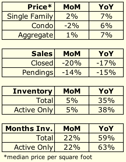
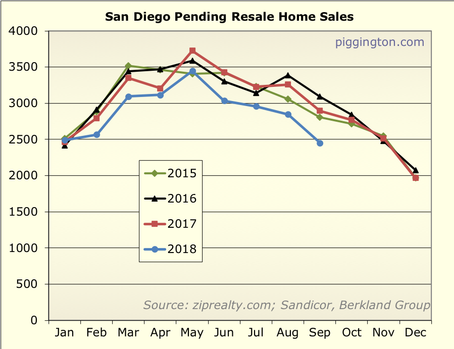
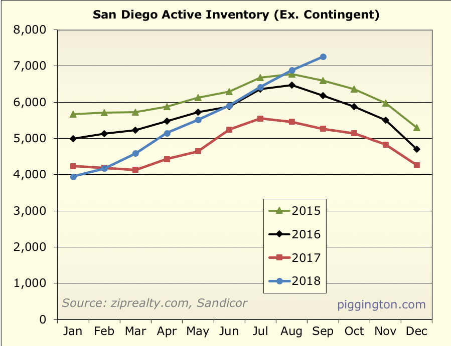
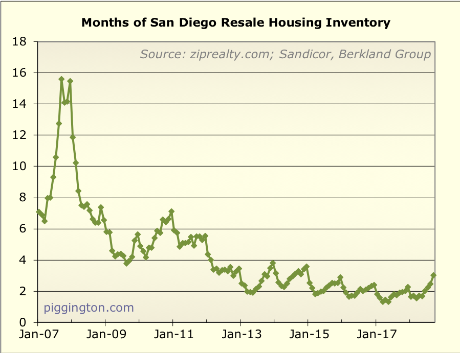
The burgeoning slowdown I described in last
month’s post seems to have arrived… witness, months of
inventory:
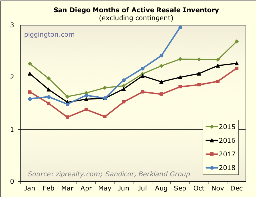
That is quite a leap, putting months of inventory 63% above last
September’s level.
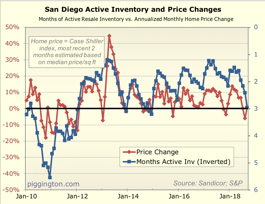
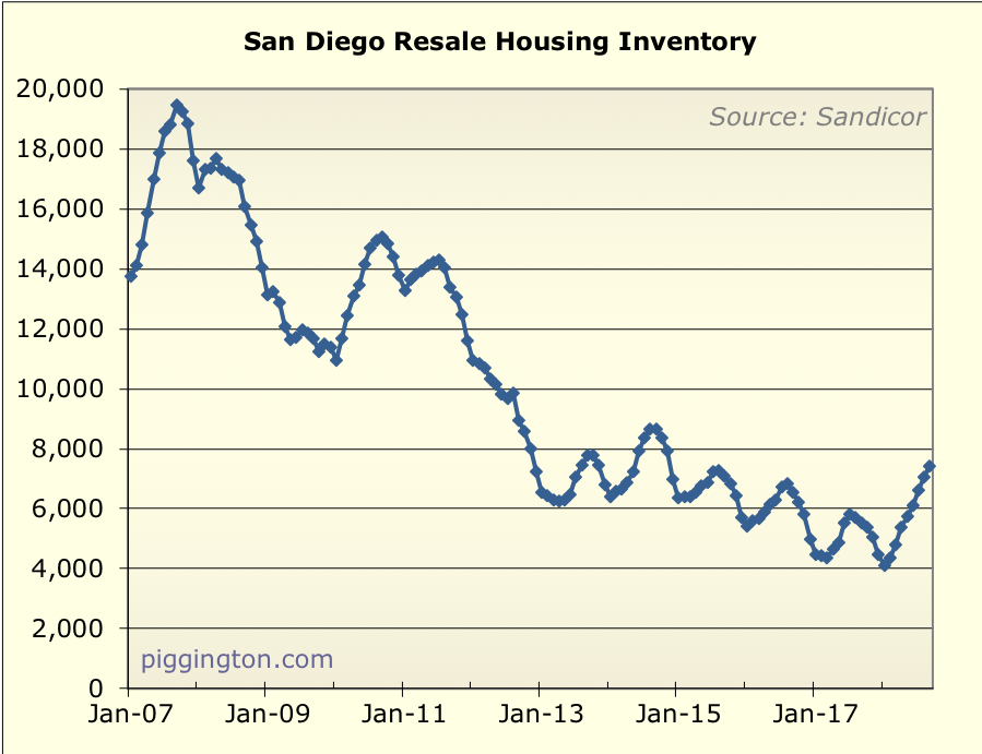
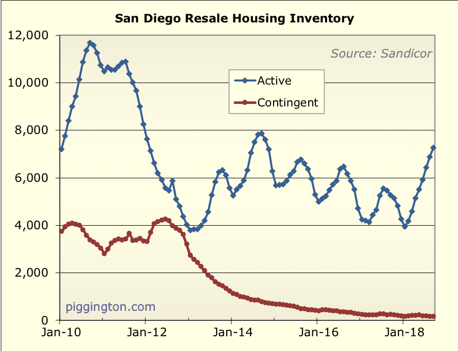
That looks pretty dramatic compared to the past 4 years, but less so
if we widen our timeframe. In fact, active months of inventory in
September 2014 was exactly the same as in September 2018:
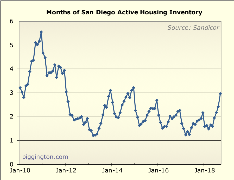
That turned out just fine for home sellers as things picked up again
in the spring of 2015. Perhaps it will be so again. But here are a
couple things to bear in mind…
- After at that point, the 30 year-mortgage rate declined for
the next two years (from 4.2% in Sept 2014 to 3.4% in late
2016). That surely fueled some of the rebound. - The housing valuation ratio is about 10% higher than it was
back then, and mortgage rates are 50 bps higher. So there is
more of an affordability headwind now than in 2014.
So things might not just pick up again next spring as they did last
time… but, that’s a long way away and lots can happen, so we’ll
see. For the time being, I think it’s reasonable to say that a
slowdown has arrived.
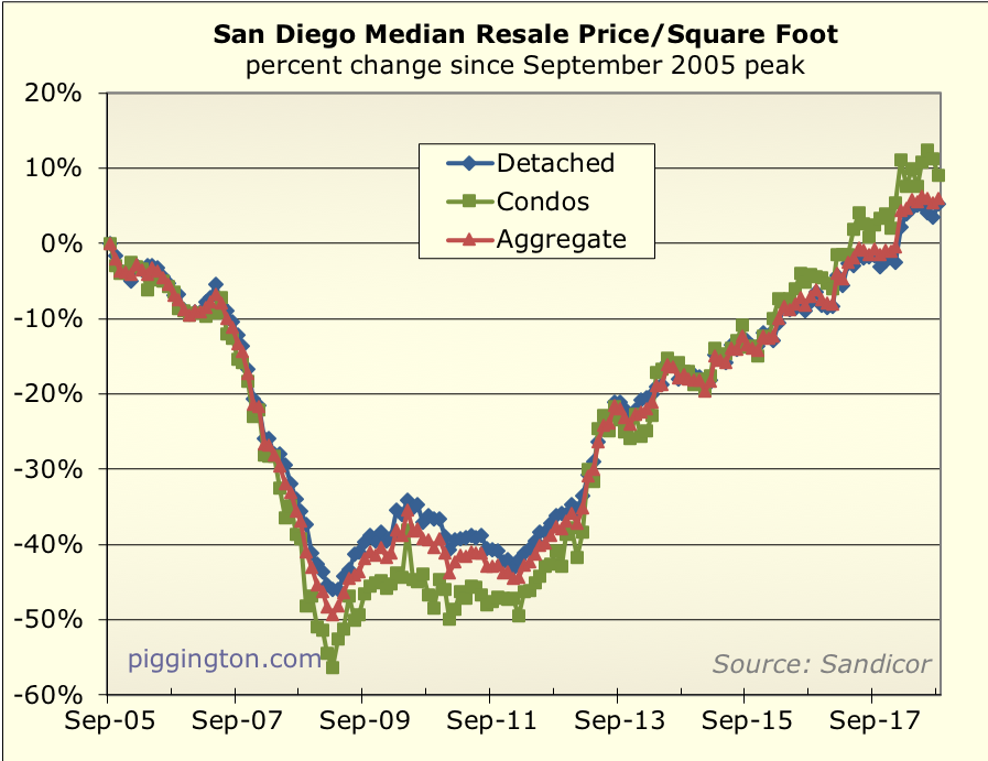
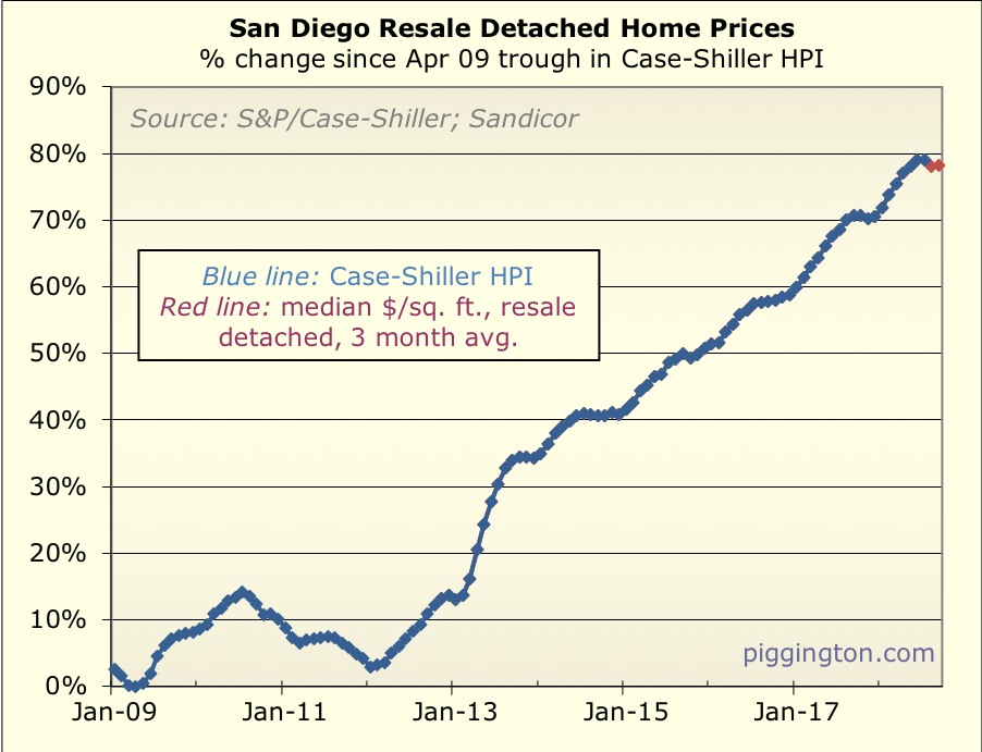
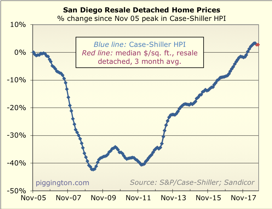
Despite the high inventory, the single family price per square foot
managed to increase for the month:
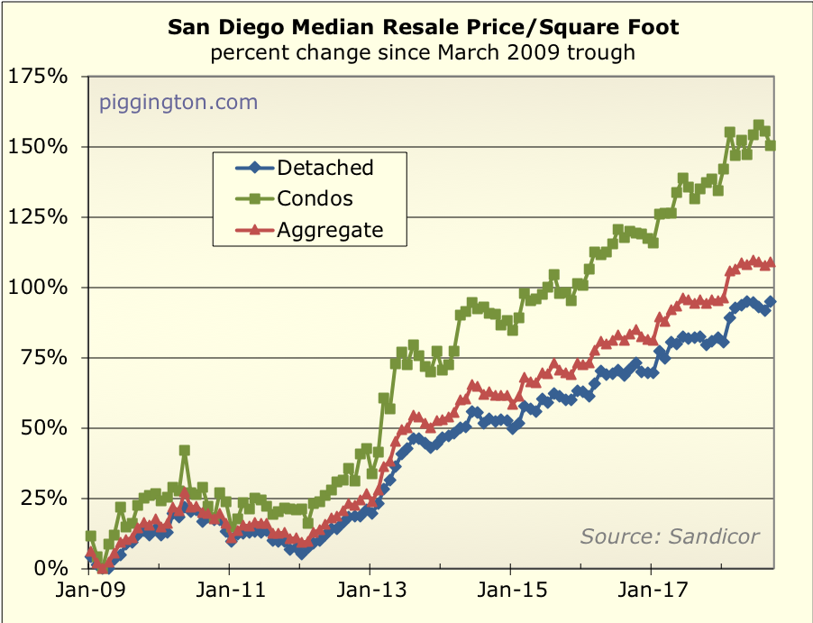
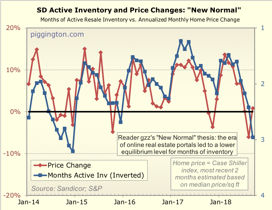
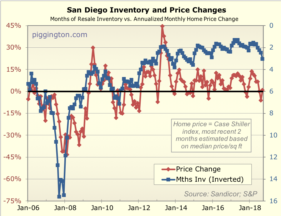
But if inventory remains at this level I expect to see more declines
than increases in the months ahead, especially since we now in the
seasonally weak time of year anyway. The “new normal” inventory vs.
price graph (which is the best fit in recent years predicts price
declines at a rate of about 6%/year at this inventory level, for
what that’s worth.
More graphs below:

About time. The crash in
About time. The crash in 2008-12 was exaggerated by irrationality. The recent bubble was also pumped up by irrationality “no inventory! BRAAAAAWK! must buy now!” Hopefully prices will fine a new normal somewhere in the middle.
Last month San Diego was #1
Last month San Diego was #1 of the top 50 metros in income growth.
This month, we are #1 again: in aging of the stock of existing apartments:
https://www.forbes.com/sites/alyyale/2018/09/17/renters-paying-more-for-less-as-older-apartments-take-over-the-market/
There is a lot of growth of course in downtown towers plus in outer suburbs. But it seems like the only infill is in city owned land like former school sites and, possibly in the future, around Qualcomm and Sports Arena.
I had a rental open up at the
I had a rental open up at the end of July. (one of 5)
SFH, 2700 sf, (built in 2001) 92027, was getting $3250, raised to $3450.
Demand was fair, perhaps not as strong is previously but it rented within a week of competing upgrades which were overdue.
All in spent 33K on new AC 9K, new mable countertops 5K, painted exterior 4K, new carpet upstairs/on stairs 4K, new flooring in bathrooms 2K, new baseboards downstairs 1.5K. Painted interior 1K (wife’s labor) :). Put in new water heater 1K, refrigerator 1K. New front door 4K. Wife refinished the kitchen cabinets herself.
So it basically looks like a brand new house now even though it is 17 years old.
Given we had only done limited maintenance during those 17 years and they totaled to about 8% of the rent we’ve collected in 17 years.
If we can go 10 more years without major renovations again, the percentage of repairs as a % of rent would drop to about 4%.
So while there may be more inventory, if it is older, buyers and investors should factor the condition of the home to see the total economic calculation.
For now, I don’t see an issue with finding good quality renters with newer/upgraded housing.
Hi Rich,
Market seems to
Hi Rich,
Market seems to have turned on a dime. Just as Chinese P2P lending collapses and appearance of first signs of Chinese property bubble burst. Coincidence?
Anyway to figure out foreign buyer % as part of total sales?
Thanks
Howdy ocr – I think the
Howdy ocr – I think the increase in rates is probably a factor, but yeah, Chinese buyers disappearing could also be a factor. Unfortunately I have no idea how to figure out the number of foreign buyers, that would have been cool to measure (and see if it’s changing).
I’ve heard of people using all-cash offers as a proxy for foreign buyers but that seems a bit vague.
I suppose one way to triangulate would be to look at non-coastal/glamour markets. If it’s rates, they should be going down too… if it’s just the glamour markets, that would argue that a specific type of buyer is disappearing. But again… there could be lots going on there.
Personally I was hoping that the market would go high enough that you’d start your website back up. 😉
Even coastal/glamor vs
Even coastal/glamor vs non-coastal isn’t a good proxy for foreign buyers vs rates. Non-coastal could just be less overvalued and thus less sensitive to rates.
Yeah… I agree. (I was
Yeah… I agree. (I was thinking that even as I typed it, hence my walking it back at the end there).
Rich Toscano wrote:Howdy ocr
[quote=Rich Toscano]Howdy ocr – I think the increase in rates is probably a factor, but yeah, Chinese buyers disappearing could also be a factor. Unfortunately I have no idea how to figure out the number of foreign buyers, that would have been cool to measure (and see if it’s changing).
I’ve heard of people using all-cash offers as a proxy for foreign buyers but that seems a bit vague.
I suppose one way to triangulate would be to look at non-coastal/glamour markets. If it’s rates, they should be going down too… if it’s just the glamour markets, that would argue that a specific type of buyer is disappearing. But again… there could be lots going on there.
Personally I was hoping that the market would go high enough that you’d start your website back up. ;-)[/quote]
Haha, the spector of a worldwide drop got me out of my hibernation at least. LOL
I have learned complex problems tend to be multifactorial in causation. For our market we probably are looking at the combo effect of rising interest rate and drying up of foreign buyers. For them, the trade war, economic slowdown, flight of manufacturers (lots of Taiwanese report of repatriating businesses), all leading to credit tightening within China. Builders are overleveraged (hey, sounds familiar? ;-)), and the rest is history (or will be history).
FWIW
sorting my mail, I’m
FWIW
sorting my mail, I’m getting flyers from apt brokers that says stuff like
so it appears some properties are over priced and not moving
Rich, what do the
Rich, what do the affordability graphs look like these days? I mean price relative to income and rental? You also used to have a graph for monthly payment combining price and interest rate. Both were very interesting/useful!
The latest is here:
The latest is here: https://www.piggington.com/shambling_pretty_damn_far_afield_affordability_point
It’s from 5 months ago but it won’t have changed much since then… though the monthly payment chart would look a bit worse today, as rates are a bit higher.