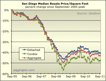
The median price per square foot of San Diego resale homes was down
.2% for single family homes, up .8 percent for attached homes, and
up .2% in aggregate in September. Let’s call it flat for the
month:
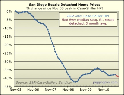
The Case-Shiller proxy, which uses a 3-month rolling average,
dropped a notch to its lowest level in over two years:
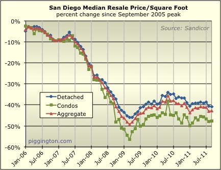
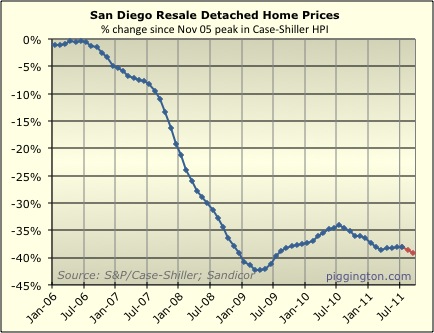
Here are calendar-aligned versions of the above two graphs to help
account for seasonality:
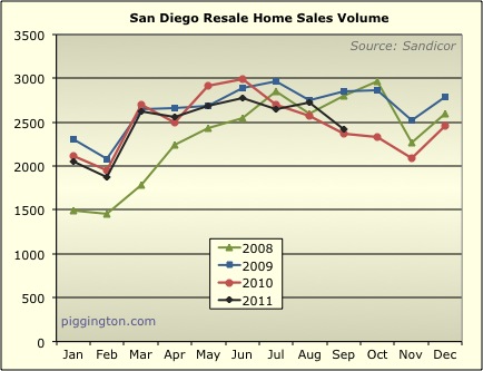
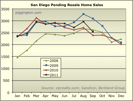
Closed and pending sales were both down for the month, but both are
mildly up from a year ago:
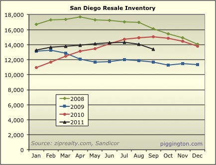
Inventory also dropped for the month, but is 11% below last year’s
level:
Months of inventory climbed to 5.3 months — up from August but 16%
below last year’s level:
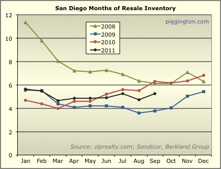
We’ll have to watch to see if that months of inventory figure keeps
creeping up, but for now, it’s at a fairly neutral level that
doesn’t imply much in the way of big price swings in the near
future.

Last graph:
What categories
Last graph:
What categories do you count as inventory?
I have been using active and
I have been using active and contingent. This is what I have historically, so to compare apples to apples that’s what I use now. FWIW the correlation between price and months of supply has worked pretty well when including both those categories.
I used to do a separate graph showing % contingent (based on your elucidation of that category), but I stopped because % contingent never seemed to change very much.
What is the diff. between
What is the diff. between your first chart and the “sold” line in the redfin chart in the right-hand column ?
That is showing the price per sq. ft very close to if not below the last low.
They use a 3 month trailing
They use a 3 month trailing average… there’s would be more akin to my CS proxy.
Great post. If you are
Great post. If you are interested in more data like average rent, average rent per square foot, average cash flow, average cap rate for residential properties let us know we would be glad to contribute. http://youtu.be/sC1bZ3RzKzQ