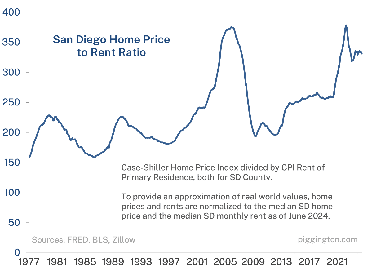
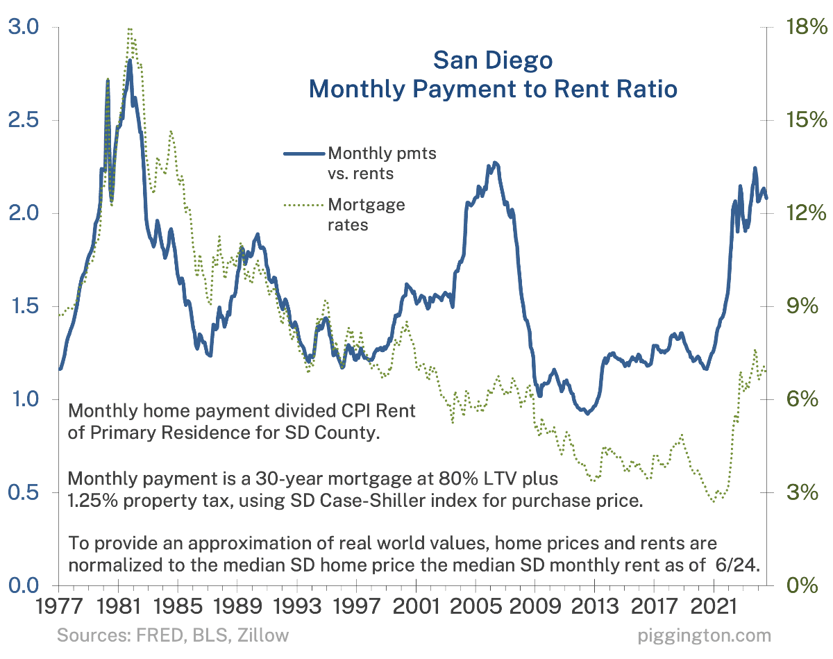
I’ve decided to make a change; from now on I’ll just be focusing rents as the numerator in the valuation ratios. I’ll discuss why at the end, for those who care — first, here’s the fun stuff:


My views remain pretty much the same as in the last two updates (yes it’s been a while, but not much has actually changed over that time on the valuation front). If you want a refresher:
- This one from Feb 23 discusses potential outcomes in declining order of probable-ness. The only thing I’d add here is that the sharp rise in months of inventory lately raises the chance of further nominal price declines.
- In this one from Jul 23 I discussed two reasons prices have held up so well despite terrible affordability: a strong job market and rate lock-in. Current thoughts:
- Interest just dropped pretty hard (but as the article discusses, rate declines are a two-sided coin for the market… they increase affordability but also free up previously lock-in supply).
- The job market appears to be weakening somewhat but for now is still quite strong an on absolute basis.
- San Diego had been underperforming the US housing market when this was written; the opposite has been true more recently. Not very relevant to the thesis but I thought I’d point it out.
- Even before the very recent rate drop, time had indeed chipped away at the lock-in effect, and more inventory has come online lately even as sales remain very depressed. (We recently returned to the pre-Covid average of supply-vs-demand).
OK, feel free to lose consciousness at this point as I’m going to talk about the changes to the graphs and why I made them.
I always compared prices to both rents and per capita incomes. Each bore a plausible fundamental relationship to home prices — how much people were paying for the competing form of shelter, and how much people were earning. And it seemed like it was better to have two fundamental yardsticks than one.
At the same time, I always felt that rent was the more meaningful comparison. Incomes show how much people earn — but rents do too, because a population’s income plays a big role in determining local rents. And rents capture supply and demand info that income does not. (For an exaggerated thought experiment: imagine that San Diego’s population were to double, but that everyone who moved here earned the same amount as the people who already lived here. Per capita income wouldn’t register a change at all, but this change would surely have a profound impact on rents).
As it happens, the two measures moved in lockstep the whole time and one really never said anything different from the other. But if there were a disparity, I feel that rent would be the right figure to emphasize.
While there wasn’t much benefit in tracking both, there were some downsides. I didn’t want to have 2x the graphs so I combined bother measures into a single blended measure. This was fine, but I think it was probably confusing to some people in the way that a simple price/rent multiplier would not be. Also, the income info was kind of a pain to cobble together, which is part of the reason why I was such a slacker on making these valuation updates.
So, I’ve decided to scuttle the income part and just focus on the single, superior fundamental metric of rents.
A bit deeper down the rathole: the numerator is the Case-Shiller Home Price Index and the denominator is the CPI Rent of Primary Residence. The actual numbers involved are abstract index numbers — for instance, the CS index is normalized to 100 at January 2000, and just relates back to that arbitrary number. I followed this convention with my combined metric.
But I’d rather have a number that resembles a real-world value, so I’ve normalized the two data series to the median home price, and median rent, as of June 2024. This is an imperfect mapping, because the CS index isn’t mapping the median home (it’s single family only) and the CPI isn’t mapping the median rent (it’s a lot more complicated than that). But that’s fine. It allows you to see that, for example, the ratio of monthly payments to rents is about 2x right now, whereas it was in the 1-1.3x range in the pre-Covid years. This is more helpful than an abstract number, I think.
Importantly, while the normalization to real world numbers is imprecise, the relationship between the ratios — the shape of the line on the chart — is entirely precise.
Last bit. I got rid of the two straight lines, “current value” and “historical median.” They made the graph too busy without adding much value. Current value is easy to eyeball, and while median is less so, I was always concerned that people might take that as a forecast of full reversion to that median level. That wasn’t my intent; I just wanted to provide some context, but it probably wasn’t worth the clutter or potential confusion.
And that is all; if you made it this far, pour yourself a stiff drink. I hope everyone enjoys the new and hopefully a lot more frequent valuation charts…

I find this really helpful! Thanks Rich
Thank you Mr. Cheese
My three rentals in San Diego/San Marcos some in at 1.8X mortgage payment vs rent. 92127/92078
My three in Escondido come in at 1.5X mortgage payment vs rent. 92027
Presume areas closer to the coast have the higher ratios and rents don’t climb proportionate to value of the home in some higher priced areas.
Still overall a very valuable metric and helps a long term reader like myself see the relative value proposition.
Thanks… yeah, it’s unlikely to match up because I am comparing the ratio of the median home purchase price, vs. the median rent, which aren’t actually the same set of properties (purchased homes vs. rentals).
So it’s not really intended to square up with the ratio on a given property, which will of course be much more accurate. But rather just to keep the numbers from being completely abstract (in the “year 2000 = 100” style). 🙂
Still this is extremely useful and gives a good sense of where the market is going.
Have been following your site for well over a decade and greatly appreciate your insights.
Thank you Escoguy! I appreciate your insights as well.
Good stuff. I’m interested to see whether the expected rate cut next month affects things, although I’m sure the true impact won’t be seen in the data for a few more months.
[…] I continue to think that the most likely scenario is for prices to kind of go nowhere for a while as rents/incomes/inflation catch up, allowing the blue lines in the above graphs to return to more historically normal levels. (More nuance on this view can be found in the previous installment). […]