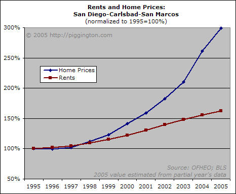
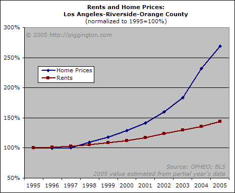
Since I spend a lot of time focusing on San Diego statistics, I thought I’d do some charts comparing rents and home prices in both San Diego and other regions in Southern CA.
Mapping rents and home prices is probably the most important single piece of analysis one can perform. Population growth, incomes, housing availability, and other fundamental factors should feed into both rent prices and sale prices. When there is a disconnect between the two, we know that there is something besides fundamentals driving the market.
As can be seen in the graphs below, the speculative premium placed on Southern California home ownership has caused home price increases to absolutely dwarf those of rents:


These two pictures alone go a long way in demonstrating just how far from reality the Southern CA housing market has gotten.
Note that the ratio of sale prices to rents is by necessity a mean-reverting relationship. If investors can’t make enough rent money to cover the cost of their investment properties, they will be losing money in order to bet on further price appreciation. This can’t go on forever. If rents don’t rise quickly enough, there simply won’t be enough investors to support prices at these levels, and prices will thus have to come down to lure investors back in. Life is full of uncertainties, but one thing we know for sure is that the relationship between prices and rents will eventually return to normal.
