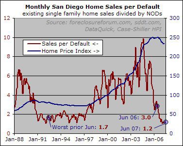
Back in April, I put up a long-term chart of the number of monthly home sales divided by the number of Notices of Default (NODs) in that same month. A summary of the reasoning behind the chart, explained at length in the original article, goes like this: price declines take place when there is a lot of "must-sell" inventory, meaning that sellers can’t wait around for the price they want but rather have to take whatever price they can get. The number of defaulting homeowners can provide an admittedly rough indication of how much must-sell inventory is or soon will be on the market. Comparing sales volume to the number of NODs can tell us how much demand is likely to offset the potential must-sell supply, thus providing a clue about the direction of pricing pressure in the months ahead.
I think you intended
I think you intended “sellers” not “buyers” in the second sentence.
Good catch John — it is
Good catch John — it is fixed here and soon will be at Voice. Thank you.
I wonder, Rich, if it would
I wonder, Rich, if it would be easier to look at the entire data series if it were semi-logarithmic. For example, it’s pretty hard to appreciate the price index pullback in the 90s, but on a percentage basis, it was quite significant.
Couple problems there.
Couple problems there. Excel doesn’t handle log charts well, especially with dual axes. And even if we could log the price, it’s not appropriate to log the sales-per-nod because the raw number is what matters, not the rate of change like with prices.
This chart is really “about” the sales per nod… it’s not intended to give an idea of the scale of the price decline, just to show that nominal prices have generally fallen while sales per nod was low and risen when it was not. For a price focused chart this would be a good start:
http://piggington.com/historical_home_prices_payments_rents_rates
I am with Rich on this one.
I am with Rich on this one. Unless there is some reason to think there is an exponential relationship, there is not much point to looking at the chart on a log scale. If we just want to look at the lower value detail, just omit the time periods with the larger values.
Rich, I am puzzled. I do not see much historical relationship between two sets of data, though it seems like there ought to be.
It actually looks like the Sales/NOD is correlated to the derivative of the price. High Sales/NOD => rising prices. What is the level at which prices are flat, and below that, prices will fall?
jhamon – I agree.
I was
jhamon – I agree.
I was going to post the same thing
(with the Schiller index remaining on a linear scale)
The graph will lose its punch if the picture gets worse and there end up being 2 or 3 NODS for each sale instead of the other way around. i.e. if it gets 3x worse, the graph will only show a small movement.
Are the NOD/NOT comparisons
Are the NOD/NOT comparisons to the last downturns skewed as “most” recent homeowners have first and second mortgages?
Basically, does today’s homeowner defaulting on two mortgages instead of one get counted twice?